2019独角兽企业重金招聘Python工程师标准>>> 
1.@keyframes定义和用法
通过 @keyframes 规则,您能够创建动画。
创建动画的原理是,将一套 CSS 样式逐渐变化为另一套样式。
在动画过程中,您能够多次改变这套 CSS 样式。
以百分比来规定改变发生的时间,或者通过关键词 "from" 和 "to",等价于 0% 和 100%。
0% 是动画的开始时间,100% 动画的结束时间。
为了获得最佳的浏览器支持,您应该始终定义 0% 和 100% 选择器。
注释:请使用动画属性来控制动画的外观,同时将动画与选择器绑定。
2.@keyframes语法
@keyframes animationname {keyframes-selector {css-styles;}}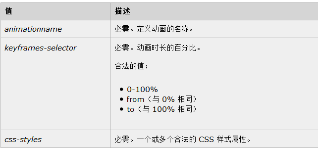
3.w3c上面的案例,多个样式的改变
<!DOCTYPE html>
<html>
<head>
<style>
div
{
width:100px;
height:100px;
background:red;
position:relative;
animation:mymove 5s infinite;
-moz-animation:mymove 5s infinite; /* Firefox */
-webkit-animation:mymove 5s infinite; /* Safari and Chrome */
-o-animation:mymove 5s infinite; /* Opera */
}@keyframes mymove
{
0%   {top:0px; background:red; width:100px;}
100% {top:200px; background:yellow; width:300px;}
}@-moz-keyframes mymove /* Firefox */
{
0%   {top:0px; background:red; width:100px;}
100% {top:200px; background:yellow; width:300px;}
}@-webkit-keyframes mymove /* Safari and Chrome */
{
0%   {top:0px; background:red; width:100px;}
100% {top:200px; background:yellow; width:300px;}
}@-o-keyframes mymove /* Opera */
{
0%   {top:0px; background:red; width:100px;}
100% {top:200px; background:yellow; width:300px;}
}
</style>
</head>
<body><p><b>注释:</b>本例在 Internet Explorer 中无效。</p><div></div></body>
</html>给一个元素调用animation属性
.demo1 {width: 50px;height: 50px;margin-left: 100px;background: blue;-webkit-animation-name:'wobble';/*动画属性名,也就是我们前面keyframes定义的动画名*/-webkit-animation-duration: 10s;/*动画持续时间*/-webkit-animation-timing-function: ease-in-out; /*动画频率,和transition-timing-function是一样的*/-webkit-animation-delay: 2s;/*动画延迟时间*/-webkit-animation-iteration-count: 10;/*定义循环资料,infinite为无限次*/-webkit-animation-direction: alternate;/*定义动画方式*/}===========================
自用:
/*定义旋转*/
@-webkit-keyframes rock{0%{ transform:rotate(0deg) }10%{ transform:rotate(3deg) }20%{ transform:rotate(-3deg) }30%{ transform:rotate(2deg) }40%{ transform:rotate(-2deg) }50%{ transform:rotate(1deg) }60%{ transform:rotate(-1deg) }70%{ transform:rotate(0deg) }100%{ transform:rotate(0deg) }}/**给需要抖动选中的元素加上动画*/
.c_zongzi_box_rock{-webkit-animation:rock 2s infinite;}infinite是无限的动画的意思 rock定义的-webkit-keyframes的名字,2s是动画的时间
transform-origin是动画变换的基点(参照点)
1、top left | left top 等价于 0 0 | 0% 0%
2、top | top center | center top 等价于 50% 0
3、right top | top right 等价于 100% 0
4、left | left center | center left 等价于 0 50% | 0% 50%
5、center | center center 等价于 50% 50%(默认值)
6、right | right center | center right 等价于 100% 50%
7、bottom left | left bottom 等价于 0 100% | 0% 100%
8、bottom | bottom center | center bottom 等价于 50% 100%
9、bottom right | right bottom 等价于 100% 100%
其中 left,center right是水平方向取值,对应的百分值为left=0%;center=50%;right=100%而top center bottom是垂直方向的取值,其中top=0%;center=50%;bottom=100%;如果只取一个值,表示垂直方向值不变