react 组件样式_如何使用样式化组件为React组件创建视觉变体
react 组件样式
by Gilad Dayagi
通过吉拉德·达亚吉
如何使用样式化组件为React组件创建视觉变体 (How to create visual variants for React components using styled-components)
Styled-components is a library for styling React components that took the React world by storm when it was introduced at the end of 2016. The library is powerful and flexible. And solves most of the problems that classic CSS has in the so-called Component Age.
Styled-components是用于对React组件进行样式设置的库,该库在2016年底推出时风靡了React世界。该库功能强大且灵活。 并解决了经典CSS在所谓的“组件时代”中存在的大多数问题 。
In this post, I’ll look into one aspect of styling components:
在这篇文章中,我将研究样式组件的一个方面:
How to implement a component that can have multiple visual variants.
如何实现可以具有多个视觉变量的组件。
And I’ll show you three different ways to achieve this using styled-components, which I call:
我将向您展示三种使用样式化组件来实现此目的的方法,我称之为:
1: The Classic Approach
1:经典方法
2: The Component Approach
2:分量法
3: The Extending Approach
3:扩展方法
I’ll assume some knowledge of React and styled-components. But in case you need a reference, both have excellent documentation. You can find React’s docs here and styled-component’s here.
我将假设一些有关React和样式化组件的知识。 但是,如果您需要参考,两者都有出色的文档。 你可以找到阵营的文档在这里和风格的分量的位置 。
You can see a live demo of each approach here.
您可以在此处观看每种方法的现场演示。
视觉变体 (Visual variants)
In React, a component translates state and props into a visual representation. This usually means into a DOM element.
在React中,组件将状态和道具转换为视觉表示。 这通常意味着进入DOM元素。
And sometimes you need a component to switch between several visual states, depending on certain conditions. Meaning you need the component to change, perhaps, color to convey different information. For example:
有时,您需要一个组件来根据特定条件在几种视觉状态之间切换。 这意味着您需要更改组件(也许是颜色)以传达不同的信息。 例如:
- A button can be normal, primary, secondary, disabled, etc.按钮可以是普通,主要,辅助,禁用等。
- A list item can be selected or not selected.可以选择列表项,也可以不选择。
- A form element can be required, with error or normal.可能需要表单元素,错误或正常。
A good example of this visual variant pattern is Bootstrap’s button styles. You style the button independent of its content and choose among a host of variants. And each variant of the button serves its own semantic purpose (like success or disabled) as opposed to appearance (like blue, round, etc.).
Bootstrap的按钮样式就是一个很好的例子。 您可以对按钮进行样式设置,使其与按钮的内容无关,然后在众多变体中进行选择。 与外观(例如蓝色,圆形等)相反,按钮的每个变体都具有自己的语义目的(例如成功或禁用)。
So how do you implement visual variants with styled-components? You can do so using the Classic Approach, Component Approach, or Extending Approach.
那么如何使用样式化组件实现视觉变体? 您可以使用经典方法,组件方法或扩展方法进行操作。
1:经典方法 (1: The Classic Approach)
Styled-components fully supports CSS. Which includes the ability to apply style rules to “subclasses” of elements. That means you can create visual variants using CSS classes not so different from how it’s done with plain CSS.
样式化组件完全支持CSS。 其中包括将样式规则应用于元素的“子类”的功能。 这意味着您可以使用CSS类创建视觉变体,与普通CSS的变体没有什么不同。
To select a variant of a component you modify the className prop. You can also pass a number of classes this way and combine several variants, say, ‘primary’ and ‘large’.
要选择组件的变体,请修改className属性。 您还可以通过这种方式传递许多类,并组合多个变体,例如“主要”和“大型”。
Example
例
// ButtonClassic.jsximport styled from 'styled-components'const ButtonClassic = styled.button` background: #fff; color: #333; font-size: 1em; margin: 1em; padding: 6px 12px; border: 1px solid #ccc; border-radius: 4px; cursor: pointer;/* Style sub-classes */ &.primary { color: #fff; background: #337ab7; border-color: #2e6da4; } &.success { color: #fff; background-color: #5cb85c; border-color: #4cae4c; } &.link { color: #337ab7; background-color: transparent; border: none; border-radius: 0; font-weight: 400; } &.large { font-size: 1.2em; padding: 10px 16px; border-radius: 6px; } &.disabled { color: #ddd; background-color: #aaa; border: 1px solid #aaa; }`;export default ButtonClassicUsage
用法
// ... <ButtonClassic>Default</ButtonClassic><ButtonClassic className="primary">Primary</ButtonClassic><ButtonClassic className="success">Success</ButtonClassic><ButtonClassic className="link">Link</ButtonClassic>// With Combos<ButtonClassic className="primary large"> Primary Large</ButtonClassic><ButtonClassic className="disabled primary large"> Primary Large Disabled</ButtonClassic>Pros
优点
- Easy to support several variants.易于支持多种变体。
- Easy to combine a list of variants (for example, primary + large + disabled)易于组合变体列表(例如,主+大+禁用)
- Code is readable and compact代码清晰易读
- Easy to port styles from plain CSS易于从普通CSS移植样式
Cons
缺点
- Doesn’t use standard component facilities (props)不使用标准组件设施(道具)
- When combining classes, results depend on the declaration order of the style rule. Like in classic CSS. This may lead to unexpected behavior.组合类时,结果取决于样式规则的声明顺序。 就像经典CSS一样。 这可能会导致意外的行为。
2:分量法 (2: The Component Approach)
Styled components, like their name suggest are simply normal components. Which means they can receive props. Props that can be accessed in the style declaration and used to determine values for style rules.
样式化的组件(如其名称所暗示的)只是普通组件。 这意味着他们可以接收道具。 可以在样式声明中访问的道具,用于确定样式规则的值。
I call this the Component Approach because it works like how usual React components work. Where prop values are used to calculate the visual representation of the component. In this case, the concept is limited to styling, rather than content.
我将其称为“组件方法”,因为它的工作方式与通常的React组件的工作方式相同。 其中prop值用于计算组件的视觉表示。 在这种情况下,该概念仅限于样式而不是内容。
Example
例
// ButtonComponent.jsx import styled from 'styled-components'const ButtonComponent = styled.button` background: ${props => props.primary ? '#337ab7' : '#fff'}; color: ${props => props.primary ? '#fff' : '#333'}; font-size: 1em; margin: 1em; padding: 6px 12px; border: ${props => props.primary ? '1px solid #2e6da4' : '1px solid #ccc'}; border-radius: 4px; cursor: pointer;`export default ButtonComponentUsage
用法
// ...<ButtonComponent>Default</ButtonComponent><ButtonComponent primary={true}>Primary</ButtonComponent>Pros
优点
- Standard React component behavior, deriving visual representation from props标准React组件行为,从props派生视觉表示
Cons
缺点
- If more than two states are needed, the code can become unreadable如果需要两个以上的状态,则代码可能变得不可读
- There is some code repetition, especially if many rules differ between variants.有一些代码重复,尤其是在变体之间有很多规则不同的情况下。
3:扩展方法 (3: The Extending Approach)
Besides primitive elements, styled-components allows us to also style custom components. So you can re-style a base or default component. And override relevant style rules to create a visual variant.
除了基本元素之外,样式化组件还允许我们对自定义组件进行样式化。 因此,您可以重新设置基本或默认组件的样式。 并覆盖相关的样式规则以创建视觉变体。
Example
例
// ButtonExtend.jsximport styled from 'styled-components'const ButtonExtend = styled.button` background: #fff; color: #333; font-size: 1em; margin: 1em; padding: 6px 12px; border: 1px solid #ccc; border-radius: 4px; cursor: pointer;`export default ButtonExtendexport const ButtonExtendPrimary = styled(ButtonExtend)` color: #fff; background: #337ab7; border-color: #2e6da4;`export const ButtonExtendSuccess = styled(ButtonExtend)` color: #fff; background-color: #5cb85c; border-color: #4cae4c;`export const ButtonExtendLink = styled(ButtonExtend)` color: #337ab7; background-color: transparent; border: none; border-radius: 0; font-weight: 400;`Usage
用法
// ...<ButtonExtend>Default</ButtonExtend><ButtonExtendPrimary>Primary<;/ButtonExtendPrimary><ButtonExtendSuccess>Success</ButtonExtendSuccess><ButtonExtendLink>Link</ButtonExtendLink>Pros
优点
- Each variant is a separate component每个变体都是单独的组件
- Easy to have many variants容易有多种变体
- Code is very readable代码可读性强
Cons
缺点
- To get a different variant, a different component needs to be rendered vs changing a property on the same component which might be more cumbersome.为了获得不同的变体,与渲染同一组件上的属性相比,需要渲染一个不同的组件,这可能会比较麻烦。
- Can’t easily support combining multiple variants.无法轻松地支持多个变体的组合。
摘要 (Summary)
I have listed all the ways for doing visual variants that I had a chance to try, but there might be others. Which approach is best depends on your specific needs and preferences.
我已经列出了我有机会尝试过的所有视觉变化方法,但是可能还有其他方法。 哪种方法最好取决于您的特定需求和偏好。
If you missed the link above, a live demo of the code examples is available in this webpack bin.
如果您错过了上面的链接,可以在此webpack bin中获得代码示例的实时演示。
If you know of other approaches using styled-components, let me know in the comments below.
如果您知道使用样式化组件的其他方法,请在下面的评论中告诉我。
Update (Jun 9 2017)
更新(2017年6月9日)
Styled-components V2 was released a few days ago with a slightly better way to use the Extending Approach.
样式组件V2是几天前发布的 ,使用扩展方法的一种更好的方法。
There is now a specific function for this approach named extend. The function is like the original method, but under the hood creates a new stylesheet by extending the old one. And thus doesn’t generate two classes.
现在,此方法有一个特定功能,称为extend 。 该函数类似于原始方法,但是在内部通过扩展旧样式表来创建新样式表。 因此不会生成两个类。
So the original example for the Extending Approach, would look something like this:
因此,扩展方法的原始示例如下所示:
// ButtonExtendV2.jsximport styled from 'styled-components'const ButtonExtendV2 = styled.button` background: #fff; color: #333; font-size: 1em; margin: 1em; padding: 6px 12px; border: 1px solid #ccc; border-radius: 4px; cursor: pointer;`export default ButtonExtendV2export const ButtonExtendV2Primary = ButtonExtendV2.extend` color: #fff; background: #337ab7; border-color: #2e6da4;`export const ButtonExtendV2Success = ButtonExtendV2.extend` color: #fff; background-color: #5cb85c; border-color: #4cae4c;`// ...翻译自: https://www.freecodecamp.org/news/visual-variants-for-react-components-with-styled-components-dfaff6a76273/
react 组件样式
相关文章:

HDU 1406 完数
完数 Time Limit: 2000/1000 MS (Java/Others) Memory Limit: 65536/32768 K (Java/Others) Total Submission(s): 18647 Accepted Submission(s): 6894 Problem Description完数的定义:如果一个大于1的正整数的所有因子之和等于它的本身,则称这个…
14-flutter Animation 动画
动画 一 Animation 在Flutter中,Animation对象本身和UI渲染没有任何关系。Animation是一个抽象类,它拥有其当前值和状态(完成或停止)。其中一个比较常用的Animation类是Animation。 Flutter中的Animation对象是一个在一段时间内…
---Intel SSD 750 under Linux
https://wiki.archlinux.org/index.php/Solid_State_Drives/NVMe转载于:https://www.cnblogs.com/bzhao/p/6405268.html
谷歌数字图书馆_如何在没有联系的情况下找到6位数字的工作-提示使我获得了Google和其他技术巨头的工作机会...
谷歌数字图书馆Shortly after college, I began chasing something many people want but few ever get: a job they love.大学毕业后不久,我开始追求许多人想要但很少有人得到的东西:他们热爱的工作。 I left school with a biology degree and a job …
attribute
(verilog-2001) (*keep 1*) wire my_reg; 最大扇出信号设置 (*maxfan 20*)reg clk_en; 上电初始化 reg q 1b1; keep :确保组合逻辑不被优化 preserve:防止寄存器被优化掉。对于扇出较大的信号,可以同时定义两个信号来分担扇出,…
算法基础之冒泡排序
data[10,4,33,21,54,3,9,11] //for index,i in enumerate(data[0:-1): for j in range(1,len(data)): for i in range(len(data)-j): if data[i]>data[i1]: tempdata[i1] data[i1]data[i] data[i]temp print(data) 转载于:https://www.cnblogs.com/my334420/p/6407843.html

15-flutter Scaffold详解
Scaffold 是一个实现基本的material design 的布局结构 appBar显示在界面顶部的一个 AppBarbody当前界面所显示的主要内容 WidgetfloatingActionButtonMaterial 设计中所定义的 FAB,界面的主要功能按钮persistentFooterButtons固定在下方显示的按钮,比…
成本管理系统开源_开源教科书如何降低大学成本
成本管理系统开源Over the past 10 years, the cost of textbooks in the US has increased by 88%. This has contributed to more than $1 trillion in total student loan debt, which Americans are struggling pay back.在过去的10年中,美国的教科书成本增加了…

OA项目12:系统管理之用户管理
首注:本学习教程为传智播客汤阳光讲师所公布的免费OA项目视频我的文字版实践笔记,本人用此来加强巩固自己开发知识,如有网友转载,请注明。谢谢。 一 之前在第8节时已经将User实体及映射文件建立好了,所以设计实体已…

16-flutter-Swiper 插件的使用
Flutter-Swiper 插件的使用 1 在pubspec.ymal 中去导入插件 dependencies:flutter:sdk: flutter# The following adds the Cupertino Icons font to your application.# Use with the CupertinoIcons class for iOS style icons.cupertino_icons: ^0.1.2flutter_swiper: ^1.1…
NPOI导Excel样式设置
一、创建一个Excel //创建一个工作簿 XSSFWorkbook workbook new XSSFWorkbook(); //创建一个页 ISheet sheet workbook.CreateSheet("sheet1"); //创建一行 IRow row sheet.CreateRow(0); //创建一列 ICell ce…
谢尔盖.布林的早期思想_谷歌联合创始人谢尔盖·布林(Sergey Brin)谈人工智能与自动化...
谢尔盖.布林的早期思想Here are three links worth your time:这是三个值得您花费时间的链接: Google cofounder Sergey Brin talks about AI, automation, and the future of education (34 minute watch) Google联合创始人谢尔盖布林(Sergey Brin)谈论人工智能&a…
17-flutter导航栏渐变效果
MediaQuery.removePadding 移除顶部的 padding import package:flutter/material.dart; // 导入swiper 组件 import package:flutter_swiper/flutter_swiper.dart;const APPBAR_SCROLL_OFFSET 200; class HomePage extends StatefulWidget {// 重写Create State 方法override…
链表之逆转链表
链表之逆转链表 传入一个Node指针,将它指向的链表进行逆置,返回逆置后的新链表,注意操作过程中不要额外申请空间,即在传入的链表中进行节点逆置. 代码: Node * reverse_list(Node *head){Node * preNULL;Node * curhea…
如何使用Redux-saga和ReactDnD测试React和Redux(哇!)
by Gregory Beaver通过格雷戈里海狸 如何使用Redux-saga和ReactDnD测试React和Redux(哇!) (How to test React and Redux with Redux-saga and ReactDnD (whew!)) 帮助程序和系统使测试更加容易 (Helpers and systems to make testing easier) This article is the…
18-flutter的Future和FutureBuilder
Future 表示接卸来某个时间的值或者错误,借助Future可以在flutter 总实现异步操作。 其本事是dart:async 包中的一个类,使用它的时候需要导入dart:async 包,Future 有两种状态。 pending 执行中completed 执行结束 ,…
js控制使div自动适应居中
一直都在想怎么样使弹出的DIV能在任何时候都是居中显示的,刚开始的时候是用CSS样式直接定义好层的位置,但是当页面很长的时候,或是浏览器窗口大小不是固定的时候就不能正确的显示,所以只好用JS来控制DIV的显示位置。首先再次详细解…
【poj3420】 Quad Tiling
http://poj.org/problem?id3420 (题目链接) 题意 给出$n*m$的网格,用$1*2$的方块覆盖有多少种方案。 Solution 数据很大,不能直接搞了,我们矩乘一下。0表示已放置,1表示未放置。dfs跑出一个$16*16$的转移矩阵,然后矩乘…
bokeh pandas_使用Pandas和Bokeh将Rolling Stone的500张最伟大专辑可视化
bokeh pandasby Gautham Koorma通过Gautham Koorma 使用Pandas和Bokeh将Rolling Stone的500张最伟大专辑可视化 (Rolling Stone’s 500 Greatest Albums Visualized Using Pandas and Bokeh) In 2003, Rolling Stones Magazine polled musicians, producers, and industry exe…

使用WinINet和WinHTTP实现Http訪问
使用WinINet和WinHTTP实现Http訪问 飘飘白云 l_zhaohui163.com 2007-11-30 Http訪问有两种方式,GET和POST,就编程来说GET方式相对简单点,它不用向server提交数据,在这个例程中我使用POST方式,提交数据value1与value2&a…
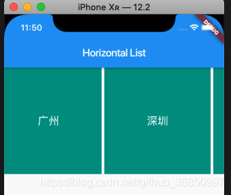
19-flutter的ListView 和 GridView的使用
ListView 的水平样式 和垂直样式 1 水平列表 import package:flutter/material.dart;const CITY_LIST ["北京","上海","广州","深圳","南京","郑州","武汉"];void main() > runApp(MyApp());clas…
linux下ndk编译命令行程序及配置
1.在http://developer.android.com/tools/sdk/ndk/index.html下载Android-ndk-r8e-linux-x86.tar.bz2,解压后把android-ndk-r8e添加到环境变量PATH中,例如, export PATH$PATH:/opt/studydisk/android-ndk-r8e 2.新建一个文件夹,如helloword&a…
vs2017数据可视化建模_介绍数据可视化社区调查2017
vs2017数据可视化建模by lars verspohl由拉斯韦斯波尔 介绍数据可视化社区调查2017 (Introducing the Data Visualization Community Survey 2017) Data visualization is a funny fish. It sort of stands on its own feet (or fins), but is also intimately entangled with…
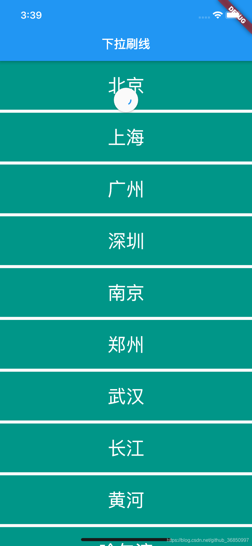
20-flutter下拉刷新与上拉加载
1 RefreshIndicator 下拉刷新控件 下拉刷新的时候会回调 onRefresh 方法 RefreshIndicator(onRefresh: _handleRefresh,child: ListView(children: _buildList(),), ),2 上拉加载多 上拉加载更多的时候 override void initState() { super.initState();_scrollController.a…
PHP+redis实现超迷你全文检索
2014年10月31日 11:45:39 情景: 我们平台有好多游戏, 运营的同事在查询某一款游戏的时候, 目前使用的是html的select下拉列表的展现形式, 运营的同事得一个个去找,然后选中,耗时又费眼 效果: 输入"三国"或者"国三", 将自动列出所有包含"三国"的游…
Linux下的Shell编程(2)环境变量和局部变量
Shell Script是一种弱类型语言,使用变量的时候无需首先声明其类型。 局部变量在本地数据区分配内存进行存储,这个变量归当前的Shell所有,任何子进 程都不能访问本地变量。这些变量与环境变量不同,环境变量被存储在另一内存区&…
上拉电阻和下拉电阻_硬件基础:下拉电阻和上拉电阻如何工作
上拉电阻和下拉电阻by Taron Foxworth通过塔伦福克斯沃思(Taron Foxworth) 硬件基础:下拉电阻和上拉电阻如何工作 (Hardware fundamentals: how pull-down and pull-up resistors work) If you’ve ever wired up a button to an Arduino, you’ve come across thi…
时间序列学习笔记4
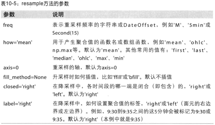
6. 重采样及频率转换 重采样(resample)表示将时间序列的频率进行转换的过程。可以分为降采样和升采样等。 pandas对象都有一个resample方法,可以进行频率转换。 In [5]: rng pd.date_range(1/1/2000, periods100, freqD)In [6]: ts Series(…
linux驱动编程入门实例
编辑 /*****hello.c*******/ #include <linux/init.h> #include <linux/module.h> #include <linux/kernel.h> MODULE_LICENSE("Dual BSD/GPL"); static int hello_init() { printk("<1>hello\n"); return 0; } static void hello…
iOS UIView快速添加事件
给UIView 做一个延展 // // UIViewSKTap.h // MeiGouYouPin // // Created by coder on 2019/10/29. // Copyright © 2019 AlexanderYeah. All rights reserved. // #import <UIKit/UIKit.h> NS_ASSUME_NONNULL_BEGIN typedef void(^TapBlock)(void); interfac…