如何用Jupyter Notebook制作新冠病毒疫情追踪器?
出品 | AI科技大本营(ID:rgznai100)
新冠肺炎已在全球范围内爆发。为了解全球疫情分布情况,有技术人员使用Jupyter Notebook绘制了两种疫情的等值线地图(choropleth chart)和散点图。
前者显示了一个国家/地区的疫情扩散情况:该国家/地区的在地图上的颜色越深,其确诊案例越多。其中的播放键可以为图表制作动画,同时还可以使用滑块手动更改日期。
第二个散点图中的红点则表明其大小与某一特定地点的确诊病例数量成对数比例。这个图表的分辨率更高,数据呈现的是州/省一级的疫情情况。
最终的疫情地图显示效果清晰明了,以下为作者分享的全部代码:
from datetime import datetimeimport re
from IPython.display import displayimport numpy as npimport pandas as pdimport plotly.graph_objects as gofrom plotly.subplots import make_subplots
pd.options.display.max_columns = 12
date_pattern = re.compile(r"\d{1,2}/\d{1,2}/\d{2}")def reformat_dates(col_name: str) -> str: # for columns which are dates, I'd much rather they were in day/month/year format try: return date_pattern.sub(datetime.strptime(col_name, "%m/%d/%y").strftime("%d/%m/%Y"), col_name, count=1) except ValueError: return col_name
# this github repo contains timeseries data for all coronavirus cases: https://github.com/CSSEGISandData/COVID-19confirmed_cases_url = "https://raw.githubusercontent.com/CSSEGISandData/COVID-19/master/csse_covid_19_data/" \ "csse_covid_19_time_series/time_series_19-covid-Confirmed.csv"deaths_url = "https://raw.githubusercontent.com/CSSEGISandData/COVID-19/master/csse_covid_19_data/" \ "csse_covid_19_time_series/time_series_19-covid-Deaths.csv"
等值线地图
renamed_columns_map = {   "Country/Region": "country",   "Province/State": "location",   "Lat": "latitude",   "Long": "longitude"}
cols_to_drop = ["location", "latitude", "longitude"]
confirmed_cases_df = (   pd.read_csv(confirmed_cases_url)   .rename(columns=renamed_columns_map)   .rename(columns=reformat_dates)   .drop(columns=cols_to_drop))deaths_df = (   pd.read_csv(deaths_url)   .rename(columns=renamed_columns_map)   .rename(columns=reformat_dates)   .drop(columns=cols_to_drop))
display(confirmed_cases_df.head())display(deaths_df.head())
# extract out just the relevant geographical data and join it to another .csv which has the country codes.# The country codes are required for the plotting function to identify countries on the mapgeo_data_df = confirmed_cases_df[["country"]].drop_duplicates()country_codes_df = ( pd.read_csv( "country_code_mapping.csv", usecols=["country", "alpha-3_code"], index_col="country"))geo_data_df = geo_data_df.join(country_codes_df, how="left", on="country").set_index("country")
# my .csv file of country codes and the COVID-19 data source disagree on the names of some countries. This # dataframe should be empty, otherwise it means I need to edit the country name in the .csv to matchgeo_data_df[(pd.isnull(geo_data_df["alpha-3_code"])) & (geo_data_df.index != "Cruise Ship")
输出:
dates_list = (    deaths_df.filter(regex=r"(\d{2}/\d{2}/\d{4})", axis=1)    .columns    .to_list())
# create a mapping of date -> dataframe, where each df holds the daily counts of cases and deaths per countrycases_by_date = {}for date in dates_list:    confirmed_cases_day_df = (        confirmed_cases_df        .filter(like=date, axis=1)        .rename(columns=lambda col: "confirmed_cases")    )    deaths_day_df = deaths_df.filter(like=date, axis=1).rename(columns=lambda col: "deaths")    cases_df = confirmed_cases_day_df.join(deaths_day_df).set_index(confirmed_cases_df["country"])date_df = (        geo_data_df.join(cases_df)        .groupby("country")        .agg({"confirmed_cases": "sum", "deaths": "sum", "alpha-3_code": "first"})    )    date_df = date_df[date_df["confirmed_cases"] > 0].reset_index()        cases_by_date[date] = date_df    # the dataframe for each day looks something like this:cases_by_date[dates_list[-1]].head()
输出:
# helper function for when we produce the frames for the map animationdef frame_args(duration): return { "frame": {"duration": duration}, "mode": "immediate", "fromcurrent": True, "transition": {"duration": duration, "easing": "linear"}, }
fig = make_subplots(rows=2, cols=1, specs=[[{"type": "scattergeo"}], [{"type": "xy"}]], row_heights=[0.8, 0.2])
# set up the geo data, the slider, the play and pause buttons, and the titlefig.layout.geo = {"showcountries": True}fig.layout.sliders = [{"active": 0, "steps": []}]fig.layout.updatemenus = [    {        "type": "buttons",        "buttons": [            {                "label": "▶",  # play symbol                "method": "animate",                "args": [None, frame_args(250)],            },            {                "label": "◼",                "method": "animate",  # stop symbol                "args": [[None], frame_args(0)],            },        ],        "showactive": False,        "direction": "left",    }]fig.layout.title = {"text": "COVID-19 Case Tracker", "x": 0.5}
frames = []steps = []# set up colourbar tick values, ranging from 1 to the highest num. of confirmed cases for any country thus farmax_country_confirmed_cases = cases_by_date[dates_list[-1]]["confirmed_cases"].max()
# to account for the significant variance in number of cases, we want the scale to be logarithmic...high_tick = np.log1p(max_country_confirmed_cases)low_tick = np.log1p(1)log_tick_values = np.geomspace(low_tick, high_tick, num=6)
# ...however, we want the /labels/ on the scale to be the actual number of cases (i.e. not log(n_cases))visual_tick_values = np.expm1(log_tick_values).astype(int)# explicitly set max cbar value, otherwise it might be max - 1 due to a rounding errorvisual_tick_values[-1] = max_country_confirmed_cases  visual_tick_values = [f"{val:,}" for val in visual_tick_values]
# generate line chart data# list of tuples: [(confirmed_cases, deaths), ...]cases_deaths_totals = [(df.filter(like="confirmed_cases").astype("uint32").agg("sum")[0],                         df.filter(like="deaths").astype("uint32").agg("sum")[0])                           for df in cases_by_date.values()]
confirmed_cases_totals = [daily_total[0] for daily_total in cases_deaths_totals]deaths_totals =[daily_total[1] for daily_total in cases_deaths_totals]# this loop generates the data for each framefor i, (date, data) in enumerate(cases_by_date.items(), start=1):    df = data# the z-scale (for calculating the colour for each country) needs to be logarithmic    df["confirmed_cases_log"] = np.log1p(df["confirmed_cases"])df["text"] = (        date        + "<br>"        + df["country"]        + "<br>Confirmed cases: "        + df["confirmed_cases"].apply(lambda x: "{:,}".format(x))        + "<br>Deaths: "        + df["deaths"].apply(lambda x: "{:,}".format(x))    )# create the choropleth chart    choro_trace = go.Choropleth(        **{            "locations": df["alpha-3_code"],            "z": df["confirmed_cases_log"],            "zmax": high_tick,            "zmin": low_tick,            "colorscale": "reds",            "colorbar": {                "ticks": "outside",                "ticktext": visual_tick_values,                "tickmode": "array",                "tickvals": log_tick_values,                "title": {"text": "<b>Confirmed Cases</b>"},                "len": 0.8,                "y": 1,                "yanchor": "top"            },            "hovertemplate": df["text"],            "name": "",            "showlegend": False        }    )        # create the confirmed cases trace    confirmed_cases_trace = go.Scatter(        x=dates_list,        y=confirmed_cases_totals[:i],        mode="markers" if i == 1 else "lines",        name="Total Confirmed Cases",        line={"color": "Red"},        hovertemplate="%{x}<br>Total confirmed cases: %{y:,}<extra></extra>"    )            # create the deaths trace    deaths_trace = go.Scatter(        x=dates_list,        y=deaths_totals[:i],        mode="markers" if i == 1 else "lines",        name="Total Deaths",        line={"color": "Black"},        hovertemplate="%{x}<br>Total deaths: %{y:,}<extra></extra>"    )if i == 1:        # the first frame is what the figure initially shows...        fig.add_trace(choro_trace, row=1, col=1)        fig.add_traces([confirmed_cases_trace, deaths_trace], rows=[2, 2], cols=[1, 1])    # ...and all the other frames are appended to the `frames` list and slider    frames.append(dict(data=[choro_trace, confirmed_cases_trace, deaths_trace], name=date))steps.append(        {"args": [[date], frame_args(0)], "label": date, "method": "animate",}    )
# tidy up the axes and finalise the chart ready for displayfig.update_xaxes(range=[0, len(dates_list)-1], visible=False)fig.update_yaxes(range=[0, max(confirmed_cases_totals)])fig.frames = framesfig.layout.sliders[0].steps = stepsfig.layout.geo.domain = {"x": [0,1], "y": [0.2, 1]}fig.update_layout(height=650, legend={"x": 0.05, "y": 0.175, "yanchor": "top", "bgcolor": "rgba(0, 0, 0, 0)"})fig
疫情散点图
renamed_columns_map = {    "Country/Region": "country",    "Province/State": "location",    "Lat": "latitude",    "Long": "longitude"}
confirmed_cases_df = (    pd.read_csv(confirmed_cases_url)    .rename(columns=renamed_columns_map)    .rename(columns=reformat_dates)    .fillna(method="bfill", axis=1))deaths_df = (    pd.read_csv(deaths_url)    .rename(columns=renamed_columns_map)    .rename(columns=reformat_dates)    .fillna(method="bfill", axis=1))
display(confirmed_cases_df.head())display(deaths_df.head())
fig = go.Figure()
geo_data_cols = ["country", "location", "latitude", "longitude"]geo_data_df = confirmed_cases_df[geo_data_cols]dates_list = (    confirmed_cases_df.filter(regex=r"(\d{2}/\d{2}/\d{4})", axis=1)    .columns    .to_list())
# create a mapping of date -> dataframe, where each df holds the daily counts of cases and deaths per countrycases_by_date = {}for date in dates_list:    # get a pd.Series of all cases for the current day    confirmed_cases_day_df = (        confirmed_cases_df.filter(like=date, axis=1)        .rename(columns=lambda col: "confirmed_cases")        .astype("uint32")    )        # get a pd.Series of all deaths for the current day    deaths_day_df = (        deaths_df.filter(like=date, axis=1)        .rename(columns=lambda col: "deaths")        .astype("uint32")    )        cases_df = confirmed_cases_day_df.join(deaths_day_df)  # combine the cases and deaths dfs    cases_df = geo_data_df.join(cases_df)  # add in the geographical data    cases_df = cases_df[cases_df["confirmed_cases"] > 0]  # get rid of any rows where there were no cases        cases_by_date[date] = cases_df    # each dataframe looks something like this:cases_by_date[dates_list[-1]].head()
输出:
# generate the data for each dayfig.data = []for date, df in cases_by_date.items(): df["confirmed_cases_norm"] = np.log1p(df["confirmed_cases"]) df["text"] = ( date + "<br>" + df["country"] + "<br>" + df["location"] + "<br>Confirmed cases: " + df["confirmed_cases"].astype(str) + "<br>Deaths: " + df["deaths"].astype(str) ) fig.add_trace( go.Scattergeo( name="", lat=df["latitude"], lon=df["longitude"], visible=False, hovertemplate=df["text"], showlegend=False, marker={ "size": df["confirmed_cases_norm"] * 100, "color": "red", "opacity": 0.75, "sizemode": "area", }, ) )
# sort out the nitty gritty of the annotations and slider stepsannotation_text_template = "<b>Worldwide Totals</b>" \                           "<br>{date}<br><br>" \                           "Confirmed cases: {confirmed_cases:,d}<br>" \                           "Deaths: {deaths:,d}<br>" \                           "Mortality rate: {mortality_rate:.1%}"annotation_dict = {    "x": 0.03,    "y": 0.35,    "width": 150,    "height": 110,    "showarrow": False,    "text": "",    "valign": "middle",    "visible": False,    "bordercolor": "black",}
steps = []for i, data in enumerate(fig.data):    step = {        "method": "update",        "args": [            {"visible": [False] * len(fig.data)},            {"annotations": [dict(annotation_dict) for _ in range(len(fig.data))]},        ],        "label": dates_list[i],    }# toggle the i'th trace and annotation box to visible    step["args"][0]["visible"][i] = True    step["args"][1]["annotations"][i]["visible"] = Truedf = cases_by_date[dates_list[i]]    confirmed_cases = df["confirmed_cases"].sum()    deaths = df["deaths"].sum()    mortality_rate = deaths / confirmed_cases    step["args"][1]["annotations"][i]["text"] = annotation_text_template.format(        date=dates_list[i],        confirmed_cases=confirmed_cases,        deaths=deaths,        mortality_rate=mortality_rate,    )steps.append(step)
sliders = [    {        "active": 0,        "currentvalue": {"prefix": "Date: "},        "steps": steps,        "len": 0.9,        "x": 0.05,    }]
first_annotation_dict = {**annotation_dict}first_annotation_dict.update(    {        "visible": True,        "text": annotation_text_template.format(            date="10/01/2020", confirmed_cases=44, deaths=1, mortality_rate=0.0227        ),    })fig.layout.title = {"text": "COVID-19 Case Tracker", "x": 0.5}fig.update_layout(    height=650,    margin={"t": 50, "b": 20, "l": 20, "r": 20},    annotations=[go.layout.Annotation(**first_annotation_dict)],    sliders=sliders,)fig.data[0].visible = True  # set the first data point visible
fig
# save the figure locally as an interactive HTML pagefig.update_layout(height=1000)fig.write_html("nCoV_tracker.html")
来源:
https://mfreeborn.github.io/blog/2020/03/15/interactive-coronavirus-map-with-jupyter-notebook#Chart-1---A-Choropleth-Chart
【end】◆有奖征文◆推荐阅读超轻量级中文OCR,支持竖排文字识别、ncnn推理,总模型仅17M网红直播时的瘦脸、磨皮等美颜功能是如何实现的?比特币最主流,以太坊大跌,区块链技术“万金油”红利已结束 | 区块链开发者年度报告一文了解 Spring Boot 服务监控,健康检查,线程信息,JVM堆信息,指标收集,运行情况监控!用 3 个“鸽子”,告诉你闪电网络是怎样改变加密消息传递方式的!出生小镇、高考不顺、复旦执教、闯荡硅谷,59 岁陆奇为何如此“幸运”?你点的每个“在看”,我都认真当成了AI
相关文章:

关于Aptana studio工具
今天,使用了Aptana studio这个工具,界面类似于Myeclipse因使用MyEclipse比较顺手,这个工具上手还挺容易的。而且比Dreamweaver好用多了,有代码提示的工具,再加上工具不大,耗内存较小。挺喜欢这个工具的。写…
再谈JSON -json定义及数据类型
再谈json 近期在项目中使用到了highcharts ,highstock做了一些统计分析。使用jQuery ajax那就不得不使用json, 可是在使用过程中也出现了非常多的疑惑,比方说,什么情况下我们须要去将字符串转换为json对象。什么情况下就不须要转换。通过hql和sql查询返回…

Linux软连接和硬链接
1.Linux链接概念 Linux链接分两种,一种被称为硬链接(Hard Link),另一种被称为符号链接(Symbolic Link)。默认情况下,ln命令产生硬链接。 【硬连接】 硬连接指通过索引节点来进行连接。在Linux的…
学语言不是写程序!
这是发到我邮箱里面的一封信,嗯,类似的信有好几封,春节期间呢,我主要陪笑笑,呵呵,不办公,就一直压着没有回答,有点delay了,现在给这几位同学抱个歉哈,对不住了…
“AI”战疫在行动,一文盘点百度大脑增援疫情防控的AI操作
2020年春节,注定将刻进每个人的记忆。面对突如其来的新型冠状病毒感染的肺炎疫情,除了一线医护人员的日夜奋战,“人工智能”也在特殊时期走向前沿,接受了抗疫洗礼。 3月13日,今年第一期百度大脑开放日首次通过直播的形…
POJ 2778 AC自己主动机+矩阵幂 不错的题
http://poj.org/problem?id2778 有空再又一次做下,对状态图的理解非常重要 题解: http://blog.csdn.net/morgan_xww/article/details/7834801 另外做了矩阵幂的模板: //ac.sz是矩阵的大小 void mulmtr(long long x[MAXNODE][MAXNODE],long l…

Libevent调用
1.最基本的打印libevent版本 #include <event.h> #include <stdio.h>int main() {const char *version event_get_version();printf("%s\n",version);return 0; }# gcc getVersion.c -o getVersion -levent 参考:https://github.com/mike-zh…
如何更新你的机器学习模型?手把手带你设计一个可持续的预测模型!
作者 | CloudFactory译者 | 天道酬勤 责编 | 徐威龙出品 | AI科技大本营(ID:rgznai100)高效的机器学习模型需要高质量的数据。训练你的机器学习模型并不是过程中的单个有限阶段。即使将其部署到生产环境中,也可能需要稳定的新训练数据流来确保…
占失物,笔记本电脑电池
公历:2009年3月18日18时11分 农历: 农历己丑年(牛)二月廿二 节气: 2009年3月5日19时2分惊蛰年建:己丑 月建:丁卯 日建:壬戌 时建:己酉 断:玄武中值天地合,故能寻到,在西方,又为长生之地,故为住…
Scala Learn 1 Basic
Chap 0 前言 focus on: Scala 的语法十分简洁Scala 运行在虚拟机之上, 可以使用 java 的海量类库和工具Scala 拥抱函数式编程的同时,并没有废弃面向对象Scala 既有动态语言那样的灵活简洁,同时有保留了静态类型检查的安全与执行效率Scala 既能处理脚本化…

linux下使用NetBeans调试libevent库
1.安装libevent 参考:http://blog.csdn.net/unix21/article/details/8679269 libevent安装在usr/local/libevent下 2.安装netBeans http://www.netbeans.org 3.配置netBeans 1)打开项目的属性选项,选择包含目录,把/usr//local/libevent/…
批量删除指定文件
Linux下的解决方法: # Linux Batch Delete find /home/data/-name ab.doc-exec rm -f {} \;注:最后反斜杠前有一空格,最后一个是分号。Windows下的解决方法:rem Windows Batch Delete 1: DEL /Q /S D:\home\data\*.class 2: FOR /R D…
百万人学AI:CSDN重磅共建人工智能技术新生态
站在AI发展的新十年起点上,CSDN将发挥开发者优势,与中国AI各行业和企业共建“百万人学AI”新技术生态。 作者 | CSDN新媒体事业部 8年前,现图灵奖得主Hinton团队在ImageNet竞赛中首次使用深度学习完胜Google等其它团队,顿时让工…
Android Property Animation属性动画:scale缩放动画(4)
Android Property Animation属性动画:scale缩放动画(4) 和之前我写的附录文章1,2,3相似,本文将接着使用Android Property Animation属性动画实现一个缩放的动画。代码部分和文章1,2,3中的代码大同小异&am…
结构体的两种声明方式:堆上和栈上以及在双链表的应用
在看《算法精解:C语言描述》的双链表chtbl和redis的双链表adlist.c发现代码思路基本是一致的。 但是,对于链表的初始化却不一样 1.《算法精解:C语言描述》风格 /************************************************************************…

COM 组件设计与应用(六)——用 ATL 写第一个组件(vc.net)
一、前言 1、与 《COM 组件设计与应用(五)》的内容基本一致。但本回讲解的是在 vc.net 2003 下的使用方法,即使你不再使用vc6.0,也请和上一回的内容,参照比对。2、这第一个组件,除了所有 COM 组件必须的 IUnknown 接口外ÿ…

《评人工智能如何走向新阶段》后记(再续19)
由AI科技大本营下载自视觉中国304. 也来讨论构建模拟人类思维过程的认知计算机制,好像这个问题迄今尚未获得解决。 我们先从输入的信息类型说起:一类是语言输入(包括词、句、文本),第二类是图像输入(包括图…

PHP下载/采集远程图片到本地
2019独角兽企业重金招聘Python工程师标准>>> PHP下载/采集远程图片到本地01 /** 02* 下载远程图片到本地 03* 04* param string $url 远程文件地址 05* param string $filename 保存后的文件名(为空时则为随机生成的文件名,否则为原文件名&am…

Linux守护进程实现
Linux守护进程 redis版: void daemonize(void) {int fd;if (fork() ! 0) exit(0); /* parent exits */setsid(); /* create a new session *//* Every output goes to /dev/null. If Redis is daemonized but* the logfile is set to stdout in the configuration …
美团十年,支撑最大规模外卖配送的一站式机器学习平台如何炼成?
作者 | 艳伟,美团配送技术团队资深技术专家编辑 | 唐小引题图 | 东方 ICAI 是目前互联网行业炙手可热的“明星”,无论是老牌巨头,还是流量新贵,都在大力研发 AI 技术,为自家的业务赋能。配送作为外卖平台闭环链条上重要…
Windows 2008 R2中的NAP新功能详解
随着Windows Server 2008 R2版本的发布,Windows网络访问保护模式(NAP)又增加了新功能。在本文中,笔者将对新功能进行简要的介绍。Windows Server 2008中提供的网络访问保护(NAP)功能已经更新到R2版本。在Windows功能、无线网络访问…
whoosh学习(1)
2019独角兽企业重金招聘Python工程师标准>>> 背景 当前项目需要用到全文搜索redis不方便实现mysql效率太低搜索引擎选择 pylucenewhoosh(似乎更受欢迎,文档最全)为什么选择 纯python实现,省了编译二进制包的繁琐过程。…
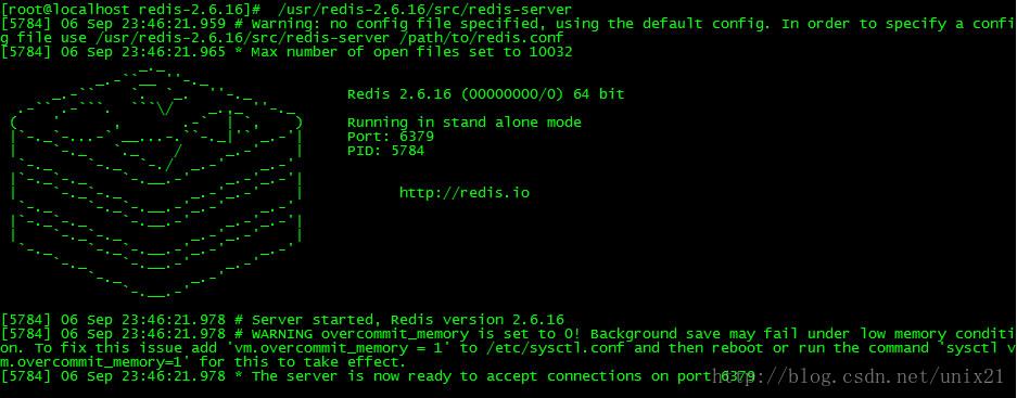
仿照redis写的nginx开机画面
redis有一个开机画面: 下面是我写的的nginx开机画面: 新建一个文件 asciilogo.h //仿照redis风格打印一个logo,这样启动的时候就不会不注意 char *ascii_logo " …
房子成焦点,被挂马的房产网站仍在增加中
统计发现,近期大部分使用极光漏洞挂马,这个漏洞实在是太好用了。没打补丁,没装网盾,按网马广告上说的,有不弹、不卡、不闪三大“优点”,点击挂马网页会中招。今天新增被挂马的知名房产网站列表(…
检测、量化、追踪新冠病毒,基于深度学习的自动CT图像分析有多靠谱?
作者 | Ophir Gozes, Maayan Frid-Adar等译者 | 刘畅出品 | AI科技大本营(ID:rgznai100)背景:新冠病毒的传播非常迅速,并对数十亿人的生活产生了重大影响。由于非对称胸部CT已被证明是检测、量化和追踪该疾病的有效工具࿰…
关于产品体验以及产品会被抄袭的思考
一个好产品本来可以以免费让用户注册为开始吸引用户并从而能引导用户进行消费和购买的;但是由于可能考虑到当前这个产品可能会被别人抄袭,从而设定了门槛,然后营销团队进行沟通,和别人说当前的产品是多么多么的好,从而…
Linux socket 网络编程 常用头文件
一 三种类型的套接字:1.流式套接字(SOCKET_STREAM)提供面向连接的可靠的数据传输服务。数据被看作是字节流,无长度限制。例如FTP协议就采用这种。2.数据报式套接字(SOCKET_DGRAM)提供无连接的数据传输服务,…

达摩院实现自动驾驶核心技术突破,达摩院首次实现3D物体检测精度与速度的兼得
阿里巴巴达摩院在自动驾驶3D物体检测领域取得了新突破!达摩院近期一篇论文入选计算机视觉顶会CVPR 2020,该论文提出了一个通用、高性能的自动驾驶检测器,首次实现3D物体检测精度与速度的兼得,有效提升自动驾驶系统安全性能。目前&…
$httpprovider指令中拦截器interceptors的使用介绍
2019独角兽企业重金招聘Python工程师标准>>> $http服务允许我们使用http请求和后台做通信,但是在每一次放松请求之前我们都希望能够捕捉这个请求并且进行操作,比如之前富瑞中每一个请求中header要放入用户名和密码一样,富瑞的做法…
bzero, memset ,setmem 区别
bzero 原型:extern void bzero(void *s, int n);用法:#include <string.h> 功能:置字节字符串s的前n个字节为零。 说明:bzero无返回值。 举例: // bzero.c #include <sysl…