几行代码完成动态图表绘制 | Python实战
作者 | 小F
来源 | 法纳斯特
头图 | CSDN下载自视觉中国
关于动态条形图,小F以前推荐过「Bar Chart Race」这个库。三行代码就能实现动态条形图的绘制。
有些同学在使用的时候,会出现一些错误。一个是加载文件报错,另一个是生成GIF的时候报错。
这是因为作者的示例是网络加载数据,会读取不到。通过读取本地文件,就不会出错。
GIF生成失败一般是需要安装imagemagick(图片处理工具)。
最近小F又发现一个可视化图库「Pandas_Alive」,不仅包含动态条形图,还可以绘制动态曲线图、气泡图、饼状图、地图等。
同样也是几行代码就能完成动态图表的绘制。
安装版本建议是0.2.3,matplotlib版本是3.2.1。
同时需自行安装tqdm(显示进度条)和descartes(绘制地图相关库)。
要不然会出现报错,估计是作者的requestment.txt没包含这两个库。
好了,成功安装后就可以引入这个第三方库,直接选择加载本地文件。
import pandas_aliveimport pandas as pdcovid_df = pd.read_csv('data/covid19.csv', index_col=0, parse_dates=[0])covid_df.plot_animated(filename='examples/example-barh-chart.gif', n_visible=15)
生成了一个GIF图,具体如下。
刚开始学习这个库的时候,大家可以减少数据,这样生成GIF的时间就会快一些。
比如小F在接下来的实践中,基本都只选取了20天左右的数据。
对于其他图表,我们可以查看官方文档的API说明,得以了解。
下面我们就来看看其他动态图表的绘制方法吧!
动态条形图
elec_df = pd.read_csv("data/Aus_Elec_Gen_1980_2018.csv", index_col=0, parse_dates=[0], thousands=',')elec_df = elec_df.iloc[:20, :]elec_df.fillna(0).plot_animated('examples/example-electricity-generated-australia.gif', period_fmt="%Y", title='Australian Electricity Generation Sources 1980-2018')动态柱状图
covid_df = pd.read_csv('data/covid19.csv', index_col=0, parse_dates=[0])covid_df.plot_animated(filename='examples/example-barv-chart.gif', orientation='v', n_visible=15)动态曲线图
covid_df = pd.read_csv('data/covid19.csv', index_col=0, parse_dates=[0])covid_df.diff().fillna(0).plot_animated(filename='examples/example-line-chart.gif', kind='line', period_label={'x': 0.25, 'y': 0.9})
动态面积图
covid_df = pd.read_csv('data/covid19.csv', index_col=0, parse_dates=[0])covid_df.sum(axis=1).fillna(0).plot_animated(filename='examples/example-bar-chart.gif', kind='bar', period_label={'x': 0.1, 'y': 0.9}, enable_progress_bar=True, steps_per_period=2, interpolate_period=True, period_length=200)
动态散点图
max_temp_df = pd.read_csv("data/Newcastle_Australia_Max_Temps.csv",    parse_dates={"Timestamp": ["Year", "Month", "Day"]},)min_temp_df = pd.read_csv("data/Newcastle_Australia_Min_Temps.csv",    parse_dates={"Timestamp": ["Year", "Month", "Day"]},)
max_temp_df = max_temp_df.iloc[:5000, :]min_temp_df = min_temp_df.iloc[:5000, :]
merged_temp_df = pd.merge_asof(max_temp_df, min_temp_df, on="Timestamp")merged_temp_df.index = pd.to_datetime(merged_temp_df["Timestamp"].dt.strftime('%Y/%m/%d'))
keep_columns = ["Minimum temperature (Degree C)", "Maximum temperature (Degree C)"]merged_temp_df[keep_columns].resample("Y").mean().plot_animated(filename='examples/example-scatter-chart.gif', kind="scatter",                                                                title='Max & Min Temperature Newcastle, Australia')
动态饼状图
covid_df = pd.read_csv('data/covid19.csv', index_col=0, parse_dates=[0])covid_df.plot_animated(filename='examples/example-pie-chart.gif', kind="pie", rotatelabels=True, period_label={'x': 0, 'y': 0})
动态气泡图
multi_index_df = pd.read_csv("data/multi.csv", header=[0, 1], index_col=0)multi_index_df.index = pd.to_datetime(multi_index_df.index, dayfirst=True)
map_chart = multi_index_df.plot_animated(    kind="bubble",    filename="examples/example-bubble-chart.gif",    x_data_label="Longitude",    y_data_label="Latitude",    size_data_label="Cases",    color_data_label="Cases",    vmax=5, steps_per_period=3, interpolate_period=True, period_length=500,    dpi=100)
地理空间点图表
import geopandasimport pandas_aliveimport contextily
gdf = geopandas.read_file('data/nsw-covid19-cases-by-postcode.gpkg')gdf.index = gdf.postcodegdf = gdf.drop('postcode',axis=1)
result = gdf.iloc[:, :20]result['geometry'] = gdf.iloc[:, -1:]['geometry']
map_chart = result.plot_animated(filename='examples/example-geo-point-chart.gif',                                 basemap_format={'source':contextily.providers.Stamen.Terrain})
多边形地理图表
import geopandasimport pandas_aliveimport contextily
gdf = geopandas.read_file('data/italy-covid-region.gpkg')gdf.index = gdf.regiongdf = gdf.drop('region',axis=1)
result = gdf.iloc[:, :20]result['geometry'] = gdf.iloc[:, -1:]['geometry']
map_chart = result.plot_animated(filename='examples/example-geo-polygon-chart.gif',                                 basemap_format={'source': contextily.providers.Stamen.Terrain})
多个动态图表
covid_df = pd.read_csv('data/covid19.csv', index_col=0, parse_dates=[0])
animated_line_chart = covid_df.diff().fillna(0).plot_animated(kind='line', period_label=False,add_legend=False)animated_bar_chart = covid_df.plot_animated(n_visible=10)
pandas_alive.animate_multiple_plots('examples/example-bar-and-line-chart.gif',                                    [animated_bar_chart, animated_line_chart], enable_progress_bar=True)
城市人口
def population(): urban_df = pd.read_csv("data/urban_pop.csv", index_col=0, parse_dates=[0])animated_line_chart = ( urban_df.sum(axis=1) .pct_change() .fillna(method='bfill') .mul(100) .plot_animated(kind="line", title="Total % Change in Population", period_label=False, add_legend=False) )animated_bar_chart = urban_df.plot_animated(n_visible=10, title='Top 10 Populous Countries', period_fmt="%Y")pandas_alive.animate_multiple_plots('examples/example-bar-and-line-urban-chart.gif', [animated_bar_chart, animated_line_chart], title='Urban Population 1977 - 2018', adjust_subplot_top=0.85, enable_progress_bar=True)
G7国家平均寿命
def life():    data_raw = pd.read_csv("data/long.csv")list_G7 = ["Canada","France","Germany","Italy","Japan","United Kingdom","United States",    ]data_raw = data_raw.pivot(        index="Year", columns="Entity", values="Life expectancy (Gapminder, UN)"    )
data = pd.DataFrame()data["Year"] = data_raw.reset_index()["Year"]for country in list_G7:data[country] = data_raw[country].values
data = data.fillna(method="pad")data = data.fillna(0)data = data.set_index("Year").loc[1900:].reset_index()
data["Year"] = pd.to_datetime(data.reset_index()["Year"].astype(str))
data = data.set_index("Year")data = data.iloc[:25, :]animated_bar_chart = data.plot_animated(        period_fmt="%Y", perpendicular_bar_func="mean", period_length=200, fixed_max=True    )animated_line_chart = data.plot_animated(        kind="line", period_fmt="%Y", period_length=200, fixed_max=True    )pandas_alive.animate_multiple_plots("examples/life-expectancy.gif",        plots=[animated_bar_chart, animated_line_chart],        title="Life expectancy in G7 countries up to 2015",        adjust_subplot_left=0.2, adjust_subplot_top=0.9, enable_progress_bar=True    )
新南威尔斯州COVID可视化
def nsw():import geopandasimport pandas as pdimport pandas_aliveimport contextilyimport matplotlib.pyplot as pltimport json
with open('data/package_show.json', 'r', encoding='utf8')as fp:        data = json.load(fp)
# Extract url to csv component    covid_nsw_data_url = data["result"]["resources"][0]["url"]    print(covid_nsw_data_url)
# Read csv from data API url    nsw_covid = pd.read_csv('data/confirmed_cases_table1_location.csv')    postcode_dataset = pd.read_csv("data/postcode-data.csv")
# Prepare data from NSW health datasetnsw_covid = nsw_covid.fillna(9999)    nsw_covid["postcode"] = nsw_covid["postcode"].astype(int)grouped_df = nsw_covid.groupby(["notification_date", "postcode"]).size()    grouped_df = pd.DataFrame(grouped_df).unstack()    grouped_df.columns = grouped_df.columns.droplevel().astype(str)grouped_df = grouped_df.fillna(0)    grouped_df.index = pd.to_datetime(grouped_df.index)cases_df = grouped_df
# Clean data in postcode dataset prior to matchinggrouped_df = grouped_df.T    postcode_dataset = postcode_dataset[postcode_dataset['Longitude'].notna()]    postcode_dataset = postcode_dataset[postcode_dataset['Longitude'] != 0]    postcode_dataset = postcode_dataset[postcode_dataset['Latitude'].notna()]    postcode_dataset = postcode_dataset[postcode_dataset['Latitude'] != 0]    postcode_dataset['Postcode'] = postcode_dataset['Postcode'].astype(str)
# Build GeoDataFrame from Lat Long dataset and make map chart    grouped_df['Longitude'] = grouped_df.index.map(postcode_dataset.set_index('Postcode')['Longitude'].to_dict())    grouped_df['Latitude'] = grouped_df.index.map(postcode_dataset.set_index('Postcode')['Latitude'].to_dict())    gdf = geopandas.GeoDataFrame(        grouped_df, geometry=geopandas.points_from_xy(grouped_df.Longitude, grouped_df.Latitude), crs="EPSG:4326")    gdf = gdf.dropna()
# Prepare GeoDataFrame for writing to geopackage    gdf = gdf.drop(['Longitude', 'Latitude'], axis=1)    gdf.columns = gdf.columns.astype(str)    gdf['postcode'] = gdf.index# gdf.to_file("data/nsw-covid19-cases-by-postcode.gpkg", layer='nsw-postcode-covid', driver="GPKG")
# Prepare GeoDataFrame for plotting    gdf.index = gdf.postcode    gdf = gdf.drop('postcode', axis=1)    gdf = gdf.to_crs("EPSG:3857")  # Web Mercatorresult = gdf.iloc[:, :22]    result['geometry'] = gdf.iloc[:, -1:]['geometry']    gdf = resultmap_chart = gdf.plot_animated(basemap_format={'source': contextily.providers.Stamen.Terrain}, cmap='cool')
# cases_df.to_csv('data/nsw-covid-cases-by-postcode.csv')    cases_df = cases_df.iloc[:22, :]
from datetime import datetimebar_chart = cases_df.sum(axis=1).plot_animated(        kind='line',        label_events={'Ruby Princess Disembark': datetime.strptime("19/03/2020", "%d/%m/%Y"),# 'Lockdown': datetime.strptime("31/03/2020", "%d/%m/%Y")        },        fill_under_line_color="blue",        add_legend=False    )map_chart.ax.set_title('Cases by Location')grouped_df = pd.read_csv('data/nsw-covid-cases-by-postcode.csv', index_col=0, parse_dates=[0])    grouped_df = grouped_df.iloc[:22, :]line_chart = (        grouped_df.sum(axis=1)            .cumsum()            .fillna(0)            .plot_animated(kind="line", period_label=False, title="Cumulative Total Cases", add_legend=False)    )
def current_total(values):        total = values.sum()        s = f'Total : {int(total)}'return {'x': .85, 'y': .2, 's': s, 'ha': 'right', 'size': 11}race_chart = grouped_df.cumsum().plot_animated(        n_visible=5, title="Cases by Postcode", period_label=False, period_summary_func=current_total    )
import timetimestr = time.strftime("%d/%m/%Y")plots = [bar_chart, line_chart, map_chart, race_chart]
from matplotlib import rcParamsrcParams.update({"figure.autolayout": False})# make sure figures are `Figure()` instances    figs = plt.Figure()    gs = figs.add_gridspec(2, 3, hspace=0.5)    f3_ax1 = figs.add_subplot(gs[0, :])    f3_ax1.set_title(bar_chart.title)    bar_chart.ax = f3_ax1f3_ax2 = figs.add_subplot(gs[1, 0])    f3_ax2.set_title(line_chart.title)    line_chart.ax = f3_ax2f3_ax3 = figs.add_subplot(gs[1, 1])    f3_ax3.set_title(map_chart.title)    map_chart.ax = f3_ax3f3_ax4 = figs.add_subplot(gs[1, 2])    f3_ax4.set_title(race_chart.title)    race_chart.ax = f3_ax4timestr = cases_df.index.max().strftime("%d/%m/%Y")    figs.suptitle(f"NSW COVID-19 Confirmed Cases up to {timestr}")pandas_alive.animate_multiple_plots('examples/nsw-covid.gif',        plots,        figs,        enable_progress_bar=True    )
意大利COVID可视化
def italy():import geopandasimport pandas as pdimport pandas_aliveimport contextilyimport matplotlib.pyplot as pltregion_gdf = geopandas.read_file('data/geo-data/italy-with-regions')    region_gdf.NOME_REG = region_gdf.NOME_REG.str.lower().str.title()    region_gdf = region_gdf.replace('Trentino-Alto Adige/Sudtirol', 'Trentino-Alto Adige')    region_gdf = region_gdf.replace("Valle D'Aosta/Vallée D'Aoste\r\nValle D'Aosta/Vallée D'Aoste", "Valle d'Aosta")italy_df = pd.read_csv('data/Regional Data - Sheet1.csv', index_col=0, header=1, parse_dates=[0])italy_df = italy_df[italy_df['Region'] != 'NA']cases_df = italy_df.iloc[:, :3]    cases_df['Date'] = cases_df.index    pivoted = cases_df.pivot(values='New positives', index='Date', columns='Region')    pivoted.columns = pivoted.columns.astype(str)    pivoted = pivoted.rename(columns={'nan': 'Unknown Region'})cases_gdf = pivoted.T    cases_gdf['geometry'] = cases_gdf.index.map(region_gdf.set_index('NOME_REG')['geometry'].to_dict())cases_gdf = cases_gdf[cases_gdf['geometry'].notna()]cases_gdf = geopandas.GeoDataFrame(cases_gdf, crs=region_gdf.crs, geometry=cases_gdf.geometry)gdf = cases_gdfresult = gdf.iloc[:, :22]    result['geometry'] = gdf.iloc[:, -1:]['geometry']    gdf = resultmap_chart = gdf.plot_animated(basemap_format={'source': contextily.providers.Stamen.Terrain}, cmap='viridis')cases_df = pivoted    cases_df = cases_df.iloc[:22, :]
from datetime import datetimebar_chart = cases_df.sum(axis=1).plot_animated(        kind='line',        label_events={'Schools Close': datetime.strptime("4/03/2020", "%d/%m/%Y"),'Phase I Lockdown': datetime.strptime("11/03/2020", "%d/%m/%Y"),# '1M Global Cases': datetime.strptime("02/04/2020", "%d/%m/%Y"),# '100k Global Deaths': datetime.strptime("10/04/2020", "%d/%m/%Y"),# 'Manufacturing Reopens': datetime.strptime("26/04/2020", "%d/%m/%Y"),# 'Phase II Lockdown': datetime.strptime("4/05/2020", "%d/%m/%Y"),        },        fill_under_line_color="blue",        add_legend=False    )map_chart.ax.set_title('Cases by Location')line_chart = (        cases_df.sum(axis=1)            .cumsum()            .fillna(0)            .plot_animated(kind="line", period_label=False, title="Cumulative Total Cases", add_legend=False)    )
def current_total(values):        total = values.sum()        s = f'Total : {int(total)}'return {'x': .85, 'y': .1, 's': s, 'ha': 'right', 'size': 11}race_chart = cases_df.cumsum().plot_animated(        n_visible=5, title="Cases by Region", period_label=False, period_summary_func=current_total    )
import timetimestr = time.strftime("%d/%m/%Y")plots = [bar_chart, race_chart, map_chart, line_chart]
# Otherwise titles overlap and adjust_subplot does nothingfrom matplotlib import rcParamsfrom matplotlib.animation import FuncAnimationrcParams.update({"figure.autolayout": False})# make sure figures are `Figure()` instances    figs = plt.Figure()    gs = figs.add_gridspec(2, 3, hspace=0.5)    f3_ax1 = figs.add_subplot(gs[0, :])    f3_ax1.set_title(bar_chart.title)    bar_chart.ax = f3_ax1f3_ax2 = figs.add_subplot(gs[1, 0])    f3_ax2.set_title(race_chart.title)    race_chart.ax = f3_ax2f3_ax3 = figs.add_subplot(gs[1, 1])    f3_ax3.set_title(map_chart.title)    map_chart.ax = f3_ax3f3_ax4 = figs.add_subplot(gs[1, 2])    f3_ax4.set_title(line_chart.title)    line_chart.ax = f3_ax4axes = [f3_ax1, f3_ax2, f3_ax3, f3_ax4]    timestr = cases_df.index.max().strftime("%d/%m/%Y")    figs.suptitle(f"Italy COVID-19 Confirmed Cases up to {timestr}")pandas_alive.animate_multiple_plots('examples/italy-covid.gif',        plots,        figs,        enable_progress_bar=True    )
单摆运动
def simple():import pandas as pdimport matplotlib.pyplot as pltimport pandas_aliveimport numpy as np
# Physical constants    g = 9.81    L = .4    mu = 0.2THETA_0 = np.pi * 70 / 180  # init angle = 70degs    THETA_DOT_0 = 0  # no init angVel    DELTA_T = 0.01  # time stepping    T = 1.5  # time period
# Definition of ODE (ordinary differential equation)def get_theta_double_dot(theta, theta_dot):return -mu * theta_dot - (g / L) * np.sin(theta)
# Solution to the differential equationdef pendulum(t):# initialise changing values        theta = THETA_0        theta_dot = THETA_DOT_0        delta_t = DELTA_T        ang = []        ang_vel = []        ang_acc = []        times = []for time in np.arange(0, t, delta_t):            theta_double_dot = get_theta_double_dot(                theta, theta_dot            )            theta += theta_dot * delta_t            theta_dot += theta_double_dot * delta_t            times.append(time)            ang.append(theta)            ang_vel.append(theta_dot)            ang_acc.append(theta_double_dot)        data = np.array([ang, ang_vel, ang_acc])return pd.DataFrame(data=data.T, index=np.array(times), columns=["angle", "ang_vel", "ang_acc"])
# units used for ref: ["angle [rad]", "ang_vel [rad/s]", "ang_acc [rad/s^2]"]    df = pendulum(T)    df.index.names = ["Time (s)"]    print(df)
# generate dataFrame for animated bubble plot    df2 = pd.DataFrame(index=df.index)    df2["dx (m)"] = L * np.sin(df["angle"])    df2["dy (m)"] = -L * np.cos(df["angle"])    df2["ang_vel"] = abs(df["ang_vel"])    df2["size"] = df2["ang_vel"] * 100  # scale angular vels to get nice size on bubble plot    print(df2)
# static pandas plots## print(plt.style.available)# NOTE: 2 lines below required in Jupyter to switch styles correctly    plt.rcParams.update(plt.rcParamsDefault)    plt.style.use("ggplot")  # set plot stylefig, (ax1a, ax2b) = plt.subplots(1, 2, figsize=(8, 4), dpi=100)  # 1 row, 2 subplots# fig.subplots_adjust(wspace=0.1)      # space subplots in row    fig.set_tight_layout(True)    fontsize = "small"df.plot(ax=ax1a).legend(fontsize=fontsize)    ax1a.set_title("Outputs vs Time", fontsize="medium")    ax1a.set_xlabel('Time [s]', fontsize=fontsize)    ax1a.set_ylabel('Amplitudes', fontsize=fontsize);df.plot(ax=ax2b, x="angle", y=["ang_vel", "ang_acc"]).legend(fontsize=fontsize)    ax2b.set_title("Outputs vs Angle | Phase-Space", fontsize="medium")    ax2b.set_xlabel('Angle [rad]', fontsize=fontsize)    ax2b.set_ylabel('Angular Velocity / Acc', fontsize=fontsize)
# sample scatter plot with colorbar    fig, ax = plt.subplots()    sc = ax.scatter(df2["dx (m)"], df2["dy (m)"], s=df2["size"] * .1, c=df2["ang_vel"], cmap="jet")    cbar = fig.colorbar(sc)    cbar.set_label(label="ang_vel [rad/s]", fontsize="small")# sc.set_clim(350, 400)    ax.tick_params(labelrotation=0, labelsize="medium")    ax_scale = 1.    ax.set_xlim(-L * ax_scale, L * ax_scale)    ax.set_ylim(-L * ax_scale - 0.1, L * ax_scale - 0.1)# make axes square: a circle shows as a circle    ax.set_aspect(1 / ax.get_data_ratio())    ax.arrow(0, 0, df2["dx (m)"].iloc[-1], df2["dy (m)"].iloc[-1],             color="dimgray", ls=":", lw=2.5, width=.0, head_width=0, zorder=-1             )    ax.text(0, 0.15, s="size and colour of pendulum bob\nbased on pd column\nfor angular velocity",            ha='center', va='center')
# plt.show()dpi = 100    ax_scale = 1.1    figsize = (3, 3)    fontsize = "small"
# set up figure to pass onto `pandas_alive`# NOTE: by using Figure (capital F) instead of figure() `FuncAnimation` seems to run twice as fast!# fig1, ax1 = plt.subplots()    fig1 = plt.Figure()    ax1 = fig1.add_subplot()    fig1.set_size_inches(figsize)    ax1.set_title("Simple pendulum animation, L=" + str(L) + "m", fontsize="medium")    ax1.set_xlabel("Time (s)", color='dimgray', fontsize=fontsize)    ax1.set_ylabel("Amplitudes", color='dimgray', fontsize=fontsize)    ax1.tick_params(labelsize=fontsize)
# pandas_alive    line_chart = df.plot_animated(filename="pend-line.gif", kind='line', period_label={'x': 0.05, 'y': 0.9},                                  steps_per_period=1, interpolate_period=False, period_length=50,                                  period_fmt='Time:{x:10.2f}',                                  enable_progress_bar=True, fixed_max=True, dpi=100, fig=fig1                                  )    plt.close()
# Video('examples/pend-line.mp4', html_attributes="controls muted autoplay")
# set up and generate animated scatter plot#
# set up figure to pass onto `pandas_alive`# NOTE: by using Figure (capital F) instead of figure() `FuncAnimation` seems to run twice as fast!    fig1sc = plt.Figure()    ax1sc = fig1sc.add_subplot()    fig1sc.set_size_inches(figsize)    ax1sc.set_title("Simple pendulum animation, L=" + str(L) + "m", fontsize="medium")    ax1sc.set_xlabel("Time (s)", color='dimgray', fontsize=fontsize)    ax1sc.set_ylabel("Amplitudes", color='dimgray', fontsize=fontsize)    ax1sc.tick_params(labelsize=fontsize)
# pandas_alive    scatter_chart = df.plot_animated(filename="pend-scatter.gif", kind='scatter', period_label={'x': 0.05, 'y': 0.9},                                     steps_per_period=1, interpolate_period=False, period_length=50,                                     period_fmt='Time:{x:10.2f}',                                     enable_progress_bar=True, fixed_max=True, dpi=100, fig=fig1sc, size="ang_vel"                                     )    plt.close()print("Points size follows one of the pd columns: ang_vel")# Video('./pend-scatter.gif', html_attributes="controls muted autoplay")
# set up and generate animated bar race chart## set up figure to pass onto `pandas_alive`# NOTE: by using Figure (capital F) instead of figure() `FuncAnimation` seems to run twice as fast!    fig2 = plt.Figure()    ax2 = fig2.add_subplot()    fig2.set_size_inches(figsize)    ax2.set_title("Simple pendulum animation, L=" + str(L) + "m", fontsize="medium")    ax2.set_xlabel("Amplitudes", color='dimgray', fontsize=fontsize)    ax2.set_ylabel("", color='dimgray', fontsize="x-small")    ax2.tick_params(labelsize=fontsize)
# pandas_alive    race_chart = df.plot_animated(filename="pend-race.gif", kind='race', period_label={'x': 0.05, 'y': 0.9},                                  steps_per_period=1, interpolate_period=False, period_length=50,                                  period_fmt='Time:{x:10.2f}',                                  enable_progress_bar=True, fixed_max=False, dpi=100, fig=fig2                                  )    plt.close()
# set up and generate bubble animated plot#
# set up figure to pass onto `pandas_alive`# NOTE: by using Figure (capital F) instead of figure() `FuncAnimation` seems to run twice as fast!    fig3 = plt.Figure()    ax3 = fig3.add_subplot()    fig3.set_size_inches(figsize)    ax3.set_title("Simple pendulum animation, L=" + str(L) + "m", fontsize="medium")    ax3.set_xlabel("Hor Displacement (m)", color='dimgray', fontsize=fontsize)    ax3.set_ylabel("Ver Displacement (m)", color='dimgray', fontsize=fontsize)# limits & ratio below get the graph square    ax3.set_xlim(-L * ax_scale, L * ax_scale)    ax3.set_ylim(-L * ax_scale - 0.1, L * ax_scale - 0.1)    ratio = 1.  # this is visual ratio of axes    ax3.set_aspect(ratio / ax3.get_data_ratio())ax3.arrow(0, 0, df2["dx (m)"].iloc[-1], df2["dy (m)"].iloc[-1],              color="dimgray", ls=":", lw=1, width=.0, head_width=0, zorder=-1)
# pandas_alive    bubble_chart = df2.plot_animated(        kind="bubble", filename="pend-bubble.gif",        x_data_label="dx (m)", y_data_label="dy (m)",        size_data_label="size", color_data_label="ang_vel", cmap="jet",        period_label={'x': 0.05, 'y': 0.9}, vmin=None, vmax=None,        steps_per_period=1, interpolate_period=False, period_length=50, period_fmt='Time:{x:10.2f}s',        enable_progress_bar=True, fixed_max=False, dpi=dpi, fig=fig3    )    plt.close()print("Bubble size & colour animates with pd data column for ang_vel.")
# Combined plots#    fontsize = "x-small"# Otherwise titles overlap and subplots_adjust does nothingfrom matplotlib import rcParams    rcParams.update({"figure.autolayout": False})figs = plt.Figure(figsize=(9, 4), dpi=100)    figs.subplots_adjust(wspace=0.1)    gs = figs.add_gridspec(2, 2)ax1 = figs.add_subplot(gs[0, 0])    ax1.set_xlabel("Time(s)", color='dimgray', fontsize=fontsize)    ax1.set_ylabel("Amplitudes", color='dimgray', fontsize=fontsize)    ax1.tick_params(labelsize=fontsize)ax2 = figs.add_subplot(gs[1, 0])    ax2.set_xlabel("Amplitudes", color='dimgray', fontsize=fontsize)    ax2.set_ylabel("", color='dimgray', fontsize=fontsize)    ax2.tick_params(labelsize=fontsize)ax3 = figs.add_subplot(gs[:, 1])    ax3.set_xlabel("Hor Displacement (m)", color='dimgray', fontsize=fontsize)    ax3.set_ylabel("Ver Displacement (m)", color='dimgray', fontsize=fontsize)    ax3.tick_params(labelsize=fontsize)# limits & ratio below get the graph square    ax3.set_xlim(-L * ax_scale, L * ax_scale)    ax3.set_ylim(-L * ax_scale - 0.1, L * ax_scale - 0.1)    ratio = 1.  # this is visual ratio of axes    ax3.set_aspect(ratio / ax3.get_data_ratio())line_chart.ax = ax1    race_chart.ax = ax2    bubble_chart.ax = ax3plots = [line_chart, race_chart, bubble_chart]# pandas_alive combined using custom figure    pandas_alive.animate_multiple_plots(        filename='pend-combined.gif', plots=plots, custom_fig=figs, dpi=100, enable_progress_bar=True,        adjust_subplot_left=0.2, adjust_subplot_right=None,        title="Simple pendulum animations, L=" + str(L) + "m", title_fontsize="medium"    )    plt.close()
最后如果你想完成中文动态图表的制作,加入中文显示代码即可。
# 中文显示plt.rcParams['font.sans-serif'] = ['SimHei']  # Windowsplt.rcParams['font.sans-serif'] = ['Hiragino Sans GB'] # Macplt.rcParams['axes.unicode_minus'] = False
# 读取数据df_result = pd.read_csv('data/yuhuanshui.csv', index_col=0, parse_dates=[0])# 生成图表animated_line_chart = df_result.diff().fillna(0).plot_animated(kind='line', period_label=False, add_legend=False)animated_bar_chart = df_result.plot_animated(n_visible=10)pandas_alive.animate_multiple_plots('examples/yuhuanshui.gif',                                    [animated_bar_chart, animated_line_chart], enable_progress_bar=True,                                    title='我是余欢水演职人员热度排行')
还是使用演员的百度指数数据。
GitHub地址:
https://github.com/JackMcKew/pandas_alive
使用文档:
https://jackmckew.github.io/pandas_alive/
更多精彩推荐虚拟偶像出道,技术「造星」推动下的粉丝经济
GAN模型生成山水画,骗过半数观察者,普林斯顿大学本科生出品
关于动态规划,你想知道的都在这里了!
ONES 收购 Tower,五源资本合伙人对话两位创始人
罗永浩关联直播交易案遭“问停”;中国量子计算原型机“九章”问世;pip 20.3 发布
相关文章:

inline-block元素4px空白间隙的解决办法
为什么80%的码农都做不了架构师?>>> http://www.hujuntao.com/archives/inline-block-elements-the-4px-blank-gap-solution.html 转载于:https://my.oschina.net/i33/blog/124448

Ubuntn删除软件
删除dpkg -r 软件清除dpkg -P 软件也可以用sudo apt-get remove 软件 这种方式移除这种方式install的

对象Equals相等性比较的通用实现
对象Equals相等性比较的通用实现 最近编码的过程中,使用了对象本地内存缓存,缓存用了Dictionary<string,object>, ConcurrentDictionary<string,oject>,还可以是MemoryCache(底层基于Hashtable)。使用缓存,肯定要处理数据变化缓存…
Android:ViewPager为页卡内视图组件添加事件
在数据适配器PagerAdapter的初始化方法中添加按钮事件,这里是关键,首先判断当前的页卡编号。必须使用当前的view来获取按钮。 Overridepublic Object instantiateItem(View arg0, int arg1) {if (arg1 < 3) {((ViewPager) arg0).addView(mListViews.g…
解析C语言中的sizeof
一、sizeof的概念 sizeof是C语言的一种单目操作符,如C语言的其他操作符、--等。它并不是函数。sizeof操作符以字节形式给出了其操作数的存储大小。操作数可以是一个表达式或括在括号内的类型名。操作数的存储大小由操作数的类型决定。 二、sizeof的使用方法 1、用于…

开源大咖齐聚2020启智开发者大会,共探深度学习技术未来趋势
2020年12月2日,“OpenI/O 2020启智开发者大会”在北京国家会议中心召开。大会以“启智筑梦 开源先行”为主题,立足于国际国内开源大环境和发展趋势。开源领域顶尖专家学者和企业领军人物共聚一堂,探讨开源开放呈现出的新形势、新格局、新机…
linux中编译C语言程序
1.首先安装gcc编辑器 yum install gcc* -y 2.编写C语言程序 [roottest ~]# vim aa.c #include<stdio.h> int main( ) {int a;printf("请输入一个三位数的整数:");scanf("%d",&a);if(a>100&&a<1000)printf("百位是:…
typedef的四个用途和两大陷阱
typedef的四个用途和两个陷阱 -------------------…
升级版APDrawing,人脸照秒变线条肖像画,细节呈现惊人
作者 | 高卫华出品 | AI科技大本营随着深度学习的发展,GAN模型在图像风格转换的应用越来越多,其中不少都实现了很好的效果。此前,reddit上的一个技术博主AtreveteTeTe基于GAN模型混合将普通的人像照片卡通化,并通过First Order Mo…
error LNK1112: module machine type 'X86' conflicts with target machine type 'x64'
1 这个error是什么原因造成的 cmake默认选择的是x86,即32位的生成子。 2 怎么解决这个error 在cmake ..的时候,在后面加上“-G "Visual Studio 12 2013 Win64"”选项即可。 3 怎么在CMakeLists.txt中进行相应的设置来解决这个问题 这个还未知。…
Linux的epoll
在linux的网络编程中,很长的时间都在使用select来做事件触发。在linux新的内核中,有了一种替换它的机制,就是epoll。 相比于select,epoll最大的好处在于它不会随着监听fd数目的增长而降低效率。因为在内核中的select实现中&#x…
[QA]Python字节码优化问题
这篇文章来自在Segmentfault 上面我提出的一个问题 问题背景: Python在执行的时候会加载每一个模块的PyCodeObject,其中这个对象就包含有opcode,也就是这个模块所有的指令集合,具体定义在源码目录的 /include/opcode.h 中定义了所有的指令集合࿰…
【滴滴专场】深度学习模型优化技术揭秘
滴滴拥有海量数据以及 AI 推理需求,GPU 在人脸识别、自动驾驶、地图导航等场景大量使用,滴滴云IFX团队针对斯坦福 DAWNBench 榜单的 ImageNet 模型也进行了深入优化,在 NVIDIA T4 上达到了 0.382 ms 的 Inference Latency 性能,打…
11.python并发入门(part9 多进程模块multiprocessing基本用法)
一、回顾多继承的概念。由于GIL(全局解释器锁)的存在,在python中无法实现真正的多线程(一个进程里的多个线程无法在cpu上并行执行),如果想充分的利用cpu的资源,在python中需要使用进程。二、mul…

将不确定变为确定~Flag特性的枚举是否可以得到Description信息
回到目录 之前我写过对于普通枚举类型对象,输出Description特性信息的方法,今天主要来说一下,如何实现位域Flags枚举元素的Description信息的方法。 对于一个普通枚举对象,它输出描述信息是这样的 public enum Status{[Descriptio…
中科大“九章”历史性突破,但实现真正的量子霸权还有多远?
作者 | 马超 出品 | AI科技大本营 头图 | CSDN下载自视觉中国 10月中旬,政府高层强调要充分认识推动量子科技发展的重要性和紧迫性,加强量子科技发展战略谋划和系统布局,把握大趋势,下好先手棋。 今天,我国的量子科技领…
php析构函数的用法
简单的说,析构函数是用来在对象关闭时完成的特殊工作,比如我写的上例,在实例化同时打开某文件,但是它什么时候关闭呢,用完就关闭呗,所以析构函数直接关闭它, 又或者在析构时,我们将处理好的某些数据一并写进数据库,这时可以考虑使用析构函数内完成,在析构完成前,这些对象属性仍…

泛型中? super T和? extends T的区别
经常发现有List<? super T>、Set<? extends T>的声明,是什么意思呢?<? super T>表示包括T在内的任何T的父类,<? extends T>表示包括T在内的任何T的子类,下面我们详细分析一下两种通配符具体的区别。 …

两大AI技术集于一身,有道词典笔3从0到1的飞跃
作者 | Just 出品 | AI科技大本意(ID:rgznai100) “双十一”结束的钟点刚刚敲响,拥有电子消费品的企业便很快对外界秀了一把今年的销售战绩,网易有道也不例外。在电子词典单品品类榜单上,有道词典笔稳稳拿下天猫和京东…
VIM进阶功能
2019独角兽企业重金招聘Python工程师标准>>> http://www.cnblogs.com/gunl/archive/2011/08/15/2139588.html 该网页上介绍了以下内容: 查找快速移动光标复制、删除、粘贴数字命令组合快速输入字符替换多文件编辑宏替换TABautocmd常用脚本常用配置另一篇…
最简便的清空memcache的方法
如果要清空memcache的items,常用的办法是什么?杀掉重启?如果有n台memcache需要重启怎么办?挨个做一遍? 很简单,假设memcached运行在本地的11211端口,那么跑一下命令行: $ echo ”f…

mongodb启动
将mongodb安装为Windows服务,让该服务随Windows启动而启动: 开启服务: 转载于:https://www.cnblogs.com/dabinglian/p/6861413.html
赠书 | AI 还原宋代皇帝,原来这么帅?!
整理 | 王晓曼来源 | 程序人生 (ID:coder _life)封图 | 大谷视频《人工智能还原的宋代皇帝,原来这么帅?!》*文末有赠书福利昨日,一条“人工智能还原的宋代皇帝”喜提热搜,博主大谷借…
Deep learning:三十六(关于构建深度卷积SAE网络的一点困惑)
前言: 最近一直在思考,如果我使用SCSAE(即stacked convolution sparse autoendoer)算法来训练一个的deep model的话,其网络的第二层开始后续所有网络层的训练数据从哪里来呢?其实如果在这个问题中ÿ…
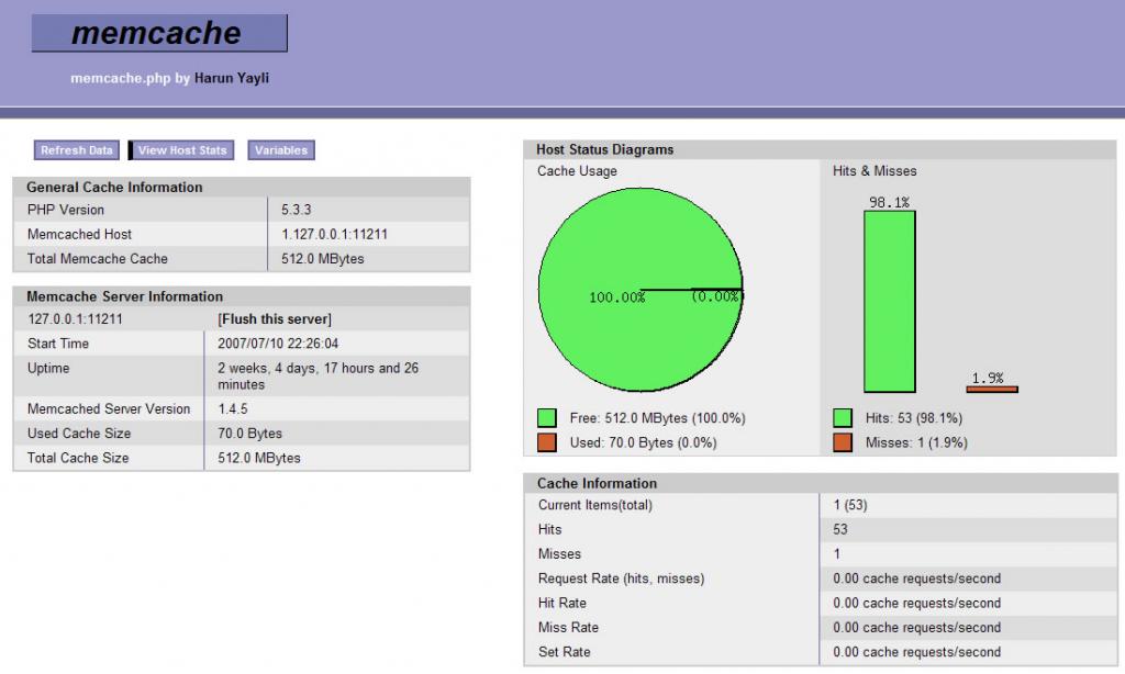
用memcache.php监测memcache的状况
最新的memcache pecl中,新增了一个memcache.php,这个php文件可以用来方便的查看memcache的状况,界面上与apc自带的apc.php风格一致。 如图: 应该算是最方便的监测memcache的办法了。 memcache.php源文件下载 是一个PHP源文件,…

想知道垃圾回收暂停的过程中发生了什么吗?查查垃圾回收日志就知道了!
\关键点\垃圾回收日志中包括着一些关键性能指标; \要做一次正确的垃圾回收分析需要收集许多数据,所以好的工具是非常必要的; \除了垃圾回收之外还有很多事件都可能会让应用程序暂停; \让你的应用程序暂停的事件也会让垃圾回收器暂…

Linux必学的网络操作命令
因为Linux系统是在Internet上起源和发展的,它与生俱来拥有强大的网络功能和丰富的网络应用软件,尤其是TCP/IP网络协议的实现尤为成熟。Linux的网络命令比较多,其中一些命令像ping、ftp、telnet、route、netstat等在其它操作系统上也能看到&am…
丢弃Transformer,FCN也可以实现E2E检测
作者 | 王剑锋来源 | 知乎CVer计算机视觉专栏我们基于FCOS,首次在dense prediction上利用全卷积结构做到E2E,即无NMS后处理。我们首先分析了常见的dense prediction方法(如RetinaNet、FCOS、ATSS等),并且认为one-to-ma…
Linux命令基础--uname
uname 显示系统信息 语 法:uname [-amnrsvpio][--help][--version] 补充说明:uname可显示linux主机所用的操作系统的版本、硬件的名称等基本信息。 参 数: -a或-all 详细输出所有信息,依次为内核名称,主机名&am…
FEC之我见一
顾名思义,FEC前向纠错,根据收到的包进行计算获取丢掉的包,而和大神沟通的结果就是 纠错神髓:收到的媒体包冗余包 > 原始媒体包数据 直到满足 收到的媒体包 冗余包 > 原始媒体包数据 则进入恢复模式,恢复出…