整理了 65 个 Matplotlib 案例,这能不收藏?

作者|周萝卜
来源|萝卜大杂烩
Matplotlib 作为 Python 家族当中最为著名的画图工具,基本的操作还是要掌握的,今天就来分享一波
文章很长,高低要忍一下,如果忍不了,那就收藏吧,总会用到的。
启用和检查交互模式
在 Matplotlib 中绘制折线图
绘制带有标签和图例的多条线的折线图
在 Matplotlib 中绘制带有标记的折线图
改变 Matplotlib 中绘制的图形的大小
在 Matplotlib 中设置轴限制
使用 Python Matplotlib 显示背景网格
使用 Python Matplotlib 将绘图保存到图像文件
将图例放在 plot 的不同位置
绘制具有不同标记大小的线条
用灰度线绘制折线图
以高 dpi 绘制 PDF 输出
绘制不同颜色的多线图
语料库创建词云
使用特定颜色在 Matplotlib Python 中绘制图形
NLTK 词汇色散图
绘制具有不同线条图案的折线图
更新 Matplotlib 折线图中的字体外观
用颜色名称绘制虚线和点状图
以随机坐标绘制所有可用标记
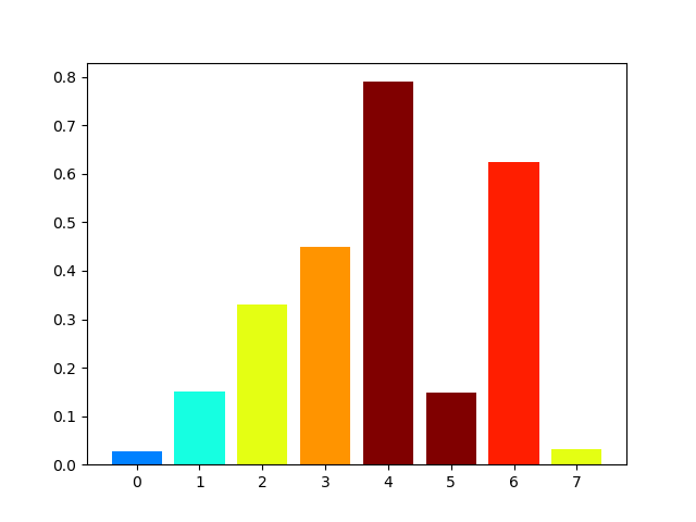
绘制一个非常简单的条形图
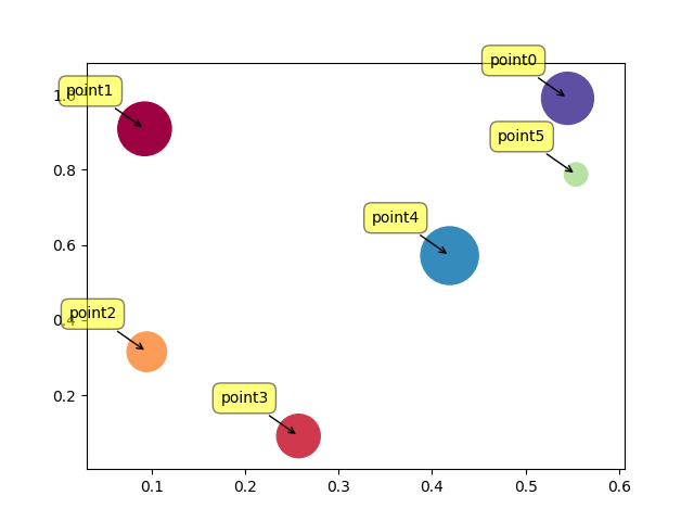
在 X 轴上绘制带有组数据的条形图
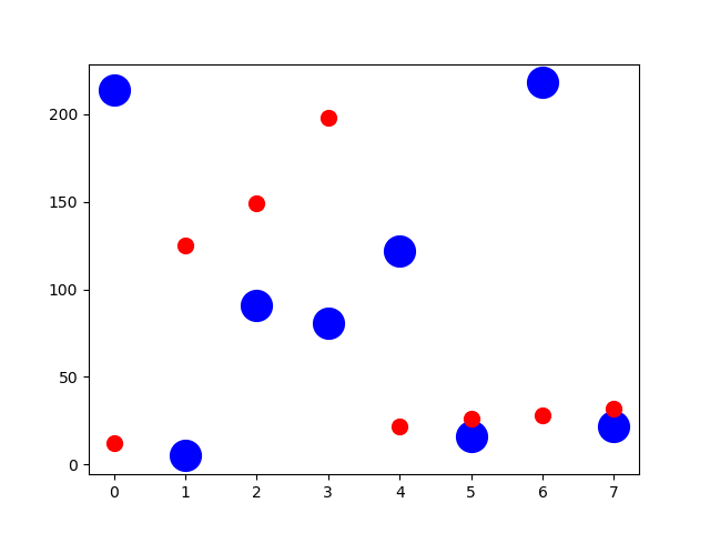
具有不同颜色条形的条形图
使用 Matplotlib 中的特定值改变条形图中每个条的颜色
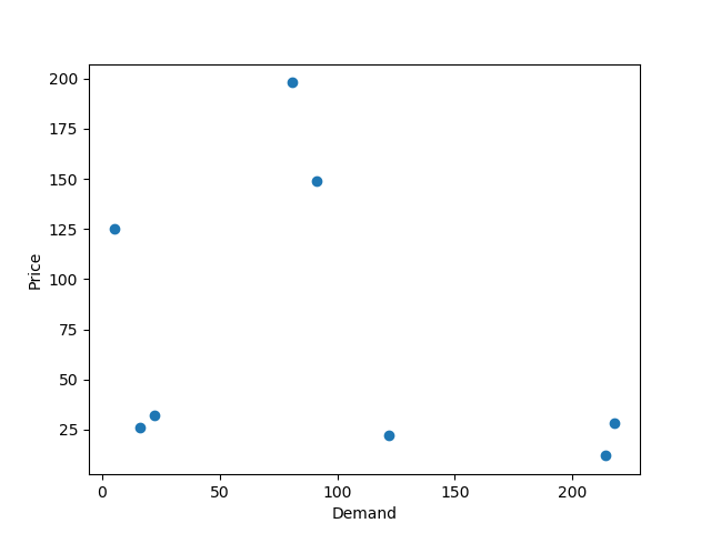
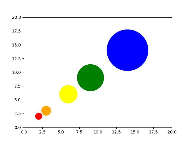
在 Matplotlib 中绘制散点图
使用单个标签绘制散点图
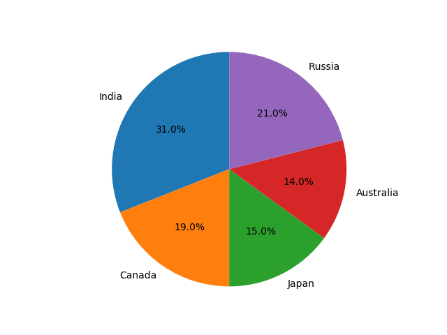
用标记大小绘制散点图
在散点图中调整标记大小和颜色
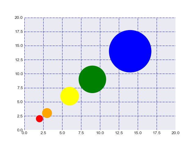
在 Matplotlib 中应用样式表
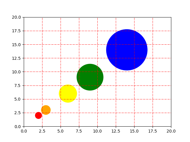
自定义网格颜色和样式
在 Python Matplotlib 中绘制饼图
在 Matplotlib 饼图中为楔形设置边框
在 Python Matplotlib 中设置饼图的方向
在 Matplotlib 中绘制具有不同颜色主题的饼图
在 Python Matplotlib 中打开饼图的轴
具有特定颜色和位置的饼图
在 Matplotlib 中绘制极坐标图
在 Matplotlib 中绘制半极坐标图
Matplotlib 中的极坐标等值线图
绘制直方图
在 Matplotlib 直方图中选择 bins
在 Matplotlib 中绘制没有条形的直方图
使用 Matplotlib 同时绘制两个直方图
绘制具有特定颜色、边缘颜色和线宽的直方图
用颜色图绘制直方图
更改直方图上特定条的颜色
箱线图
箱型图按列数据分组
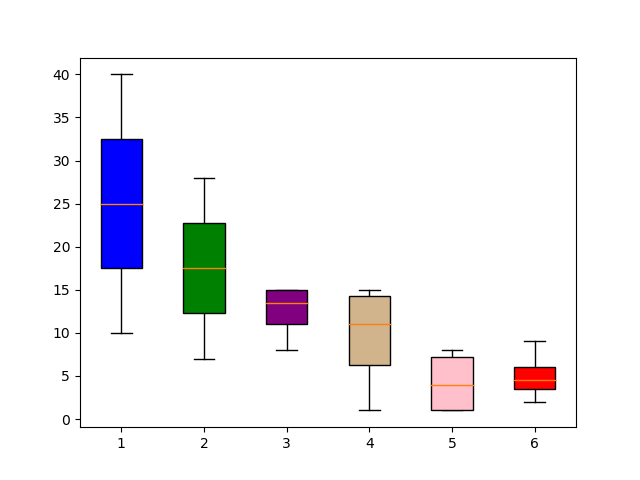
更改箱线图中的箱体颜色
更改 Boxplot 标记样式、标记颜色和标记大小
用数据系列绘制水平箱线图
箱线图调整底部和左侧
使用 Pandas 数据在 Matplotlib 中生成热图
带有中间颜色文本注释的热图
热图显示列和行的标签并以正确的方向显示数据
将 NA cells 与 HeatMap 中的其他 cells 区分开来
在 matplotlib 中创建径向热图
在 Matplotlib 中组合两个热图
使用 Numpy 和 Matplotlib 创建热图日历
在 Python 中创建分类气泡图
使用 Numpy 和 Matplotlib 创建方形气泡图
使用 Numpy 和 Matplotlib 创建具有气泡大小的图例
使用 Matplotlib 堆叠条形图
在同一图中绘制多个堆叠条
Matplotlib 中的水平堆积条形图
1启用和检查交互模式
import matplotlib as mpl
import matplotlib.pyplot as plt# Set the interactive mode to ON
plt.ion()# Check the current status of interactive mode
print(mpl.is_interactive())
Output:
True2在 Matplotlib 中绘制折线图
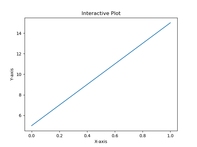
import matplotlib.pyplot as plt#Plot a line graph
plt.plot([5, 15])# Add labels and title
plt.title("Interactive Plot")
plt.xlabel("X-axis")
plt.ylabel("Y-axis")
plt.show()
Output:
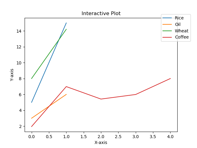
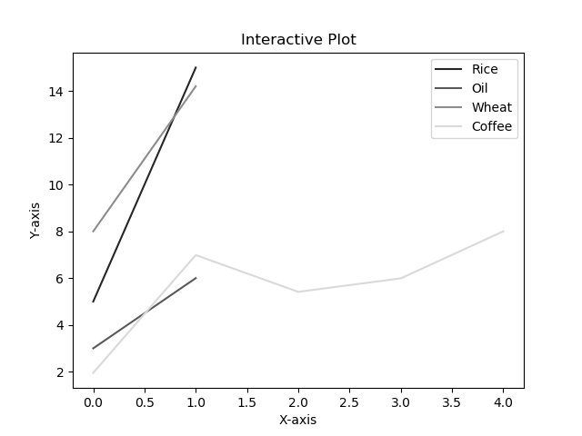
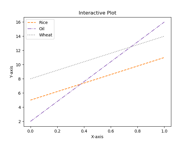
3绘制带有标签和图例的多条线的折线图
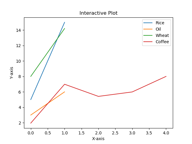
import matplotlib.pyplot as plt#Plot a line graph
plt.plot([5, 15], label='Rice')
plt.plot([3, 6], label='Oil')
plt.plot([8.0010, 14.2], label='Wheat')
plt.plot([1.95412, 6.98547, 5.41411, 5.99, 7.9999], label='Coffee')# Add labels and title
plt.title("Interactive Plot")
plt.xlabel("X-axis")
plt.ylabel("Y-axis")plt.legend()
plt.show()
Output:
4在 Matplotlib 中绘制带有标记的折线图
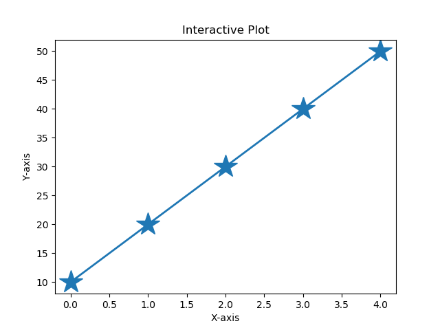
import matplotlib.pyplot as plt# Changing default values for parameters individually
plt.rc('lines', linewidth=2, linestyle='-', marker='*')
plt.rcParams['lines.markersize'] = 25
plt.rcParams['font.size'] = '10.0'#Plot a line graph
plt.plot([10, 20, 30, 40, 50])
# Add labels and title
plt.title("Interactive Plot")
plt.xlabel("X-axis")
plt.ylabel("Y-axis")plt.show()
Output:
5改变 Matplotlib 中绘制的图形的大小
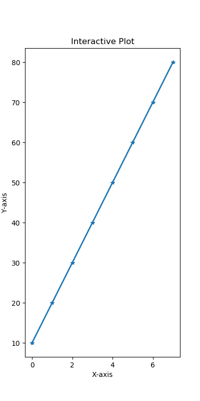
import matplotlib.pyplot as plt# Changing default values for parameters individually
plt.rc('lines', linewidth=2, linestyle='-', marker='*')plt.rcParams["figure.figsize"] = (4, 8)# Plot a line graph
plt.plot([10, 20, 30, 40, 50, 60, 70, 80])
# Add labels and title
plt.title("Interactive Plot")
plt.xlabel("X-axis")
plt.ylabel("Y-axis")plt.show()
Output:
6在 Matplotlib 中设置轴限制
import matplotlib.pyplot as pltdata1 = [11, 12, 13, 14, 15, 16, 17]
data2 = [15.5, 12.5, 11.7, 9.50, 12.50, 11.50, 14.75]# Add labels and title
plt.title("Interactive Plot")
plt.xlabel("X-axis")
plt.ylabel("Y-axis")# Set the limit for each axis
plt.xlim(11, 17)
plt.ylim(9, 16)# Plot a line graph
plt.plot(data1, data2)plt.show()
Output:
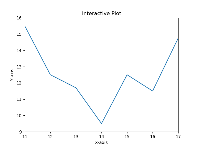
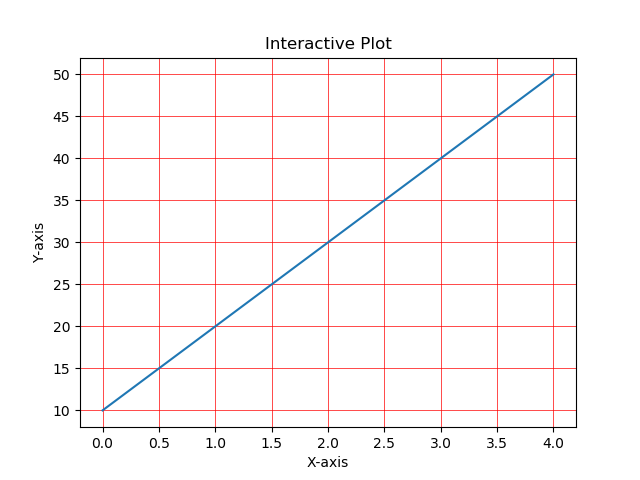
7使用 Python Matplotlib 显示背景网格
import matplotlib.pyplot as pltplt.grid(True, linewidth=0.5, color='#ff0000', linestyle='-')#Plot a line graph
plt.plot([10, 20, 30, 40, 50])
# Add labels and title
plt.title("Interactive Plot")
plt.xlabel("X-axis")
plt.ylabel("Y-axis")plt.show()
Output:
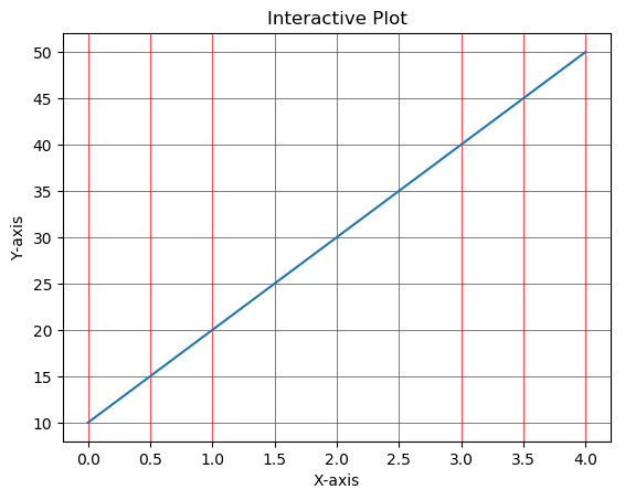
8使用 Python Matplotlib 将绘图保存到图像文件
import matplotlib.pyplot as pltplt.grid(True, linewidth=0.5, color='#ff0000', linestyle='-')#Plot a line graph
plt.plot([10, 20, 30, 40, 50])
# Add labels and title
plt.title("Interactive Plot")
plt.xlabel("X-axis")
plt.ylabel("Y-axis")plt.savefig("foo.png", bbox_inches='tight')
Output:
9将图例放在 plot 的不同位置
import matplotlib.pyplot as plt#Plot a line graph
plt.plot([5, 15], label='Rice')
plt.plot([3, 6], label='Oil')
plt.plot([8.0010, 14.2], label='Wheat')
plt.plot([1.95412, 6.98547, 5.41411, 5.99, 7.9999], label='Coffee')# Add labels and title
plt.title("Interactive Plot")
plt.xlabel("X-axis")
plt.ylabel("Y-axis")plt.legend(bbox_to_anchor=(1.1, 1.05))plt.show()
Output:
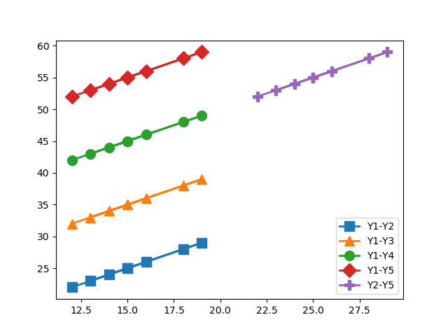
10绘制具有不同标记大小的线条
import matplotlib.pyplot as plty1 = [12, 14, 15, 18, 19, 13, 15, 16]
y2 = [22, 24, 25, 28, 29, 23, 25, 26]
y3 = [32, 34, 35, 38, 39, 33, 35, 36]
y4 = [42, 44, 45, 48, 49, 43, 45, 46]
y5 = [52, 54, 55, 58, 59, 53, 55, 56]# Plot lines with different marker sizes
plt.plot(y1, y2, label = 'Y1-Y2', lw=2, marker='s', ms=10) # square
plt.plot(y1, y3, label = 'Y1-Y3', lw=2, marker='^', ms=10) # triangle
plt.plot(y1, y4, label = 'Y1-Y4', lw=2, marker='o', ms=10) # circle
plt.plot(y1, y5, label = 'Y1-Y5', lw=2, marker='D', ms=10) # diamond
plt.plot(y2, y5, label = 'Y2-Y5', lw=2, marker='P', ms=10) # filled plus signplt.legend()
plt.show()
Output:
11用灰度线绘制折线图
import matplotlib.pyplot as plt# Plot a line graph with grayscale lines
plt.plot([5, 15], label='Rice', c='0.15')
plt.plot([3, 6], label='Oil', c='0.35')
plt.plot([8.0010, 14.2], label='Wheat',  c='0.55')
plt.plot([1.95412, 6.98547, 5.41411, 5.99, 7.9999], label='Coffee',  c='0.85')# Add labels and title
plt.title("Interactive Plot")
plt.xlabel("X-axis")
plt.ylabel("Y-axis")plt.legend()
plt.show()
Output:
12以高 dpi 绘制 PDF 输出
import matplotlib.pyplot as plt#Plot a line graph
plt.plot([5, 15], label='Rice')
plt.plot([3, 6], label='Oil')
plt.plot([8.0010, 14.2], label='Wheat')
plt.plot([1.95412, 6.98547, 5.41411, 5.99, 7.9999], label='Coffee')# Add labels and title
plt.title("Interactive Plot")
plt.xlabel("X-axis")
plt.ylabel("Y-axis")plt.savefig('output.pdf', dpi=1200, format='pdf', bbox_inches='tight')
Output:
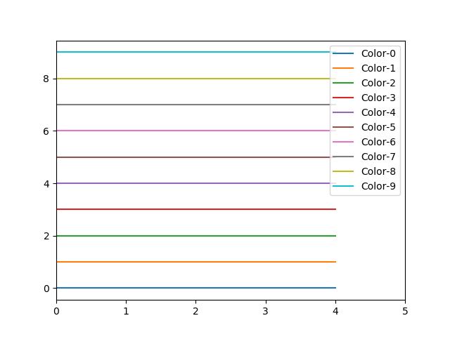
生成带有图片的pdf文件13绘制不同颜色的多线图
import matplotlib.pyplot as pltfor i in range(10):plt.plot([i]*5, c='C'+str(i), label='C'+str(i))# Plot a line graph
plt.xlim(0, 5)# Add legend
plt.legend()# Display the graph on the screen
plt.show()
Output:
14语料库创建词云
import nltk
from nltk.corpus import webtext
from nltk.probability import FreqDist
from wordcloud import WordCloud
import matplotlib.pyplot as pltnltk.download('webtext')
wt_words = webtext.words('testing.txt')  # Sample data
data_analysis = nltk.FreqDist(wt_words)filter_words = dict([(m, n) for m, n in data_analysis.items() if len(m) > 3])wcloud = WordCloud().generate_from_frequencies(filter_words)# Plotting the wordcloud
plt.imshow(wcloud, interpolation="bilinear")plt.axis("off")
(-0.5, 399.5, 199.5, -0.5)
plt.show()
Output:

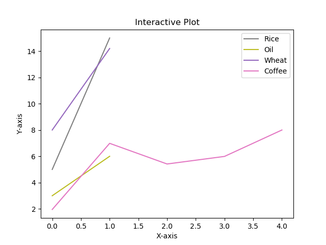
15使用特定颜色在 Matplotlib Python 中绘制图形
import matplotlib.pyplot as plt#Plot a line graph with specific colors
plt.plot([5, 15], label='Rice', c='C7')
plt.plot([3, 6], label='Oil', c='C8')
plt.plot([8.0010, 14.2], label='Wheat',  c='C4')
plt.plot([1.95412, 6.98547, 5.41411, 5.99, 7.9999], label='Coffee',  c='C6')# Add labels and title
plt.title("Interactive Plot")
plt.xlabel("X-axis")
plt.ylabel("Y-axis")plt.legend()
plt.show()
Output
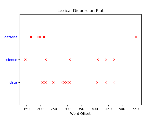
16NLTK 词汇色散图
import nltk
from nltk.corpus import webtext
from nltk.probability import FreqDist
from wordcloud import WordCloud
import matplotlib.pyplot as pltwords = ['data', 'science', 'dataset']nltk.download('webtext')
wt_words = webtext.words('testing.txt')  # Sample datapoints = [(x, y) for x in range(len(wt_words))for y in range(len(words)) if wt_words[x] == words[y]]if points:x, y = zip(*points)
else:x = y = ()plt.plot(x, y, "rx", scalex=.1)
plt.yticks(range(len(words)), words, color="b")
plt.ylim(-1, len(words))
plt.title("Lexical Dispersion Plot")
plt.xlabel("Word Offset")
plt.show()
Output:
17绘制具有不同线条图案的折线图
import matplotlib.pyplot as plt# Plot a line graph with grayscale lines
plt.plot([5, 11], label='Rice', c='C1', ls='--')
plt.plot([2, 16], label='Oil', c='C4', ls='-.')
plt.plot([8, 14], label='Wheat', c='C7', ls=':')# Add labels and title
plt.title("Interactive Plot")
plt.xlabel("X-axis")
plt.ylabel("Y-axis")plt.legend()
plt.show()
Output:
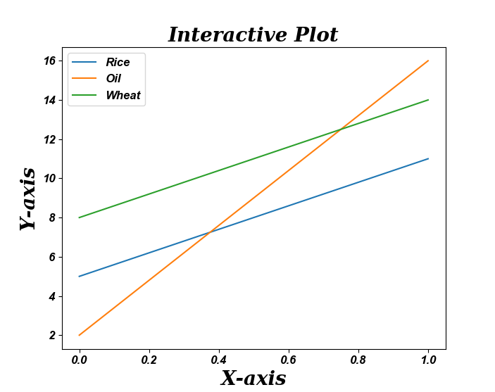
18更新 Matplotlib 折线图中的字体外观
import matplotlib.pyplot as pltfontparams = {'font.size': 12, 'font.weight':'bold','font.family':'arial', 'font.style':'italic'}plt.rcParams.update(fontparams)# Plot a line graph with specific font style
plt.plot([5, 11], label='Rice')
plt.plot([2, 16], label='Oil')
plt.plot([8, 14], label='Wheat')labelparams = {'size': 20, 'weight':'semibold','family':'serif', 'style':'italic'}# Add labels and title
plt.title("Interactive Plot", labelparams)
plt.xlabel("X-axis", labelparams)
plt.ylabel("Y-axis", labelparams)plt.legend()
plt.show()
Output:
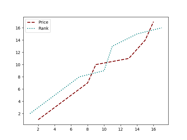
19用颜色名称绘制虚线和点状图
import matplotlib.pyplot as pltx = [2, 4, 5, 8, 9, 13, 15, 16]
y = [1, 3, 4, 7, 10, 11, 14, 17]# Plot a line graph with dashed and maroon color
plt.plot(x, y, label='Price', c='maroon', ls=('dashed'), lw=2)# Plot a line graph with dotted and teal color
plt.plot(y, x, label='Rank', c='teal', ls=('dotted'), lw=2)plt.legend()
plt.show()
Output:
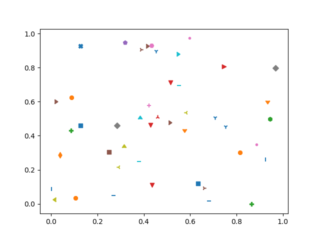
20以随机坐标绘制所有可用标记
import numpy as np
import matplotlib.pyplot as plt
from matplotlib.lines import Line2D# Prepare 50 random numbers to plot
n1 = np.random.rand(50)
n2 = np.random.rand(50)markerindex = np.random.randint(0, len(Line2D.markers), 50)for x, y in enumerate(Line2D.markers):i = (markerindex == x)plt.scatter(n1[i], n2[i], marker=y)plt.show()
Output:
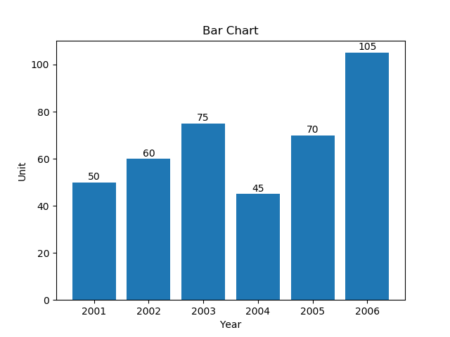
21绘制一个非常简单的条形图
import matplotlib.pyplot as pltyear = [2001, 2002, 2003, 2004, 2005, 2006]
unit = [50, 60, 75, 45, 70, 105]# Plot the bar graph
plot = plt.bar(year, unit)# Add the data value on head of the bar
for value in plot:height = value.get_height()plt.text(value.get_x() + value.get_width()/2.,1.002*height,'%d' % int(height), ha='center', va='bottom')# Add labels and title
plt.title("Bar Chart")
plt.xlabel("Year")
plt.ylabel("Unit")# Display the graph on the screen
plt.show()
Output:
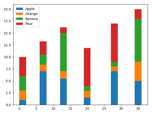
22在 X 轴上绘制带有组数据的条形图
import pandas as pd
import matplotlib.pyplot as pltdf = pd.DataFrame([[1, 2, 3, 4], [7, 1.4, 2.1, 2.8], [5.5, 1.5, 8, 1.2],[1.5, 1.4, 1, 8], [7, 1, 1, 8], [5, 4, 9, 2]],columns=['Apple', 'Orange', 'Banana', 'Pear'],index=[1, 7, 13, 20, 28, 35])
width = 2
bottom = 0for i in df.columns:plt.bar(df.index, df[i], width=width, bottom=bottom)bottom += df[i]plt.legend(df.columns)
plt.tight_layout()# Display the graph on the screen
plt.show()
Output:
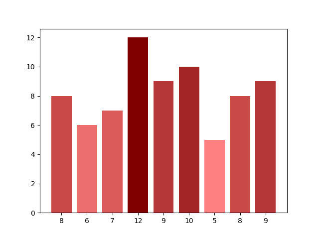
23具有不同颜色条形的条形图
import matplotlib.pyplot as plt
import matplotlib as mp
import numpy as npdata = [8, 6, 7, 12, 9, 10, 5, 8, 9]# Colorize the graph based on likeability:
likeability_scores = np.array(data)data_normalizer = mp.colors.Normalize()
color_map = mp.colors.LinearSegmentedColormap("my_map",{"red": [(0, 1.0, 1.0),(1.0, .5, .5)],"green": [(0, 0.5, 0.5),(1.0, 0, 0)],"blue": [(0, 0.50, 0.5),(1.0, 0, 0)]}
)# Map xs to numbers:
N = len(data)
x_nums = np.arange(1, N+1)# Plot a bar graph:
plt.bar(x_nums,data,align="center",color=color_map(data_normalizer(likeability_scores))
)plt.xticks(x_nums, data)
plt.show()
Output:
24使用 Matplotlib 中的特定值改变条形图中每个条的颜色
import matplotlib.pyplot as plt
import matplotlib.cm as cm
from matplotlib.colors import Normalize
from numpy.random import randdata = [2, 3, 5, 6, 8, 12, 7, 5]
fig, ax = plt.subplots(1, 1)# Get a color map
my_cmap = cm.get_cmap('jet')# Get normalize function (takes data in range [vmin, vmax] -> [0, 1])
my_norm = Normalize(vmin=0, vmax=8)ax.bar(range(8), rand(8), color=my_cmap(my_norm(data)))
plt.show()
Output:
25在 Matplotlib 中绘制散点图
import matplotlib.pyplot as pltx1 = [214, 5, 91, 81, 122, 16, 218, 22]
x2 = [12, 125, 149, 198, 22, 26, 28, 32]plt.scatter(x1, x2)# Set X and Y axis labels
plt.xlabel('Demand')
plt.ylabel('Price')#Display the graph
plt.show()
Output:
26使用单个标签绘制散点图
import numpy as np
import matplotlib.pyplot as pltN = 6
data = np.random.random((N, 4))
labels = ['point{0}'.format(i) for i in range(N)]plt.subplots_adjust(bottom=0.1)
plt.scatter(data[:, 0], data[:, 1], marker='o', c=data[:, 2], s=data[:, 3] * 1500,cmap=plt.get_cmap('Spectral'))for label, x, y in zip(labels, data[:, 0], data[:, 1]):plt.annotate(label,xy=(x, y), xytext=(-20, 20),textcoords='offset points', ha='right', va='bottom',bbox=dict(boxstyle='round,pad=0.5', fc='yellow', alpha=0.5),arrowprops=dict(arrowstyle='->', connectionstyle='arc3,rad=0'))plt.show()
Output:
27用标记大小绘制散点图
import matplotlib.pyplot as pltx1 = [214, 5, 91, 81, 122, 16, 218, 22]
x2 = [12, 125, 149, 198, 22, 26, 28, 32]plt.figure(1)
# You can specify the marker size two ways directly:
plt.plot(x1, 'bo', markersize=20)  # blue circle with size 10
plt.plot(x2, 'ro', ms=10,)  # ms is just an alias for markersize
plt.show()
Output:
28在散点图中调整标记大小和颜色
import matplotlib.pyplot as plt
import matplotlib.colors# Prepare a list of integers
val = [2, 3, 6, 9, 14]# Prepare a list of sizes that increases with values in val
sizevalues = [i**2*50+50 for i in val]# Prepare a list of colors
plotcolor = ['red','orange','yellow','green','blue']# Draw a scatter plot of val points with sizes in sizevalues and
# colors in plotcolor
plt.scatter(val, val, s=sizevalues, c=plotcolor)# Set axis limits to show the markers completely
plt.xlim(0, 20)
plt.ylim(0, 20)plt.show()
Output:
29在 Matplotlib 中应用样式表
import matplotlib.pyplot as plt
import matplotlib.colors
import matplotlib as mplmpl.style.use('seaborn-darkgrid')# Prepare a list of integers
val = [2, 3, 6, 9, 14]# Prepare a list of sizes that increases with values in val
sizevalues = [i**2*50+50 for i in val]# Prepare a list of colors
plotcolor = ['red','orange','yellow','green','blue']# Draw a scatter plot of val points with sizes in sizevalues and
# colors in plotcolor
plt.scatter(val, val, s=sizevalues, c=plotcolor)# Draw grid lines with red color and dashed style
plt.grid(color='blue', linestyle='-.', linewidth=0.7)# Set axis limits to show the markers completely
plt.xlim(0, 20)
plt.ylim(0, 20)plt.show()
Output:
30自定义网格颜色和样式
import matplotlib.pyplot as plt
import matplotlib.colors# Prepare a list of integers
val = [2, 3, 6, 9, 14]# Prepare a list of sizes that increases with values in val
sizevalues = [i**2*50+50 for i in val]# Prepare a list of colors
plotcolor = ['red','orange','yellow','green','blue']# Draw a scatter plot of val points with sizes in sizevalues and
# colors in plotcolor
plt.scatter(val, val, s=sizevalues, c=plotcolor)# Draw grid lines with red color and dashed style
plt.grid(color='red', linestyle='-.', linewidth=0.7)# Set axis limits to show the markers completely
plt.xlim(0, 20)
plt.ylim(0, 20)plt.show()
Output:
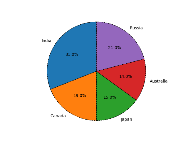
31在 Python Matplotlib 中绘制饼图
import matplotlib.pyplot as pltlabels = ['India', 'Canada', 'Japan', 'Australia', 'Russia']
sizes = [31, 19, 15, 14, 21]  # Add upto 100%# Plot the pie chart
plt.pie(sizes, labels=labels, autopct='%1.1f%%', startangle=90)# Equal aspect ratio ensures that pie is drawn as a circle.
plt.axis('equal')# Display the graph onto the screen
plt.show()
Output:
32在 Matplotlib 饼图中为楔形设置边框
import matplotlib.pyplot as pltlabels = ['India', 'Canada', 'Japan', 'Australia', 'Russia']
sizes = [31, 19, 15, 14, 21]  # Add upto 100%# Plot the pie chart
plt.pie(sizes, labels=labels, autopct='%1.1f%%', startangle=90,wedgeprops={"edgecolor":"0",'linewidth': 1,'linestyle': 'dashed', 'antialiased': True})# Equal aspect ratio ensures that pie is drawn as a circle.
plt.axis('equal')# Display the graph onto the screen
plt.show()
Output:
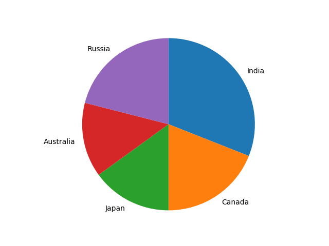
33在 Python Matplotlib 中设置饼图的方向
import matplotlib.pyplot as pltlabels = ['India', 'Canada', 'Japan', 'Australia', 'Russia']
sizes = [31, 19, 15, 14, 21]  # Add upto 100%# Plot the pie chart
plt.pie(sizes, labels=labels, counterclock=False, startangle=90)# Equal aspect ratio ensures that pie is drawn as a circle.
plt.axis('equal')# Display the graph onto the screen
plt.show()
Output:
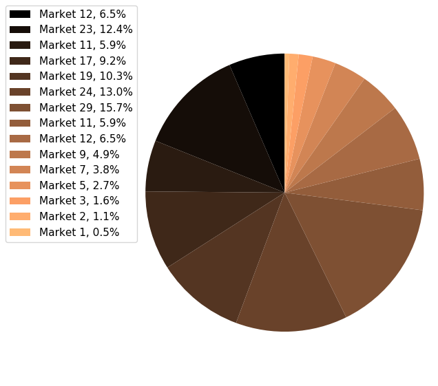
34在 Matplotlib 中绘制具有不同颜色主题的饼图
import matplotlib.pyplot as pltsizes = [12, 23, 11, 17, 19, 24, 29, 11, 12, 9, 7, 5, 3, 2, 1]
labels = ["Market %s" % i for i in sizes]fig1, ax1 = plt.subplots(figsize=(5, 5))
fig1.subplots_adjust(0.3, 0, 1, 1)theme = plt.get_cmap('copper')
ax1.set_prop_cycle("color", [theme(1. * i / len(sizes))for i in range(len(sizes))])_, _ = ax1.pie(sizes, startangle=90, radius=1800)ax1.axis('equal')total = sum(sizes)
plt.legend(loc='upper left',labels=['%s, %1.1f%%' % (l, (float(s) / total) * 100)for l, s in zip(labels, sizes)],prop={'size': 11},bbox_to_anchor=(0.0, 1),bbox_transform=fig1.transFigure
)plt.show()
Output:
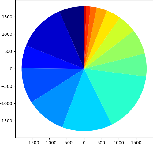
35在 Python Matplotlib 中打开饼图的轴
import matplotlib.pyplot as pltsizes = [12, 23, 11, 17, 19, 24, 29, 11, 12, 9, 7, 5, 3, 2, 1]
labels = ["Market %s" % i for i in sizes]fig1, ax1 = plt.subplots(figsize=(5, 5))
fig1.subplots_adjust(0.1, 0.1, 1, 1)theme = plt.get_cmap('jet')
ax1.set_prop_cycle("color", [theme(1. * i / len(sizes))for i in range(len(sizes))])_, _ = ax1.pie(sizes, startangle=90, radius=1800, frame=True)ax1.axis('equal')
plt.show()
Output:
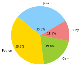
36具有特定颜色和位置的饼图
import numpy as np
import matplotlib.pyplot as pltfig =plt.figure(figsize = (4,4))
ax11 = fig.add_subplot(111)
# Data to plot
labels = 'Python', 'C++', 'Ruby', 'Java'
sizes = [250, 130, 75, 200]
colors = ['gold', 'yellowgreen', 'lightcoral', 'lightskyblue']# Plot
w,l,p = ax11.pie(sizes,  labels=labels, colors=colors,autopct='%1.1f%%', startangle=140, pctdistance=1, radius=0.5)pctdists = [.8, .5, .4, .2]for t,d in zip(p, pctdists):xi,yi = t.get_position()ri = np.sqrt(xi**2+yi**2)phi = np.arctan2(yi,xi)x = d*ri*np.cos(phi)y = d*ri*np.sin(phi)t.set_position((x,y))plt.axis('equal')
plt.show()
Output:
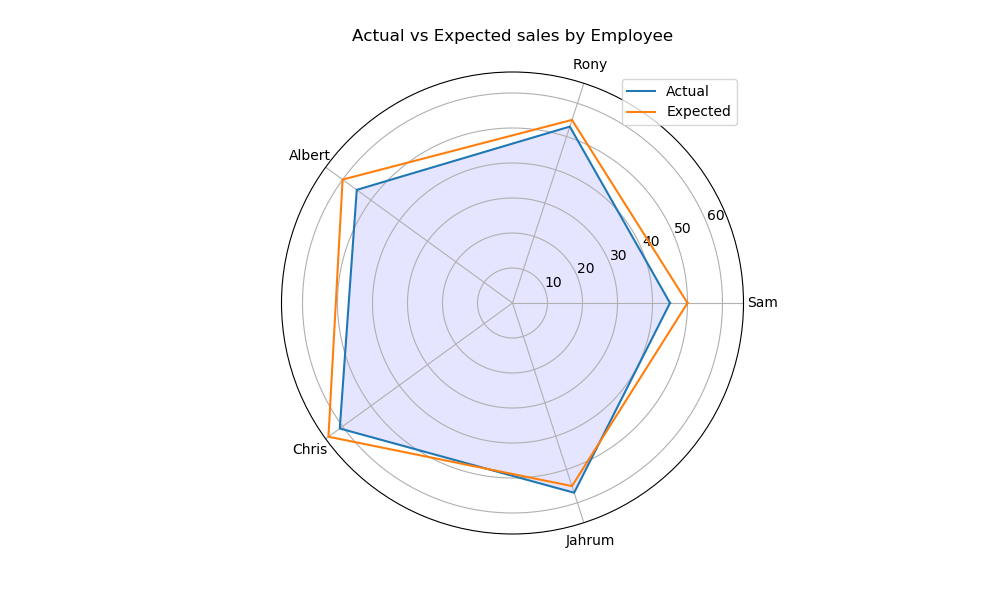
37在 Matplotlib 中绘制极坐标图
import matplotlib.pyplot as plt
import numpy as npemployee = ["Sam", "Rony", "Albert", "Chris", "Jahrum"]
actual = [45, 53, 55, 61, 57, 45]
expected = [50, 55, 60, 65, 55, 50]# Initialise the spider plot by setting figure size and polar projection
plt.figure(figsize=(10, 6))
plt.subplot(polar=True)theta = np.linspace(0, 2 * np.pi, len(actual))# Arrange the grid into number of sales equal parts in degrees
lines, labels = plt.thetagrids(range(0, 360, int(360/len(employee))), (employee))# Plot actual sales graph
plt.plot(theta, actual)
plt.fill(theta, actual, 'b', alpha=0.1)# Plot expected sales graph
plt.plot(theta, expected)# Add legend and title for the plot
plt.legend(labels=('Actual', 'Expected'), loc=1)
plt.title("Actual vs Expected sales by Employee")# Dsiplay the plot on the screen
plt.show()
Output:
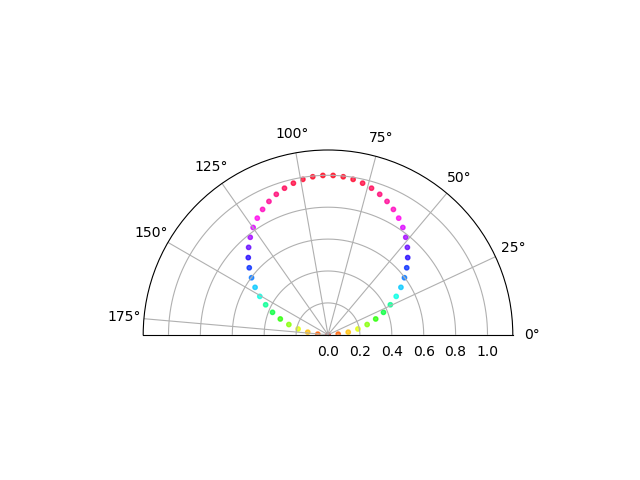
38在 Matplotlib 中绘制半极坐标图
import matplotlib.pyplot as plt
import numpy as nptheta = np.linspace(0, np.pi)
r = np.sin(theta)fig = plt.figure()
ax = fig.add_subplot(111, polar=True)
c = ax.scatter(theta, r, c=r, s=10, cmap='hsv', alpha=0.75)ax.set_thetamin(0)
ax.set_thetamax(180)plt.show()
Output:
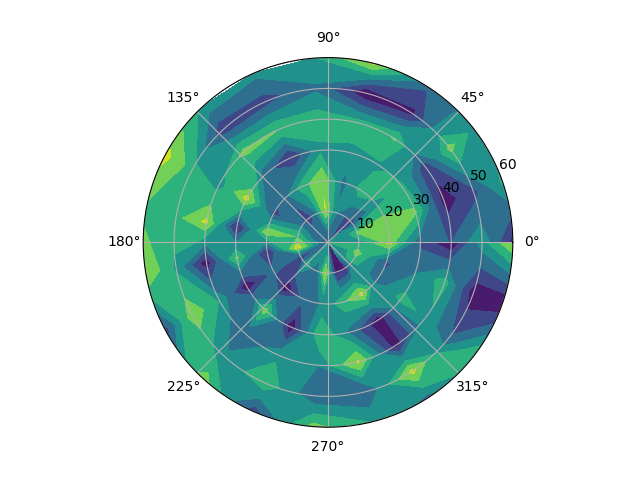
39Matplotlib 中的极坐标等值线图
import numpy as np
import matplotlib.pyplot as plt# Using linspace so that the endpoint of 360 is included
actual = np.radians(np.linspace(0, 360, 20))
expected = np.arange(0, 70, 10)r, theta = np.meshgrid(expected, actual)
values = np.random.random((actual.size, expected.size))fig, ax = plt.subplots(subplot_kw=dict(projection='polar'))
ax.contourf(theta, r, values)plt.show()
Output:
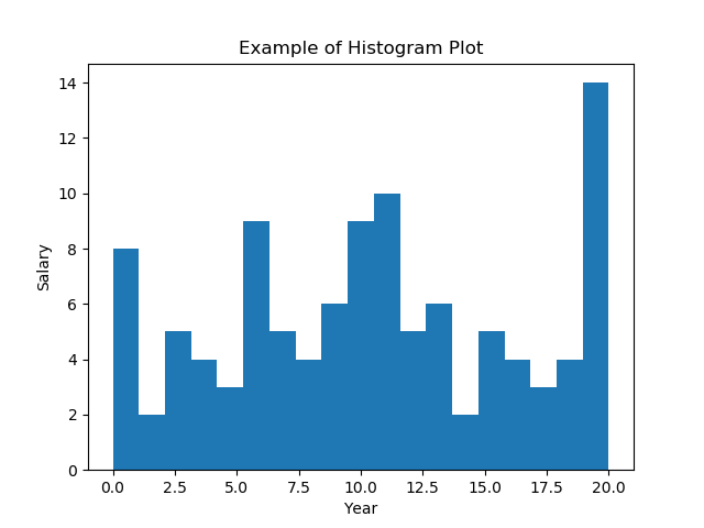
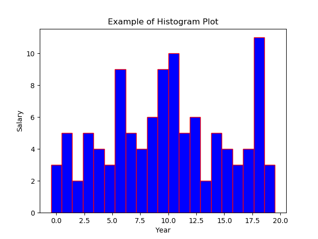
40绘制直方图
import numpy as np
import matplotlib.pyplot as plt# Data in numpy array
exp_data = np.array([12, 15, 13, 20, 19, 20, 11, 19, 11, 12, 19, 13, 12, 10, 6, 19, 3, 1, 1, 0, 4, 4, 6, 5, 3, 7, 12, 7, 9, 8, 12, 11, 11, 18, 19, 18, 19, 3, 6, 5, 6, 9, 11, 10, 14, 14, 16, 17, 17, 19, 0, 2, 0, 3, 1, 4, 6, 6, 8, 7, 7, 6, 7, 11, 11, 10, 11, 10, 13, 13, 15, 18, 20, 19, 1, 10, 8, 16, 19, 19, 17, 16, 11, 1, 10, 13, 15, 3, 8, 6, 9, 10, 15, 19, 2, 4, 5, 6, 9, 11, 10, 9, 10, 9, 15, 16, 18, 13])# Plot the distribution of numpy data
plt.hist(exp_data, bins = 19)# Add axis labels
plt.xlabel("Year")
plt.ylabel("Salary")
plt.title("Example of Histogram Plot")plt.show()
Output:
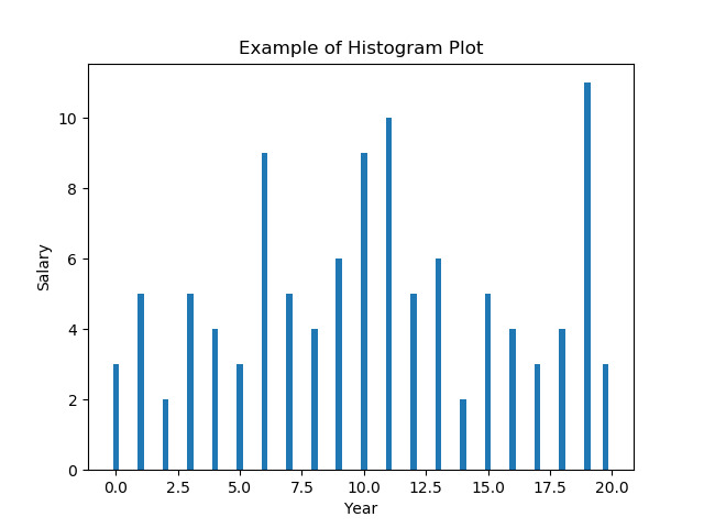
41在 Matplotlib 直方图中选择 bins
import numpy as np
import matplotlib.pyplot as plt# Data in numpy array
data = np.array([12, 15, 13, 20, 19, 20, 11, 19, 11, 12, 19, 13, 12, 10, 6, 19, 3, 1, 1, 0, 4, 4, 6, 5, 3, 7, 12, 7, 9, 8, 12, 11, 11, 18, 19, 18, 19, 3, 6, 5, 6, 9, 11, 10, 14, 14, 16, 17, 17, 19, 0, 2, 0, 3, 1, 4, 6, 6, 8, 7, 7, 6, 7, 11, 11, 10, 11, 10, 13, 13, 15, 18, 20, 19, 1, 10, 8, 16, 19, 19, 17, 16, 11, 1, 10, 13, 15, 3, 8, 6, 9, 10, 15, 19, 2, 4, 5, 6, 9, 11, 10, 9, 10, 9, 15, 16, 18, 13])# Plot the distribution of numpy data
ax = plt.hist(data, bins=np.arange(min(data), max(data) + 0.25, 0.25), align='left')
# Add axis labels
plt.xlabel("Year")
plt.ylabel("Salary")
plt.title("Example of Histogram Plot")plt.show()
Output:
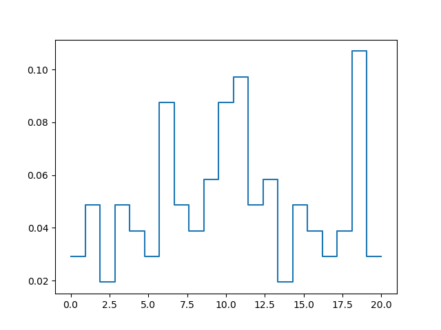
42在 Matplotlib 中绘制没有条形的直方图
import numpy as np
import matplotlib.pyplot as plt# Data in numpy array
data = np.array([12, 15, 13, 20, 19, 20, 11, 19, 11, 12, 19, 13,12, 10, 6, 19, 3, 1, 1, 0, 4, 4, 6, 5, 3, 7,12, 7, 9, 8, 12, 11, 11, 18, 19, 18, 19, 3, 6,5, 6, 9, 11, 10, 14, 14, 16, 17, 17, 19, 0, 2,0, 3, 1, 4, 6, 6, 8, 7, 7, 6, 7, 11, 11, 10,11, 10, 13, 13, 15, 18, 20, 19, 1, 10, 8, 16,19, 19, 17, 16, 11, 1, 10, 13, 15, 3, 8, 6, 9,10, 15, 19, 2, 4, 5, 6, 9, 11, 10, 9, 10, 9,15, 16, 18, 13])bins, edges = np.histogram(data, 21, normed=1)
left, right = edges[:-1], edges[1:]
X = np.array([left, right]).T.flatten()
Y = np.array([bins, bins]).T.flatten()plt.plot(X, Y)
plt.show()
Output:
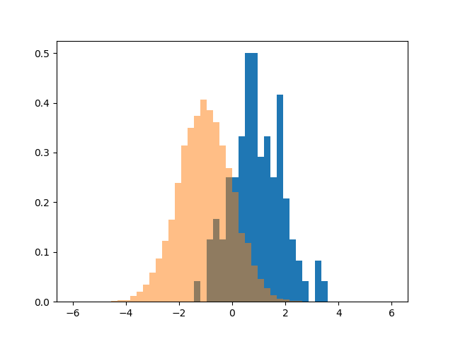
43使用 Matplotlib 同时绘制两个直方图
import numpy as np
import matplotlib.pyplot as pltage = np.random.normal(loc=1, size=100) # a normal distribution
salaray = np.random.normal(loc=-1, size=10000) # a normal distribution_, bins, _ = plt.hist(age, bins=50, range=[-6, 6], density=True)
_ = plt.hist(salaray, bins=bins, alpha=0.5, density=True)
plt.show()
Output:
44绘制具有特定颜色、边缘颜色和线宽的直方图
import numpy as np
import matplotlib.pyplot as plt# Data in numpy array
exp_data = np.array([12, 15, 13, 20, 19, 20, 11, 19, 11, 12, 19, 13, 12, 10, 6, 19, 3, 1, 1, 0, 4, 4, 6, 5, 3, 7, 12, 7, 9, 8, 12, 11, 11, 18, 19, 18, 19, 3, 6, 5, 6, 9, 11, 10, 14, 14, 16, 17, 17, 19, 0, 2, 0, 3, 1, 4, 6, 6, 8, 7, 7, 6, 7, 11, 11, 10, 11, 10, 13, 13, 15, 18, 20, 19, 1, 10, 8, 16, 19, 19, 17, 16, 11, 1, 10, 13, 15, 3, 8, 6, 9, 10, 15, 19, 2, 4, 5, 6, 9, 11, 10, 9, 10, 9, 15, 16, 18, 13])# Plot the distribution of numpy data
plt.hist(exp_data, bins=21, align='left', color='b', edgecolor='red',linewidth=1)# Add axis labels
plt.xlabel("Year")
plt.ylabel("Salary")
plt.title("Example of Histogram Plot")plt.show()
Output:
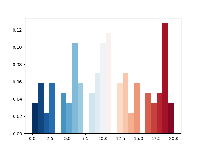
45用颜色图绘制直方图
import numpy as np
import matplotlib.pyplot as plt# Data in numpy array
data = np.array([12, 15, 13, 20, 19, 20, 11, 19, 11, 12, 19, 13, 12, 10, 6, 19, 3, 1, 1, 0, 4, 4, 6, 5, 3, 7, 12, 7, 9, 8, 12, 11, 11, 18, 19, 18, 19, 3, 6, 5, 6, 9, 11, 10, 14, 14, 16, 17, 17, 19, 0, 2, 0, 3, 1, 4, 6, 6, 8, 7, 7, 6, 7, 11, 11, 10, 11, 10, 13, 13, 15, 18, 20, 19, 1, 10, 8, 16, 19, 19, 17, 16, 11, 1, 10, 13, 15, 3, 8, 6, 9, 10, 15, 19, 2, 4, 5, 6, 9, 11, 10, 9, 10, 9, 15, 16, 18, 13])cm = plt.cm.RdBu_rn, bins, patches = plt.hist(data, 25, normed=1, color='green')
for i, p in enumerate(patches):plt.setp(p, 'facecolor', cm(i/25)) # notice the i/25plt.show()
Output:
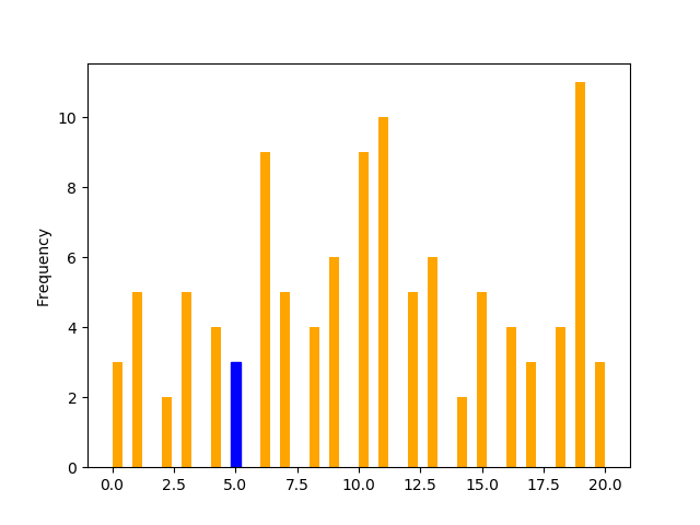
46更改直方图上特定条的颜色
import pandas as pd
import matplotlib.pyplot as plts = pd.Series([12, 15, 13, 20, 19, 20, 11, 19, 11, 12, 19, 13, 12, 10, 6, 19, 3, 1, 1, 0, 4, 4, 6, 5, 3, 7, 12, 7, 9, 8, 12, 11, 11, 18, 19, 18, 19, 3, 6, 5, 6, 9, 11, 10, 14, 14, 16, 17, 17, 19, 0, 2, 0, 3, 1, 4, 6, 6, 8, 7, 7, 6, 7, 11, 11, 10, 11, 10, 13, 13, 15, 18, 20, 19, 1, 10, 8, 16, 19, 19, 17, 16, 11, 1, 10, 13, 15, 3, 8, 6, 9, 10, 15, 19, 2, 4, 5, 6, 9, 11, 10, 9, 10, 9, 15, 16, 18, 13])p = s.plot(kind='hist', bins=50, color='orange')bar_value_to_label = 5min_distance = float("inf")  # initialize min_distance with infinity
index_of_bar_to_label = 0
for i, rectangle in enumerate(p.patches):  # iterate over every bartmp = abs(  # tmp = distance from middle of the bar to bar_value_to_label(rectangle.get_x() +(rectangle.get_width() * (1 / 2))) - bar_value_to_label)if tmp < min_distance:  # we are searching for the bar with x cordinate# closest to bar_value_to_labelmin_distance = tmpindex_of_bar_to_label = i
p.patches[index_of_bar_to_label].set_color('b')plt.show()
Output:
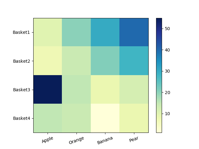
47箱线图
import matplotlib.pyplot as plt
import pandas as pddf = pd.DataFrame([[10, 20, 30, 40], [7, 14, 21, 28], [15, 15, 8, 12],[15, 14, 1, 8], [7, 1, 1, 8], [5, 4, 9, 2]],columns=['Apple', 'Orange', 'Banana', 'Pear'],index=['Basket1', 'Basket2', 'Basket3', 'Basket4','Basket5', 'Basket6'])df.boxplot(['Apple', 'Orange', 'Banana', 'Pear'])
plt.show()
Output:

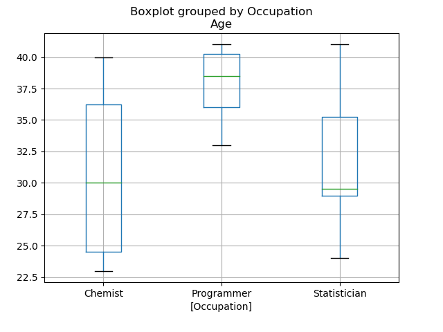
48箱型图按列数据分组
import matplotlib.pyplot as plt
import pandas as pdemployees = pd.DataFrame({'EmpCode': ['Emp001', 'Emp002', 'Emp003', 'Emp004', 'Emp005', 'Emp006', 'Emp007', 'Emp008', 'Emp009', 'Emp010', 'Emp011', 'Emp012', 'Emp013', 'Emp014', 'Emp015', 'Emp016', 'Emp017', 'Emp018', 'Emp019', 'Emp020'],'Occupation': ['Chemist', 'Statistician', 'Statistician', 'Statistician','Programmer', 'Chemist', 'Statistician', 'Statistician','Statistician', 'Programmer', 'Chemist', 'Statistician','Statistician', 'Statistician', 'Programmer', 'Chemist','Statistician', 'Statistician', 'Statistician', 'Programmer'],'Age': [23, 24, 34, 29, 40, 25, 26, 29, 40, 41, 40, 35, 41, 29, 33, 35,29, 30, 36, 37]})employees.boxplot(column=['Age'], by=['Occupation'])plt.show()
Output:
49更改箱线图中的箱体颜色
import matplotlib.pyplot as plt
import pandas as pddf = pd.DataFrame([[10, 20, 30, 40], [7, 14, 21, 28], [15, 15, 8, 12],[15, 14, 1, 8], [7, 1, 1, 8], [5, 4, 9, 2]],columns=['Apple', 'Orange', 'Banana', 'Pear'],index=['Basket1', 'Basket2', 'Basket3', 'Basket4','Basket5', 'Basket6'])box = plt.boxplot(df, patch_artist=True)colors = ['blue', 'green', 'purple', 'tan', 'pink', 'red']for patch, color in zip(box['boxes'], colors):patch.set_facecolor(color)plt.show()
Output:
50更改 Boxplot 标记样式、标记颜色和标记大小
import matplotlib.pyplot as plt
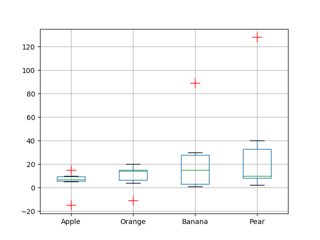
import pandas as pddf = pd.DataFrame([[10, 20, 30, 40], [7, 14, 21, 128], [15, 15, 89, 12],[-15, 14, 1, 8], [7, -11, 1, 8], [5, 4, 9, 2]],columns=['Apple', 'Orange', 'Banana', 'Pear'],index=['Basket1', 'Basket2', 'Basket3', 'Basket4','Basket5', 'Basket6'])flierprops = dict(marker='+', markerfacecolor='g', markersize=15,linestyle='none', markeredgecolor='r')df.boxplot(['Apple', 'Orange', 'Banana', 'Pear'], flierprops=flierprops)plt.show()Output:
51用数据系列绘制水平箱线图
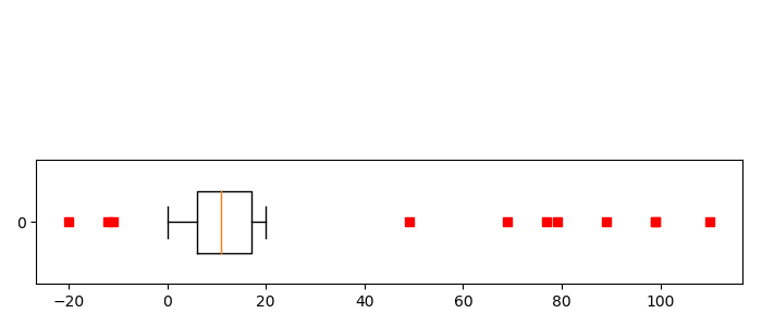
import matplotlib.pyplot as pltdata = [-12, 15, 13, -20, 19, 20, 11, 19, -11, 12, 19, 10, 12, 10, 6, 19, 3, 1, 1, 0, 4, 49, 6, 5, 3, 7, 12, 77, 9, 8, 12, 11, 11, 18, 19, 18, 19, 3, 6, 5, 6, 9, 11, 10, 18, 14, 16, 17, 17, 19, 0, 2, 0, 3, 1, 4, 6, 6, 8, 7, 7, 69, 79, 11, 11, 10, 11, 10, 13, 13, 15, 18, 20, 19, 1, 11, 8, 16, 19, 89, 17, 16, 11, 1, 110, 13, 15, 3, 8, 6, 99, 10, 15, 19, 2, 4, 5, 6, 9, 11, 10, 9, 10, 99, 15, 16, 18, 13]fig = plt.figure(figsize=(7, 3), dpi=100)
ax = plt.subplot(2, 1,2)ax.boxplot(data, False, sym='rs', vert=False, whis=0.75, positions=[0], widths=[0.5])plt.tight_layout()
plt.show()
Output:
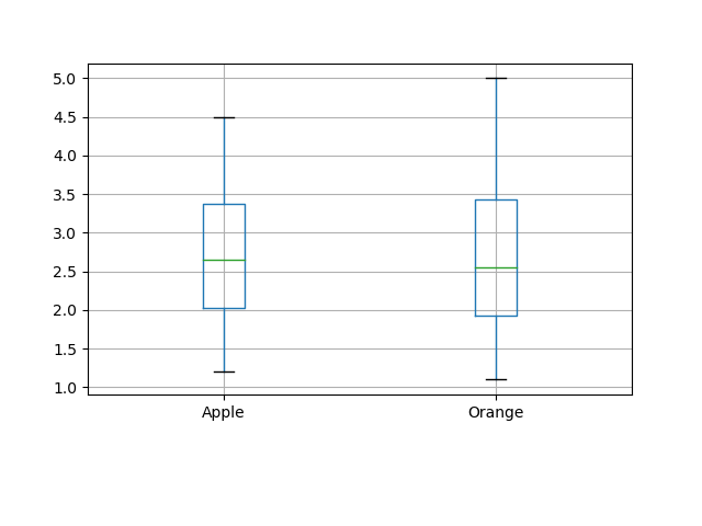
52箱线图调整底部和左侧
import matplotlib.pyplot as plt
import pandas as pdx = [[1.2, 2.3, 3.0, 4.5],[1.1, 2.2, 2.9, 5.0]]df = pd.DataFrame(x, index=['Apple', 'Orange'])
df.T.boxplot()plt.subplots_adjust(bottom=0.25)plt.show()
Output:
53使用 Pandas 数据在 Matplotlib 中生成热图
import matplotlib.pyplot as plt
import pandas as pddf = pd.DataFrame([[10, 20, 30, 40], [7, 14, 21, 28], [55, 15, 8, 12],[15, 14, 1, 8]],columns=['Apple', 'Orange', 'Banana', 'Pear'],index=['Basket1', 'Basket2', 'Basket3', 'Basket4'])plt.imshow(df, cmap="YlGnBu")
plt.colorbar()
plt.xticks(range(len(df)),df.columns, rotation=20)
plt.yticks(range(len(df)),df.index)
plt.show()
Output:
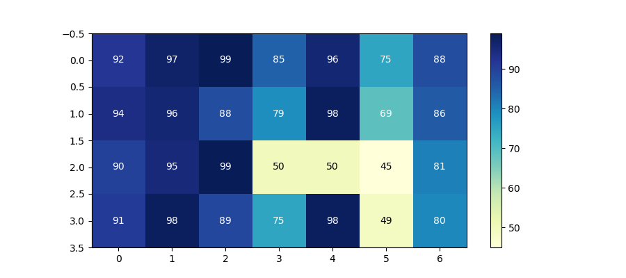
54带有中间颜色文本注释的热图
import pandas as pd
import matplotlib.pyplot as pltdata = {'Basket1': [90, 95, 99, 50, 50, 45, 81],'Basket2': [91, 98, 89, 75, 98, 49, 80],'Basket3': [92, 97, 99, 85, 96, 75, 88],'Basket4': [94, 96, 88, 79, 98, 69, 86]}fig, ax = plt.subplots(figsize=(9, 4))
df = pd.DataFrame.from_dict(data, orient='index')im = ax.imshow(df.values, cmap="YlGnBu")
fig.colorbar(im)# Loop over data dimensions and create text annotations
textcolors = ["k", "w"]
threshold = 55
for i in range(len(df)):for j in range(len(df.columns)):text = ax.text(j, i, df.values[i, j],ha="center", va="center",color=textcolors[df.values[i, j] > threshold])plt.show()
Output:
55热图显示列和行的标签并以正确的方向显示数据
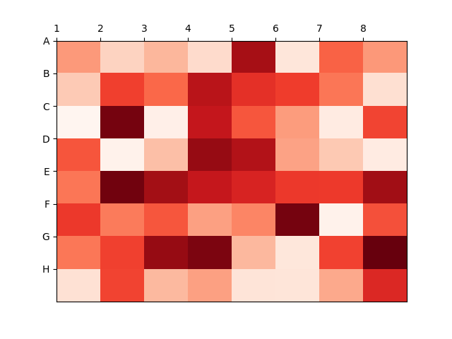
import matplotlib.pyplot as plt
import numpy as npcolumn_labels = list('ABCDEFGH')
row_labels = list('12345678')data = np.random.rand(8, 8)fig, ax = plt.subplots()
heatmap = ax.pcolor(data, cmap=plt.cm.Reds)# Put the major ticks at the middle of each cell
ax.set_xticks(np.arange(data.shape[0]), minor=False)
ax.set_yticks(np.arange(data.shape[0]), minor=False)# Want a more natural, table-like display
ax.invert_yaxis()
ax.xaxis.tick_top()ax.set_xticklabels(row_labels, minor=False)
ax.set_yticklabels(column_labels, minor=False)plt.show()
Output:
56将 NA cells 与 HeatMap 中的其他 cells 区分开来
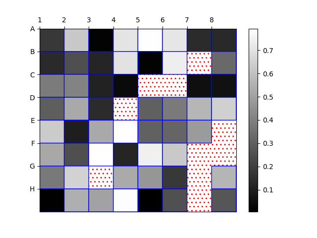
import matplotlib.pyplot as plt
import matplotlib.patches as patchesimport numpy as npcolumn_labels = list('ABCDEFGH')
row_labels = list('12345678')data = np.random.rand(8, 8)
data = np.ma.masked_greater(data, 0.8)fig, ax = plt.subplots()
heatmap = ax.pcolor(data, cmap=plt.cm.gray, edgecolors='blue', linewidths=1,antialiased=True)fig.colorbar(heatmap)
ax.patch.set(hatch='..', edgecolor='red')# Put the major ticks at the middle of each cell
ax.set_xticks(np.arange(data.shape[0]), minor=False)
ax.set_yticks(np.arange(data.shape[0]), minor=False)# Want a more natural, table-like display
ax.invert_yaxis()
ax.xaxis.tick_top()ax.set_xticklabels(row_labels, minor=False)
ax.set_yticklabels(column_labels, minor=False)plt.show()
Output:
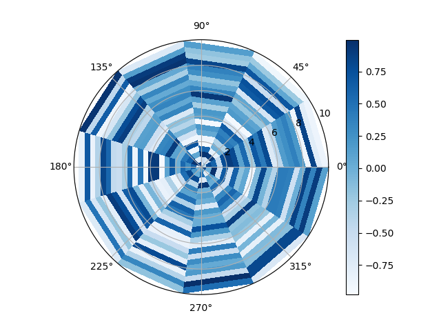
57在 matplotlib 中创建径向热图
import matplotlib.pyplot as plt
from mpl_toolkits.mplot3d import Axes3D
import numpy as npfig = plt.figure()
ax = Axes3D(fig)n = 12
m = 24
rad = np.linspace(0, 10, m)
a = np.linspace(0, 2 * np.pi, n)
r, th = np.meshgrid(rad, a)z = np.random.uniform(-1, 1, (n,m))
plt.subplot(projection="polar")plt.pcolormesh(th, r, z, cmap = 'Blues')plt.plot(a, r, ls='none', color = 'k')
plt.grid()
plt.colorbar()
plt.show()
Output:
58在 Matplotlib 中组合两个热图
import matplotlib.pyplot as plt
import numpy as np
import pandas as pd
import seaborn as snsdf1 = pd.DataFrame(np.random.rand(20, 4), columns=list("ABCD"))
df2 = pd.DataFrame(np.random.rand(20, 4), columns=list("WXYZ"))fig, (ax1, ax2) = plt.subplots(ncols=2)
fig.subplots_adjust(wspace=0.01)sns.heatmap(df1, cmap="rocket", ax=ax1, cbar=False)
fig.colorbar(ax1.collections[0], ax=ax1, location="left", use_gridspec=False, pad=0.2)sns.heatmap(df2, cmap="icefire", ax=ax2, cbar=False)
fig.colorbar(ax2.collections[0], ax=ax2, location="right", use_gridspec=False, pad=0.2)ax2.yaxis.tick_right()
ax2.tick_params(rotation=0)
plt.show()
Output:

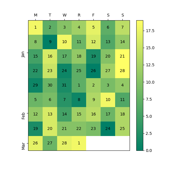
59使用 Numpy 和 Matplotlib 创建热图日历
import datetime as dt
import matplotlib.pyplot as plt
import numpy as npdef main():dates, data = generate_data()fig, ax = plt.subplots(figsize=(6, 10))calendar_heatmap(ax, dates, data)plt.show()def generate_data():num = 60data = np.random.randint(0, 20, num)start = dt.datetime(2018, 1, 1)dates = [start + dt.timedelta(days=i) for i in range(num)]return dates, datadef calendar_array(dates, data):i, j = zip(*[d.isocalendar()[1:] for d in dates])i = np.array(i) - min(i)j = np.array(j) - 1ni = max(i) + 1calendar = np.nan * np.zeros((ni, 7))calendar[i, j] = datareturn i, j, calendardef calendar_heatmap(ax, dates, data):i, j, calendar = calendar_array(dates, data)im = ax.imshow(calendar, interpolation='none', cmap='summer')label_days(ax, dates, i, j, calendar)label_months(ax, dates, i, j, calendar)ax.figure.colorbar(im)def label_days(ax, dates, i, j, calendar):ni, nj = calendar.shapeday_of_month = np.nan * np.zeros((ni, 7))day_of_month[i, j] = [d.day for d in dates]for (i, j), day in np.ndenumerate(day_of_month):if np.isfinite(day):ax.text(j, i, int(day), ha='center', va='center')ax.set(xticks=np.arange(7),xticklabels=['M', 'T', 'W', 'R', 'F', 'S', 'S'])ax.xaxis.tick_top()def label_months(ax, dates, i, j, calendar):month_labels = np.array(['Jan', 'Feb', 'Mar', 'Apr', 'May', 'Jun', 'Jul','Aug', 'Sep', 'Oct', 'Nov', 'Dec'])months = np.array([d.month for d in dates])uniq_months = sorted(set(months))yticks = [i[months == m].mean() for m in uniq_months]labels = [month_labels[m - 1] for m in uniq_months]ax.set(yticks=yticks)ax.set_yticklabels(labels, rotation=90)main()
Output:
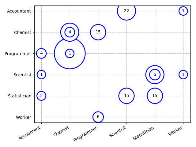
60在 Python 中创建分类气泡图
import numpy as np
import matplotlib.pyplot as plt
import pandas as pddf = pd.DataFrame({'Company1':['Chemist', 'Scientist', 'Worker','Accountant', 'Programmer', 'Chemist','Scientist', 'Worker', 'Statistician','Programmer', 'Chemist', 'Accountant', 'Statistician','Scientist', 'Accountant', 'Chemist','Scientist', 'Statistician', 'Statistician','Programmer'],                   'Company2':['Programmer', 'Statistician', 'Scientist','Statistician', 'Worker', 'Chemist','Accountant', 'Accountant', 'Statistician','Chemist', 'Programmer', 'Scientist', 'Scientist','Accountant', 'Programmer', 'Chemist','Accountant', 'Scientist', 'Scientist','Worker'],'Count':[53, 15, 1, 2, 4, 22, 6, 1, 15, 15,1,  1, 2, 2, 4, 4, 22, 22, 6, 6]})# Create padding column from values for circles that are neither too small nor too large
df["padd"] = 2.5 * (df.Count - df.Count.min()) / (df.Count.max() - df.Count.min()) + 0.5fig = plt.figure()
# Prepare the axes for the plot - you can also order your categories at this step
s = plt.scatter(sorted(df.Company1.unique()),sorted(df.Company2.unique(), reverse = True), s = 0)
s.remove
# Plot data row-wise as text with circle radius according to Count
for row in df.itertuples():bbox_props = dict(boxstyle = "circle, pad = {}".format(row.padd),fc = "w", ec = "b", lw = 2)plt.annotate(str(row.Count), xy = (row.Company1, row.Company2),bbox = bbox_props, ha="center", va="center", zorder = 2,clip_on = True)# Plot grid behind markers
plt.grid(ls = "--", zorder = 1)# Take care of long labels
fig.autofmt_xdate()
plt.tight_layout()
plt.show()
Output:
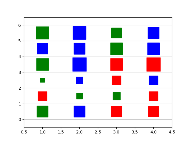
61使用 Numpy 和 Matplotlib 创建方形气泡图
import matplotlib.pyplot as plt
import numpy as np
import randomxs = np.arange(1, 5, 1)
ys = np.arange(0.5, 6, 1)colors = ["red", "blue", "green"]def square_size_color(value):square_color = random.choice(colors)if value < 1:square_size = random.choice(range(1, 10))if 3 > value > 1:square_size = random.choice(range(10, 25))else:square_size = random.choice(range(25, 35))return square_size, square_colorfor x in xs:for y in ys:square_size, square_color = square_size_color(y)plt.plot(x, y, linestyle="None", marker="s",markersize=square_size, mfc=square_color, mec=square_color)plt.grid(visible=True, axis='y')
plt.xlim(0.5, 4.5)
plt.ylim(-0.5, 6.5)
plt.show()
Output:
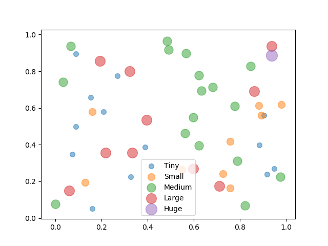
62使用 Numpy 和 Matplotlib 创建具有气泡大小的图例
import numpy as np
import matplotlib.pyplot as plt
import pandas as pdN = 50
M = 5 # Number of binsx = np.random.rand(N)
y = np.random.rand(N)
a2 = 400*np.random.rand(N)# Create the DataFrame from your randomised data and bin it using groupby.
df = pd.DataFrame(data=dict(x=x, y=y, a2=a2))
bins = np.linspace(df.a2.min(), df.a2.max(), M)
grouped = df.groupby(np.digitize(df.a2, bins))# Create some sizes and some labels.
sizes = [50*(i+1.) for i in range(M)]
labels = ['Tiny', 'Small', 'Medium', 'Large', 'Huge']for i, (name, group) in enumerate(grouped):plt.scatter(group.x, group.y, s=sizes[i], alpha=0.5, label=labels[i])plt.legend()
plt.show()
Output:
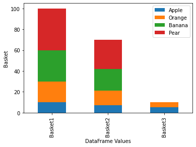
63使用 Matplotlib 堆叠条形图
import pandas as pd
import numpy as np
import matplotlib.pyplot as pltdf = pd.DataFrame([[10, 20, 30, 40], [7, 14, 21, 28], [5, 5, 0, 0]],columns=['Apple', 'Orange', 'Banana', 'Pear'],index=['Basket1', 'Basket2', 'Basket3'])ax = df.plot(kind='bar', stacked=True)
ax.set_xlabel('DataFrame Values')
ax.set_ylabel('Basket')
plt.show()
Output:
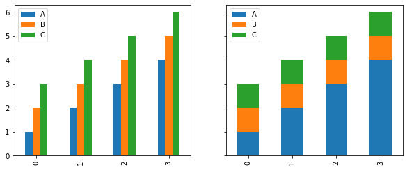
64在同一图中绘制多个堆叠条
import pandas as pd
import matplotlib.pyplot as pltdf = pd.DataFrame(dict(A=[1, 2, 3, 4],B=[2, 3, 4, 5],C=[3, 4, 5, 6]
))fig, axes = plt.subplots(1, 2, figsize=(10, 4), sharey=True)df.plot.bar(ax=axes[0])
df.diff(axis=1).fillna(df).astype(df.dtypes).plot.bar(ax=axes[1], stacked=True)plt.show()
Output:
65Matplotlib 中的水平堆积条形图
import numpy as np
import matplotlib.pyplot as pltpeople = ('A','B','C','D','E','F','G','H')
segments = 4# generate some multi-dimensional data & arbitrary labels
data = 3 + 10* np.random.rand(segments, len(people))
percentages = (np.random.randint(5,20, (len(people), segments)))
y_pos = np.arange(len(people))fig = plt.figure(figsize=(10,8))
ax = fig.add_subplot(111)colors ='rgbwmc'
patch_handles = []
left = np.zeros(len(people)) # left alignment of data starts at zero
for i, d in enumerate(data):patch_handles.append(ax.barh(y_pos, d, color=colors[i%len(colors)], align='center', left=left))# accumulate the left-hand offsetsleft += d# go through all of the bar segments and annotate
for j in range(len(patch_handles)):for i, patch in enumerate(patch_handles[j].get_children()):bl = patch.get_xy()x = 0.5*patch.get_width() + bl[0]y = 0.5*patch.get_height() + bl[1]ax.text(x,y, "%d%%" % (percentages[i,j]), ha='center')ax.set_yticks(y_pos)
ax.set_yticklabels(people)
ax.set_xlabel('Distance')plt.show()
Output:


往
期
回
顾
技术
Golang+Python实现又一技术
资讯
这个机器狗引起网友争议!
资讯
老龄化的Facebook能否再换新颜
资讯
英特尔开源编程工具 ControFlag

分享

点收藏

点点赞

点在看
相关文章:

负载均衡工具haproxy安装,配置,使用
一,什么是haproxy HAProxy提供高可用性、负载均衡以及基于TCP和HTTP应用的代 理,支持虚拟主机,它是免费、快速并且可靠的一种解决方案。HAProxy特别适用于那些负载特大的web站点,这些站点通常又需要会话保持或七层处理。HAProxy运…

【文章】本站收集与转载文章目录
1.关于推荐系统中的特征工程 2.Java程序员最喜欢的11款免费IDE编辑器 3.人工智能和机器学习领域的一些有趣的开源项目 4.微软发布Project Oxford,供Azure户免费集多项功能 5.微软推Azure机器学习工具:Algorithm Cheat Sheet
L09-10老男孩Linux运维实战培训-Nginx服务生产实战应用指南05(架构解决方案)
nginx的多实例设置首先说一下nginx后面加的参数的说明 -s 后面加reload 就是重新加载的意思和apache的graceful同样的效果 -v 小写的v显示版本号后退出 -V大写的V显示nginx的版本号和配置环境 -t 就是test的意思,检查配置文件是否正确 -c 后面配置文件的地址&#x…
linux中的apachectl是什么命令
apachectl是Apache HTTP服务器的前端程序。其设计意图是帮助管理员控制Apache httpd后台守护进程的功能。apachectl脚本有两种操作模式。首先,作为简单的httpd的前端程序,设置所有必要的环境变量,然后启动httpd ,并传递所有的命令…
数据库性能优化1——正确建立索引以及最左前缀原则
1. 索引建立的原则用于索引的最好的备选数据列是那些出现在WHERE子句、join子句、ORDER BY或GROUP BY子句中的列。仅仅出现在SELECT关键字后面的输出数据列列表中的数据列不是很好的备选列SELECTcol_a <- 不是备选列FROMtbl1 LEFT JOIN tbl2ON tbl1.col_b tbl2.col_c <-…
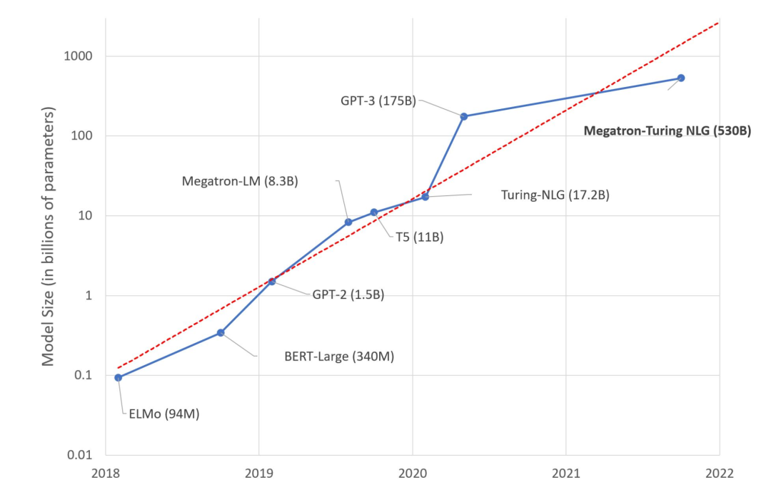
深度学习发展下的“摩尔困境”,人工智能又将如何破局?
前不久,微软和英伟达推出包含5300亿参数的语言模型MT-NLG,这是一款基于 Transformer 的模型被誉为“世界上最大、最强的生成语言模型”。 毫无疑问,这是一场令人印象深刻的机器学习工程展示。 然而,我们是否应该对这种大型模型趋势…
Kotlin学习笔记-基础语法
去年学习过一遍Kotlin,相比java而言,Kotlin确实有许多方便的地方,但是学习之后一直没有真正拿来写项目,很久不用很多东西都已经忘记了。最近Google宣布Kotlin成为Android开发的官方语言之后,Kotlin突然变得火热起来&am…
英特尔王锐:软硬件并驾齐驱,开发者是真英雄
北京时间10月28日,英特尔On技术创新峰会在北京举办。在此次峰会上,英特尔公司高级副总裁、英特尔中国区董事长王锐对外宣告了英特尔拥抱开发者,回归技术创新的决心和信心。 英特尔此前提出,四大超级技术力量赋能数字化的变革&…

基于html5海贼王单页视差滚动特效
分享一款基于html5海贼王单页视差滚动特效是一款流行滑落网页特效代码。效果图如下: 在线预览 源码下载 实现的代码: <div class"top"><div class"top_main center"><ul id"scene" class"scene&quo…
切换apache的prefork和worker模式
Apache HTTP服务器被设计为一个强大的、灵活的能够在多种平台以及不同环境下工作的服务器。 不同的平台和不同的环境经常产生不同的需求,或是为了达到同样的最佳效果而采用不同的方法。 Apache凭借它的模块化设计很好的适应了大量不同的环境。 这一设计使得网站管理…

使用adb devices命令无法识别夜神模拟器的解决方法
模拟器不喜欢原生态的,喜欢简单好用的,这里用的是夜神模拟器现象夜神模拟器启动成功,此时用adb devices命令查看,居然啥都不显示,也就是没识别出来分析很大可能是因为adb的版本不一致导致的,心中无数个草泥…
Apache的prefork模式和worker模式
prefork模式 这个多路处理模块(MPM)实现了一个非线程型的、预派生的web服务器,它的工作方式类似于Apache 1.3。它适合于没有线程安全库,需要避免线程兼容性问题的系统。它是要求将每个请求相互独立的情况下最好的MPM,这样若一个请求出现问题就…
AI 与小学生的做题之战,孰胜孰败?
现在小学生的数学题不能用简单来形容,有的时候家长拿到题也需要思考半天,看看是否有其他隐含的解题方法。市面上更是各种拍题搜答案的软件,也是一样的套路,隐含着各种氪金的信息。 就像网络上说的“不写作业母慈子孝,一…

AIDL方向指示
2019独角兽企业重金招聘Python工程师标准>>> AIDL使用简单的语法来定义接口, 该接口定义了可供客户端访问的方法和属性,并且描述其方法以及方法的参数和返回值。这些参数和返回值可以是任何类型,甚至是其他AIDL生成的接口。 其中对于Java编程…
Techshack Weekly 第 0002 期
Techshack Weekly 专注于后端技术阅读,目前有上百位订阅者,欢迎加入 Telegram Channel ,或关注推特 techshackweekly,或订阅 RSS! 点击查看本期 本期比较关注的几个领域有:TSDB, 系统设计,推荐的…

像数据分析一样写 Web 页面,这个 Python 库做到了!
作者|刘早起来源|早起Python提起用 Python 写一个 web 页面,总是会想起Django/Flask等这样的大家伙。他们确实好用,但就是流程繁琐,比如有时就想写一个简单的页面,比如问卷调查,拿 Django 来说吧总要经过安装、启动、配…

loadrunner 如何做关联
在页面中为了防止CRSF攻击,每次访问登录页面时,在浏览器器端生成一个token。 在提交时检验这个token是否有效,提交后token自动失效。 如果使用loadrunner来测试此系统话需要做一个关联,把这个token作为一个参数进行提交。 做关联有…

让你的数据离CPU更近一些
让你的数据离CPU更近一些 Jim Gray:RAM是硬盘,硬盘是磁带 永远只做自己最擅长的事情 不是所有的任务都需要同步执行

现在很火的答题赢钱游戏,让我来简单教你怎么做自动答题器
一、前言: 现在最火的直播游戏,那就是答题赢钱直播了,如百万英雄、芝士超人、花椒直播、冲顶大会等等,这些游戏的玩法都很简单,答对12题即可瓜分奖金了。玩法虽然简单,但是要能完全答对12题难度还是挺高的&…
OAuth认证协议原理分析及使用方法
twitter或豆瓣用户一定会发现,有时候,在别的网站,点登录后转到 twitter登录,之后转回原网站,你会发现你已经登录此网站了, 这种网站就是这个效果。其实这都是拜 OAuth所赐。 OAuth是什么? OAuth…

一次图文并茂的***完整测试二
任务:某公司授权你对其服务器进行******。对某核心服务器进行***测试,据了解目标机为Windows 2003 Server系统,ip地址为10.1.1.191,在C盘的根目录下存储有两个敏感文件这里就用(key1.txt,key2.txt)表示&…

神经网络学习到的是什么?(Python)
作者|泳鱼来源|算法进阶神经网络(深度学习)学习到的是什么?一个含糊的回答是,学习到的是数据的本质规律。但具体这本质规律究竟是什么呢?要回答这个问题,我们可以从神经网络的原理开始了解。一、 神经网络的…
Spring MVC原理
摘要: Spring MVC工作流程图springMVC工作流程图图一图二开发工具1.Eclipse IDE:采用Maven项目管理,模块化。2.代码生成:通过界面方式简单配置,自动生成相应代码,目前包括三种生成方式(增删改查)…
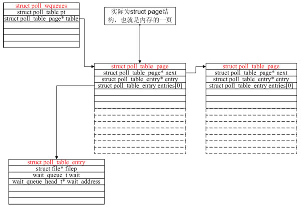
linux下poll和epoll内核源代码剖析
作者:董昊 博客链接http://donghao.org/uii/ poll和epoll的使用应该不用再多说了。当fd很多时,使用epoll比poll效率更高。 我们通过内核源码分析来看看到底是为什么。 poll剖析poll系统调用:int poll(struct pollfd *fds, nfds_t nfds, int t…

百度副总裁马杰:实现元宇宙,技术要过三道坎
近来,元宇宙一词就像龙卷风瞬间席卷整个科技圈,一时间所有新概念层出不穷,无数科技公司蜂拥而至扎堆元宇宙。先是在线游戏创作平台Robolox把元宇宙写进招股书里,成为“元宇宙第一股”。后有扎克伯格宣布将Facebook更名为Meta&…
consolez设置
2019独角兽企业重金招聘Python工程师标准>>> 菜单”—>Edit—>Setting...—>Behavior—>选择“Copy on select” “菜单”—>Edit—>Setting...—>Mouse—>Paste text—>Right 最后一个重点说明的问题是Console2对中文的支持问题。默认情…
dstat用法;利用awk求dstat所有列每列的和;linux系统监控
安装:yum install -y dstatdstat命令是一个用来替换vmstat、iostat、netstat、nfsstat和ifstat这些命令的工具,是一个全能系统信息统计工具。与sysstat相比,dstat拥有一个彩色的界面,在手动观察性能状况时,数据比较显眼…
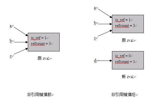
PHP内核介绍及扩展开发指南—基础知识
一、 基础知识 本章简要介绍一些Zend引擎的内部机制,这些知识和Extensions密切相关,同时也可以帮助我们写出更加高效的PHP代码。 1.1 PHP变量的存储 1.1.1 zval结构 Zend使用zval结构来存储PHP变量的值,该结构如下所示: type…

腾讯汤道生:数实融合成为行业“必答题”,腾讯未来打造四大引擎
11月3日,腾讯高级执行副总裁、云与智慧产业事业群CEO汤道生在2021腾讯数字生态大会上表示,“数实融合”正在从“选答题”,变成每个行业都要面对的“必答题”,腾讯未来将打造用户、技术、安全和生态四大引擎,助力各行各…
shell编程基础(2)---与||
shell 编程重要的应用就是管理系统,对于管理系统中成千上万的程序而言,查询某个文件名是否存在,并且获取该文件名所指代文件基本信息是系统管理员的基本任务。shell命令可以很轻松的完成这项任务。 #program this is a example for #########…