初步了解React Native的新组件库firstBorn
first-born is a React Native UI Component Framework, which follows the design methodology Atomic Design by Brad Frost.
first-born是React Native UI组件框架,它遵循Brad Frost的设计方法Atomic Design 。
Version 1.0.0 was recently published as an npm module on the 1st of April (it ain’t no joke though…).
1.0.0版最近在4月1日作为npm模块发布(尽管这不是在开玩笑……)。
In this article, we will see a demo of the existing components offered by first-born.
在这篇文章中,我们将看到通过提供现有组件的演示first-born 。
设计方法论 (The Design Methodology)
The Atomic Design methodology follows the principle that user interfaces can be deconstructed to 5 different phases.
原子设计方法遵循以下原则:可以将用户界面分解为5个不同的阶段。
According to this design methodology, the phases are described as follows:
根据此设计方法,阶段描述如下:
- Atoms: The basic, standalone elements, like Text, Icons, Buttons or TextInput boxes.原子:基本的独立元素,例如文本,图标,按钮或TextInput框。
- Molecules: A combination of different atoms, which together have better operational value. For example, a TextInput with a Text label to explain the content or display an error in data entered.分子:不同原子的组合,它们在一起具有更好的操作价值。 例如,带有文本标签的TextInput可以解释内容或在输入的数据中显示错误。
- Organisms: A combination of different molecules functioning together to form complex structures. For example, a form of many TextInput molecules.有机体:不同分子的组合在一起起作用,以形成复杂的结构。 例如,许多TextInput分子的形式。
- Template: A combination of different organisms that form the basis of the page. This includes the layout and context of these organisms.模板:构成页面基础的不同生物的组合。 这包括这些生物的布局和背景。
- Page: All the above working together in a single real-life instance, gives rise to a page. It is also the actual implementation of the template.页面:以上所有内容在一个真实的实例中协同工作,形成了一个页面。 这也是模板的实际实现。
入门 (Getting Started)
Let us first create a new React Native app using the CLI:
让我们首先使用CLI创建一个新的React Native应用程序:
react-native init firstBornExampleOnce it is created, move into the app folder:
创建完成后,移至应用程序文件夹:
cd firstBornExampleTo add first-born into the app, install it like this:
要将first-born应用添加到应用中,请按以下方式安装它:
npm i --save @99xt/first-bornfirst-born has two other dependencies we will need to install ourselves.
first-born还有另外两个依赖关系,我们需要自行安装。
npm i --save create-react-class react-native-vector-iconsWe will then need to follow this guide to set up react-native-vector-icons for the app.
然后,我们将需要遵循此指南来为该应用设置react-native-vector-icons 。
create-react-class does not have additional set-up steps.
create-react-class没有其他设置步骤。
And we’re good to go!
而且我们很好!
用法 (Usage)
To import the components, the statement will look like this:
要导入组件,该语句将如下所示:
import { <name of component> } from '@99xt/first-born'The module comes with the following inbuilt components:
该模块带有以下内置组件:
原子 (Atoms)
Text
文本
The Text atom has a fixed set of sizes. These sizes differ depending on the underlying app platform. We can also pass a color to this Text atom.
Text原子具有一组固定的大小。 这些大小取决于基础应用程序平台而有所不同。 我们还可以将颜色传递给此Text原子。
<Text size="h4">first-born example</Text>Icon
图标
The Icon atom is built on top of react-native-vector-icons Ionicons class. Ionicons come with two different renditions of one icon for both Android and iOS. This class will render the icon according to the underlying platform.
Icon原子建立在react-native-vector-icons Ionicons类的顶部。 Ionicons带有两个图标,分别适用于Android和iOS。 此类将根据基础平台渲染图标。
<Icon name="heart" color="red"/>Button
纽扣
The Button atom can be rendered in multiple ways. It only accepts Texts, Icons, and Images as child items to display. It has 3 different sizes, as well as 4 different tags that will render the button in many combinations.
Button原子可以多种方式呈现。 它仅接受Texts , Icons和Images作为要显示的子项。 它具有3种不同的大小,以及4种不同的标签,这些标签将以多种组合呈现按钮。
render() {return (<View style={styles.container}><Button size="small"><Text>Small</Text></Button><Button ><Text>Default</Text></Button><Button size="large"><Text>Large</Text></Button><Button ><Icon name="heart" /><Text>Default</Text></Button><Button rounded><Icon name="heart" /><Text>Rounded</Text></Button><Button block><Icon name="heart" /><Text>Block</Text></Button><Button rounded block><Icon name="heart" /><Text>{"Rounded & Block"}</Text></Button><Button outline><Icon name="heart" /><Text>Outline</Text></Button><Button outline transparent><Icon name="heart" /><Text>{"Outline & Transparent"}</Text></Button></View>);
}
Input
输入值
The Input atom is a styled react-native TextInput. It displays a colored border to the user if the TextInput is in focus. The onChangeText method is mandatory.
Input原子是样式react-native TextInput 。 如果TextInput处于焦点,它将向用户显示彩色边框。 onChangeText方法是强制性的。
<Input placeholder="Name" onChangeText={this.handleTextChange} />
...
handleTextChange = (text) => {this.setState({ text: text })
}
This also supports indicating an error to the user. To use this feature, we will need to create a validation method. This method should return a boolean depending on the validity of the text entered. One such scenario is checking if an email address follows the conventional format. This method is that passed in the isValid property.
这也支持向用户指示错误。 要使用此功能,我们将需要创建一种验证方法。 此方法应根据输入的文本的有效性返回一个布尔值。 一种这样的情况是检查电子邮件地址是否遵循常规格式。 此方法是在isValid属性中传递的。
checkInputValidity = (text) => {const regex = /^\w+([\.-]?\w+)*@\w+([\.-]?\w+)*(\.\w{2,3})+$/;return regex.test(text);
}
...
<Input placeholder="Email" isValid={this.checkInputValidity} />
TextArea
文字区域
The TextArea atom is a styled react-native TextInput. It displays a colored border to the user if the TextInput is in focus. It also increases in height with more data entered.
TextArea原子是样式react-native TextInput 。 如果TextInput处于焦点,它将向用户显示彩色边框。 输入更多数据后,高度也会增加。
<TextArea placeholder="Description"/>Picker
选择器
The Picker atom is a styled react-native Picker component. On Android, the picker is a dropdown that extends from the initial Picker component. On iOS, clicking the first-born Picker will open a modal for the user to pick the value.
Picker原子是样式react-native Picker组件。 在Android上,选择器是从初始“ Picker组件扩展而来的下拉列表。 在iOS上,单击第first-born Picker将打开一个模式供用户选择值。
<Picker><Picker.Item value="1" label="1" /><Picker.Item value="2" label="2" /><Picker.Item value="3" label="3" />
</Picker>
DatePicker
日期选择器
The DatePicker atom is a styled react-native View component, which looks like a TextInput. On Android, when the View is clicked, it runs the DatePickerAndroid API. On iOS, clicking the View will open a modal for the user to pick the date from the DatePickerIOS component.
DatePicker原子是样式react-native View组件,看起来像TextInput 。 在Android上,单击“ View ,它将运行DatePickerAndroid API 。 在iOS上,单击“ View将打开一个模式,供用户从DatePickerIOS组件中选择日期。
<DatePicker />分子 (Molecules)
FormDatePicker
FormDatePicker
This molecule uses the DatePicker atom and includes the Text atom as a label. The label property of this element is mandatory.
该分子使用DatePicker原子,并包括Text原子作为标签。 此元素的label属性是必需的。
<FormDatePicker label="Date" />FormPicker
FormPicker
This molecule uses the Picker atom and includes the Text atom as a label. The label property of this element is mandatory.
该分子使用Picker原子,并包含Text原子作为标签。 此元素的label属性是必需的。
<FormPicker label="Number"><Picker.Item value="1" label="1" /><Picker.Item value="2" label="2" /><Picker.Item value="3" label="3" />
</FormPicker>
We can also pass data as an array of objects, which have the keys’ value and label. The data in both keys need to be of type String.
我们还可以将数据作为对象的数组传递,这些对象具有键的value和label 。 两个键中的数据都必须为String类型。
pickerData = [{value: "1",label: "1"},{value: "2",label: "2"},{value: "3",label: "3"}
];
...
<FormPicker label="Number" pickerData={this.pickerData} />
FormInput
表单输入
This molecule uses the Input atom and includes the Text atom as a label. The label property of this element is mandatory.
该分子使用Input原子,并包括Text原子作为标签。 此元素的label属性是必需的。
<FormInput label="Name" />FormTextArea
FormTextArea
This molecule uses the TextArea atom and includes the Text atom as a label. The label property of this element is mandatory.
该分子使用TextArea原子,并包括Text原子作为标签。 此元素的label属性是必需的。
<FormTextArea label="Description" />Card
卡
The Card molecule displays a View with an image, heading, and description. Of the three, the heading is mandatory. The style of this molecule differs according to the underlying platform.
Card分子显示带有图像,标题和描述的View 。 在这三个中,标题是强制性的。 该分子的样式根据基础平台而不同。
<Card title="Heading Only" />
<Card title="Heading" description="And Description" />
<Card title="Heading" description="Description" image={require("./path/to/an/image.png")} />
ListItem
项目清单
The ListItem molecule displays a View with an image, heading, and description. Of the three, the heading is mandatory. The style of this molecule differs according to the underlying platform.
ListItem分子显示带有图像,标题和描述的View 。 在这三个中,标题是强制性的。 该分子的样式根据基础平台而不同。
<ListItem title="Heading Only" />
<ListItem title="Heading" description="And Description" />
<ListItem title="Heading" description="Description" image={require("./path/to/an/image.png")} />
Notification
通知
The Notification molecule displays a banner at the top of the page. The reference to the component is passed to the NotificationManager. Invoking the showAlert method of this manager, we can send the message to be displayed to the user.
Notification分子在页面顶部显示横幅。 对组件的引用将传递给NotificationManager 。 调用此管理器的showAlert方法,我们可以将要显示的消息发送给用户。
Add the Notification as the very last element of the parent View.
将Notification添加为父View最后一个元素。
<Notification ref={"alert"} />We will need to register this Notification molecule when the page mounts. This is to pass the reference of the Notification to the manager.
页面装入后,我们将需要注册此Notification分子。 这是为了将Notification的引用传递给管理器。
componentDidMount() {NotificationBarManager.registerMessageBar(this.refs.alert);
}
To clean up, we will also need to unregister this molecule as the page is unmounted.
为了清理,我们还需要在卸载页面时注销该分子。
componentWillUnmount() {  NotificationBarManager.unregisterMessageBar();
}
To display the Notification bar, run the below method, passing the message to be displayed.
要显示Notification栏,请运行以下方法,并传递要显示的消息。
NotificationBarManager.showAlert({  message: 'Your alert message goes here'
});
FloatingButton
浮动按钮
This molecule is equivalent to the Android Floating Action Button (FAB). It can be either a singular action or expand to display many actions.
该分子等效于Android浮动操作按钮(FAB)。 它可以是单个动作,也可以扩展为显示许多动作。
If the FAB contains a singular action, we use the onPress property to pass the method to be run when the button is clicked.
如果FAB包含单个动作,则使用onPress属性传递单击按钮时要运行的方法。
<FloatingButton onPress={this.handleShowNotification} />If the FAB needs to expand to display many actions, and action array needs to be created. Each action object in the array needs to contain at a minimum:
如果FAB需要扩展以显示许多动作,则需要创建动作数组。 数组中的每个操作对象至少需要包含:
Unique
name唯一
nameiconorimageicon或imagepositionfrom the top (starts at 1) when the FAB is expandedFAB展开时从顶部开始的
position(从1开始)method to run
onPress在
onPress上运行的方法
const actions = [{icon: 'help',name: 'bt_accessibility',position: 2,onPress: () => Alert.alert('Hello', 'Accessibility')},{icon: 'pin',name: 'bt_room',position: 1,onPress: () => Alert.alert('Hello', 'Location')},{icon: 'videocam',name: 'bt_videocam',position: 3,onPress: () => Alert.alert('Hello', 'Video')}
];
We then pass the array to the FloatingButton in the property actions:
然后,我们将数组传递给属性actions的FloatingButton :
<FloatingButton actions={this.actions} />生物体 (Organisms)
Form
形成
The Form organism is built of the form molecules, FormInput, FormPicker, FormDatePicker, and FormTextArea.
Form生物体是由表单分子FormInput , FormPicker , FormDatePicker和FormTextArea 。
To render this organism, an array containing details of each field needs to be passed. The child components are rendered according to the type specified in each object.
为了渲染这种生物,需要传递包含每个字段细节的数组。 子组件根据每个对象中指定的type进行渲染。
The mapping is as follows:
映射如下:
‘text’ —
FormInput'
FormInput-FormInput‘textarea’ —
FormTextArea'textarea'—
FormTextArea‘date’ —
FormDatePicker'
FormDatePicker-FormDatePicker‘picker’ —
FormPicker'
FormPicker-FormPicker
The object of each field can only contain the properties specified to the mapped field type. In simpler terms, an object of type ‘text’, must only contain the properties that the FormInput molecule accepts.
每个字段的对象只能包含为映射的字段类型指定的属性。 简单来说,“文本” type的对象必须仅包含FormInput分子接受的属性。
CardList
卡清单
This organism currently renders a read-only list of Cards, either horizontally or vertically. It requires an array of objects which have the same properties as a Card molecule.
该生物当前呈现水平或垂直的Cards只读列表。 它需要一系列与Card分子具有相同属性的对象。
const listData = [{title: "Heading 1",description: "Description 1",image: require("./path/to/an/image.png")},{title: "Heading 2",description: "Description 2",image: require("./path/to/an/image.png")},{title: "Heading 3",description: "Description 3",image: require("./path/to/an/image.png")}
];
To render the list, pass the array above to the data property. Add the boolean property horizontal, if we wish for a horizontally scrolling list.
要呈现列表,请将上面的数组传递给data属性。 如果希望水平滚动列表,请添加boolean属性horizontal 。
<CardList data={this.listData} />
<CardList data={this.listData} horizontal />
ListView
列表显示
This organism currently renders a read-only list of ListItem’s vertically. It requires an array of objects which have the same properties as a ListItem molecule. The same list used for a CardList can be used here as well.
该生物当前ListItem's垂直方向上呈现ListItem's只读列表。 它需要具有与ListItem分子具有相同属性的对象数组。 也可以在这里使用与CardList相同的列表。
<ListView data={this.listData} />Header Navigation (NavBar)
标题导航(NavBar)
The NavBar organism is a page header that renders according to the underlying platform. It is rendered at the top of the page, right inside the page’s main View component.
NavBar生物是根据底层平台呈现的页面标题。 它呈现在页面顶部,就在页面的主要View组件内部。
To form the NavBar, all three child elements (NavBarRight, NavBarLeft, and NavBarBody) need to be included to align the elements correctly.
要形成NavBar ,需要包括所有三个子元素( NavBarRight , NavBarLeft和NavBarBody )以正确对齐元素。
<NavBar>  <NavBarLeft /><NavBarBody><Text>Title</Text></NavBarBody><NavBarRight/>
</NavBar>
We can also include buttons to the header with the NavBarButton component. This button can be added as children to the NavBarRight and NavBarLeft components.
我们还可以在NavBarButton组件的标题中包含按钮。 可以将此按钮作为子级添加到NavBarRight和NavBarLeft组件中。
The NavBarButton can be used in two ways:
NavBarButton可以通过两种方式使用:
It has a property
type, that accepts the values ‘back, ‘drawer’ and ‘search’. This renders the corresponding icons to each type by default.它具有属性
type,它接受值'back,'drawer'和'search'。 默认情况下,这会将相应的图标呈现给每种类型。We can create a custom button by including either
Texts,IconsorImagesas children in theNavBarButtoncomponent.我们可以通过在
NavBarButton组件NavBarButtonTexts,Icons或Images作为子项来创建自定义按钮。
<NavBar><NavBarLeft ><NavBarButton type="drawer" /></NavBarLeft><NavBarBody><Text>Title</Text></NavBarBody><NavBarRight><NavBarButton><Icon name="heart" /></NavBarButton></NavBarRight>
</NavBar>
Footer Navigation (TabBar)
页脚导航(TabBar)
The TabBar organism is a page footer that renders according to the underlying platform. It is rendered at the very bottom of the page, right before the closing tag of the page’s main View component.
TabBar生物是根据基础平台呈现的页脚。 它呈现在页面的最底部,就在页面主View组件的关闭标记之前。
The TabBar contains multiple TabItems, depending on the number of pages in the tab navigation. A TabItem accepts either Texts, Icons or Images as children.
TabBar包含多个TabItem,具体取决于选项卡导航中的页面数。 TabItem接受Texts , Icons或Images作为子级。
<TabBar><TabItem active><Icon name="heart" /><Text>Favorites</Text></TabItem><TabItem><Icon name="add" /><Text>Add New</Text></TabItem><TabItem><Icon name="camera" /><Text>Camera</Text></TabItem><TabItem><Icon name="settings" /><Text>Settings</Text></TabItem>
</TabBar>
Pill Navigation (PillView)
药丸导航(PillView)
The PillView navigation is used to display different sections on a page. On Android, it renders as a header tab bar. On iOS, it renders as pills.
PillView导航用于在页面上显示不同的部分。 在Android上,它呈现为标题标签栏。 在iOS上,它呈现为药丸。
It requires two arrays to be passed to it, to successfully render the organism. One is a list of the scenes it will display. The second is the components to be displayed in the header (PillBar).
它需要传递两个数组才能成功渲染生物体。 一个是它将显示的场景列表。 第二个是要在标题( PillBar )中显示的组件。
The pill scene only requires one key in the object. It is used to denote the scene to display on the view when the corresponding PillItem is clicked.
药丸场景只需要在对象中输入一键即可。 它用于表示单击相应的PillItem时要在视图上显示的场景。
The pill header will require at least one of either Text, Icon or Image to render on the PillItem.
药丸标头至少需要Text,Icon或Image之一才能在PillItem上呈现。
const pillScenes = [{ scene: <CardList data={this.listData} /> },{ scene: <ListView data={this.listData} /> },{ scene: <View style={styles.innerContainer}><Form formElements={this.formElements} /></View> }
];
const pillHeaders = [{title: 'Card List',icon: "card"},{title: 'List View',icon: "list"},{title: 'Form',icon: "help"}
];We will then pass the two arrays to the PillView item like this:
然后,我们将两个数组传递给PillView项目,如下所示:
<PillView pillHeaders={this.pillHeaders} pillScenes={this.pillScenes} />And that is all the components first-born has to offer (so far…).
这就是first-born所必须提供的所有组件(到目前为止……)。
Once the code is a bit better assembled, we would end up with an app similar to this:
一旦代码汇编得更好,我们最终将得到一个类似于以下的应用程序:
Give first-born a try and please do let me know how it goes for you.
就给first-born一个尝试,请让我知道如何去为您服务。
Find the Demo repo here.
在此处找到演示仓库。
If you wish to see how first-born Navigation elements work with external navigation modules, have a look at the following repos;
如果您想了解第一个导航元素如何与外部导航模块一起使用,请查看以下存储库;
React Navigation: first-born-react-navigation-example
React Navigation: 第一个出生的React导航示例
React Native Router Flux: first-born-rnrf-example
React Native Router Flux: 第一个出生的RNRF示例
翻译自: https://www.freecodecamp.org/news/a-first-look-at-firstborn-react-natives-new-component-library-51403077a632/
相关文章:

less里面calc() 语法
转载 Less的好处不用说大家都知道,确实让写CSS的人不在痛苦了,最近我在Less里加入calc时确发现了有点问题,我在Less中这么写: div { width : calc(100% - 30px); } 结果Less把这个当成运算式去执行了,结果…

基于XMPP的IOS聊天客户端程序(XMPP服务器架构)
最近看了关于XMPP的框架,以文本聊天为例,需要发送的消息为: <message type"chat" from"kangserver.com" to"testserver.com"> <body>helloWord</body> </message> …
小程序云开发,判断数据库表的两个字段匹配 云开发数据库匹配之 and 和 or 的配合使用
云开发数据库匹配之 and 和 or 的配合使用 代码: // 获取成员消息onMsg2() {let that thiswx.cloud.init({env: gezi-ofhmx})const DB wx.cloud.database()const _ DB.command;var aa "1"var bb "2"DB.collection(message_logging).where…
react引入多个图片_重新引入React:v16之后的每个React更新都已揭开神秘面纱。
react引入多个图片In this article (and accompanying book), unlike any you may have come across before, I will deliver funny, unfeigned and dead serious comic strips about every React update since v16. It’ll be hilarious, either intentionally or unintention…
75. Find Peak Element 【medium】
75. Find Peak Element 【medium】 There is an integer array which has the following features: The numbers in adjacent positions are different.A[0] < A[1] && A[A.length - 2] > A[A.length - 1].We define a position P is a peek if: A[P] > A[P-1…
云开发地图标记导航 云开发一次性取所有数据
地图取 elx 表格的经纬度数据,存到云开发数据库里面,然后标记在地图上,点击地图的标记可以实现路线规划,导航,拨打电话。 elx数据格式如下: 云开发的数据库不能直接导入elx,所以需要转换为csv文…
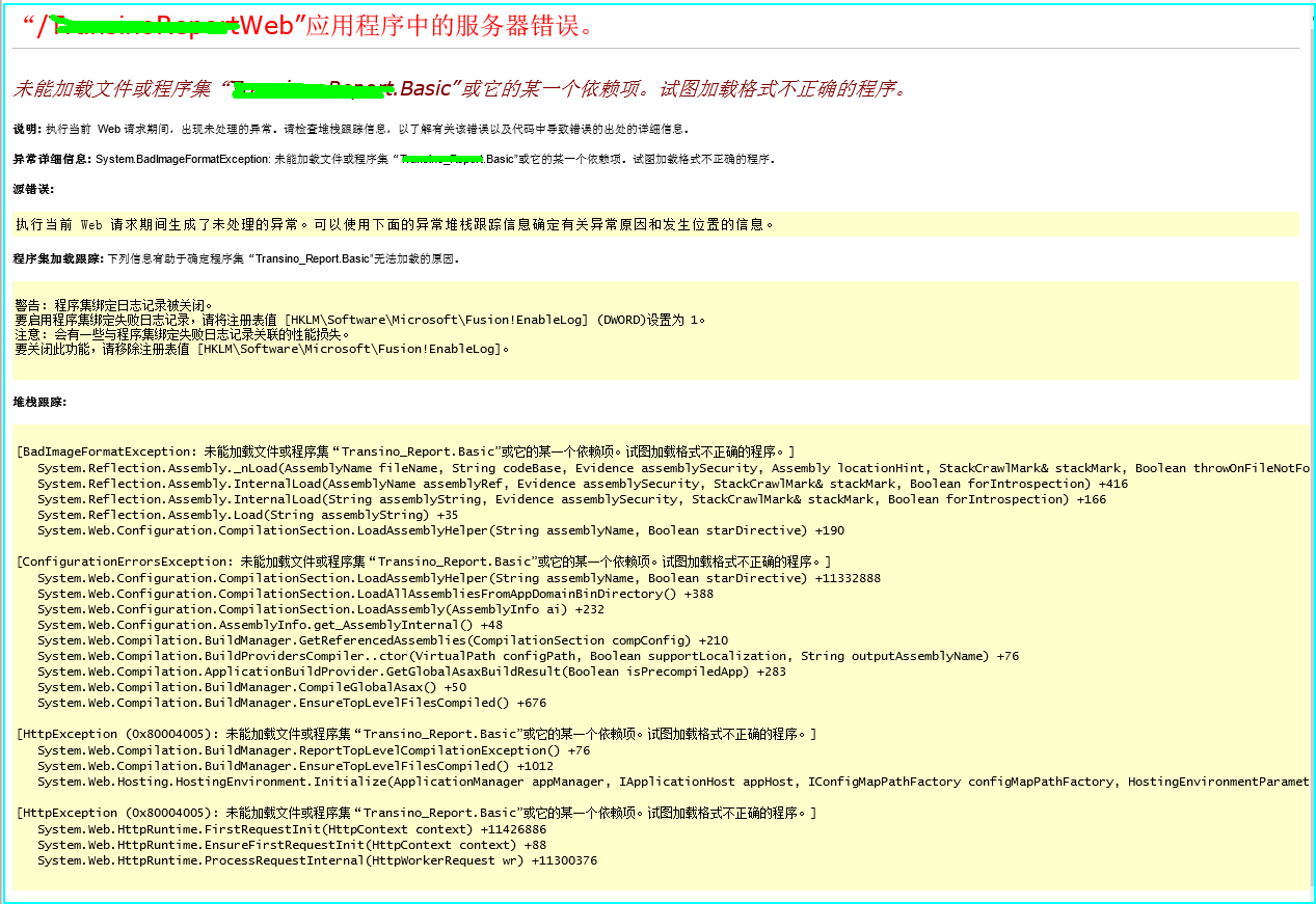
未能加载文件或程序集“Report.Basic”或它的某一个依赖项。试图加载格式不正确的程序...
出现问题如下: 解决办法: 这是由于没有开启32位程序兼容模式 具体操作如下:找到对应的程序池--------高级设置-------修改“启用32位应用程序”状态修改为true 转载于:https://www.cnblogs.com/OliverQin/p/5018575.html
flutter开发小程序_为什么我认为Flutter是移动应用程序开发的未来
flutter开发小程序I dabbled a bit in Android and iOS development quite a few years back using Java and Objective-C. After spending about a month working with both of them, I decided to move on. I just couldn’t get into it.几年前,我使用Java和Obje…
小程序获取图片的宽高
代码: imgInfo(url){wx.getImageInfo({src: url,success (res) {console.log(res.width)console.log(res.height)return {width:res.width,height:res.height}}})},
凯撒密码、GDP格式化输出、99乘法表
1.恺撒密码的编码 plaincode input(明文:)print(密文:,end)for i in plaincode: print(chr(ord(i)3),end) 2.国家名称 GDP总量(人民币亿元) 中国 ¥765873.4375澳大利亚 ¥ 78312.4375(国家名称左…

random类的使用
小栗子a如下: string[] punch new[] { "石头", "剪刀", "布" }; string myPunch; public string MyPunch{get{Random random new Random();int Index random.Next(3);myPunch punch[Index].ToString();return myPunch;}} 转载于:https://ww…
如何使用C#在ASP.NET Core中轻松实现QRCoder
by Yogi由瑜伽士 如何使用C#在ASP.NET Core中轻松实现QRCoder (How to easily implement QRCoder in ASP.NET Core using C#) QRCoder is a very popular QR Code implementation library written in C#. It is available in GitHub. Here I am going to implement…

简述软件配置管理
http://blog.csdn.net/zhangmike/article/details/470477本文用菊子曰发布转载于:https://www.cnblogs.com/sdsunjing/p/5019791.html
startActivityForResult和setResult详解
startActivityForResult和setResult详解 原文:startActivityForResult和setResult详解startActivityForResult与startActivity的不同之处在于:1、startActivity( ) 仅仅是跳转到目标页面,若是想跳回当前页面,则必须再使用一次startActivity( …

小程序瀑布流实现
实现思路:把图片分成两排,创建两个数组,计算总数组中图片的宽高,对比上一个图片和当前的图片高度,低的就给另一个数组添加。效果图: 上代码: // miniprogram/pages/find/index.js const app g…
Webhooks上的一个简单方法:恐吓现在停止
Webhook.Webhook。 It sounds like what happens when you cross a spider and a pirate. In the world of the internet though, webhooks are something completely different. Webhooks help connect services together.听起来就像当您越过蜘蛛和海盗时会发生什么。 但是&a…

12.MySql关于获取当前时间的三个函数
这三个函数都是获取当前时间的,获取的详细格式如下图所示,可以根据需要来选用。 转载于:https://www.cnblogs.com/Nick-Hu/p/7566805.html
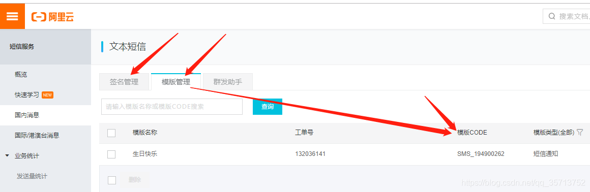
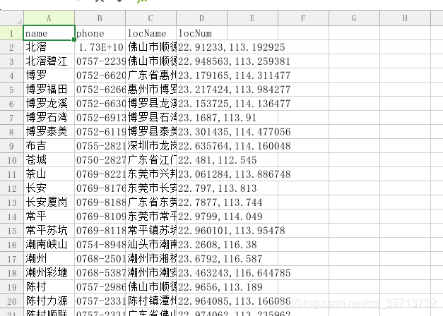
微信小程序云开发,使用阿里云短信服务,搜索员工生日定期发送短信。
相关API文档地址: 阿里云短信服务API文档地址 小程序云开发云函数正则匹配API文档地址 小程序云开发云函数定时触发器 1.登录阿里云,购买短信服务并添加签名和模板 2., 登录阿里云,鼠标放在右上角的头像图标就会显示 AccessKey…
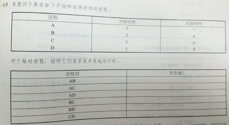
信息安全系统设计基础家庭作业
《深入理解计算机系统》家庭作业 * 8.9 答案: 进程对 是否并发 AB 否 AC 是 AD 是 BC 是 BD 是 CD 是 * 8.10 答案: A. 调用一次,返回两次: fork B. 调用一次,从不返回: execve, longjmp C. 调…
css游戏代码_介绍CSSBattle-第一个CSS代码搜寻游戏
css游戏代码by kushagra gour由kushagra gour 介绍CSSBattle-第一个CSS代码搜寻游戏 (Introducing CSSBattle — the first CSS code-golfing game) If you are learning Web development or are already a professional Web developer, there is a very high chance you have…
IOS手机全屏长按识别二维码HTML代码
代码段作用讲解: 1. 二维码的全屏样式, opacity: 0; 透明样式, touch-callout: none; -webkit-touch-callout: none; -ms-touch-callout: none; -moz-touch-callout: none; 禁止IOS默认长按事件 .codePage {position: absolute;touch-callout: none;…
[亲测]在Mac下配置php开发环境:Apache+php+MySql
公司给我们配上了高大上的Apple Mac Pro本本,这两天自己正在习惯中。通过虚拟机PD,确实解决了一些因为工作习惯无法在iOS上很好完成的事情,但是我想,既然用起了iOS就尽量将一些事务在iOS环境下处理,免得好似关羽耍着大…
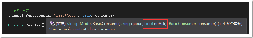
RabbitMQ 异常与任务分发
RabbitMQ 异常与任务分发 异常情况处理 上篇最后提到了这个问题, consumer异常退出、queue出错、甚至rabbitMQ崩溃。因为它们都是软件 ,软件都会有bug,这是无法避免的。所以RabbitMQ在设计的时候也想到了这一点 在之前,消息分发给…
reddit_如何使用Python创建自定义Reddit通知系统
redditby Kelsey Wang王凯西 如何使用Python创建自定义Reddit通知系统 (How to make a custom Reddit notification system with Python) Don’t you just love automated emails? I know I do. I mean, who doesn’t enjoy waking up to 236 new messages from Nike, Ticket…
1016. Phone Bills (25)
时间限制400 ms内存限制65536 kB代码长度限制16000 B判题程序Standard作者CHEN, Yue去掉非法数据计算账单A long-distance telephone company charges its customers by the following rules:Making a long-distance call costs a certain amount per minute, depending on the…
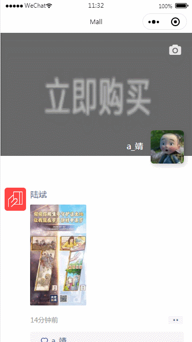
样式集(五)微信朋友圈样式模拟
效果图: 小图标: 源码: <!--pages/findList/findList.wxml--> <image class"xxiangji" catchtap"xxiangji" src"/images/xxiangji.png"></image> <image class"top_img" src&…
为什么要选择useState而不是useReducer
by Austin Malerba奥斯汀马勒巴(Austin Malerba) 为什么要选择useState而不是useReducer (Why you should choose useState instead of useReducer) 通过useState进行本地和全局状态管理的指南 (A guide to local and global state management via useState) Since the introd…
php 类中的变量的定义
php 如果在类中定义变量,在类的方法中调用时应该加上$this-> . class ClassName {private $a 333;function __construct(){$this->a 2222;}public function bbb($value){echo $this->a;} } $b new className(); echo $b->bbb();转载于:https://www.c…
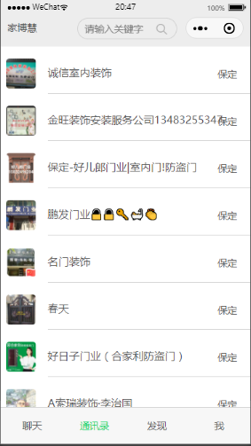
微信小程序云数据库触底分页加载,下拉无限加载,第一次请求数据随机,随机获取数据库的数据
效果图 小程序云开发分页加载代码 <!--pages/chatList/chatList.wxml--> <view class"pageTitle">家博慧</view> <view class" search_arr"><icon class"searchcion" size16 typesearch></icon><input …

Linux(Centos)之安装Java JDK及注意事项
1.准备工作 a.因为Java JDK区分32位和64位系统,所以在安装之前必须先要判断以下我们的Centos系统为多少位系统,命令如下: uname -a解释:如果有x86_64就是64位的,没有就是32位的。后面是X686或X86_64则内核是64位的&…